- Share via
When it comes to black-and-white cinema, there’s more to it than meets the eye. The monochromatic look dates to the early days of movie history and tends to evoke nostalgia within the psyche. It gently reminds us of where we’ve been and resonates in ways color simply cannot.
Even during the Academy Awards’ infancy, the organization recognized the dichotomy between the two formats with different awards honoring cinematographers’ work — one for color and one for black and white — from 1939 to 1967. It wasn’t until “Schindler’s List” in 1993 that a predominantly black-and-white film took home the cinematography prize among color nominees.
There’s been a growing resurgence of black-and-white movies in the past decade, including best picture winner “The Artist” (2011) and “Roma” (2018), which won a trio of Oscars, as well as the nominated films “Cold War” (2018), “The Lighthouse” (2019) and “Mank” (2020), which won Oscars for cinematography and production design.
This year’s crop is unusually large and includes a number of pictures that have sewn black and white into the fabric of their visual stories — for specific reasons.
Writer-director Kenneth Branagh’s “Belfast” is a story told through the eyes of young Buddy (Jude Hill), who finds himself staring into the face of the Northern Ireland conflict, a volatile period that started during the late 1960s during which unionists and nationalists clashed over whether to stay part of the United Kingdom or to leave and join a united Ireland.
The journey was personal for Branagh, as it reflected on his childhood. The director tapped cinematographer Haris Zambarloukos, a longtime collaborator, and the two chose black and white to bring validity to the performances and grandeur to the mundane.
“We knew we wanted to strip things away visually and believed black and white could do that,” Branagh says. “It’s a cleaner look and can be different forensically for a story. It can let you concentrate on the human condition in a deep way.”
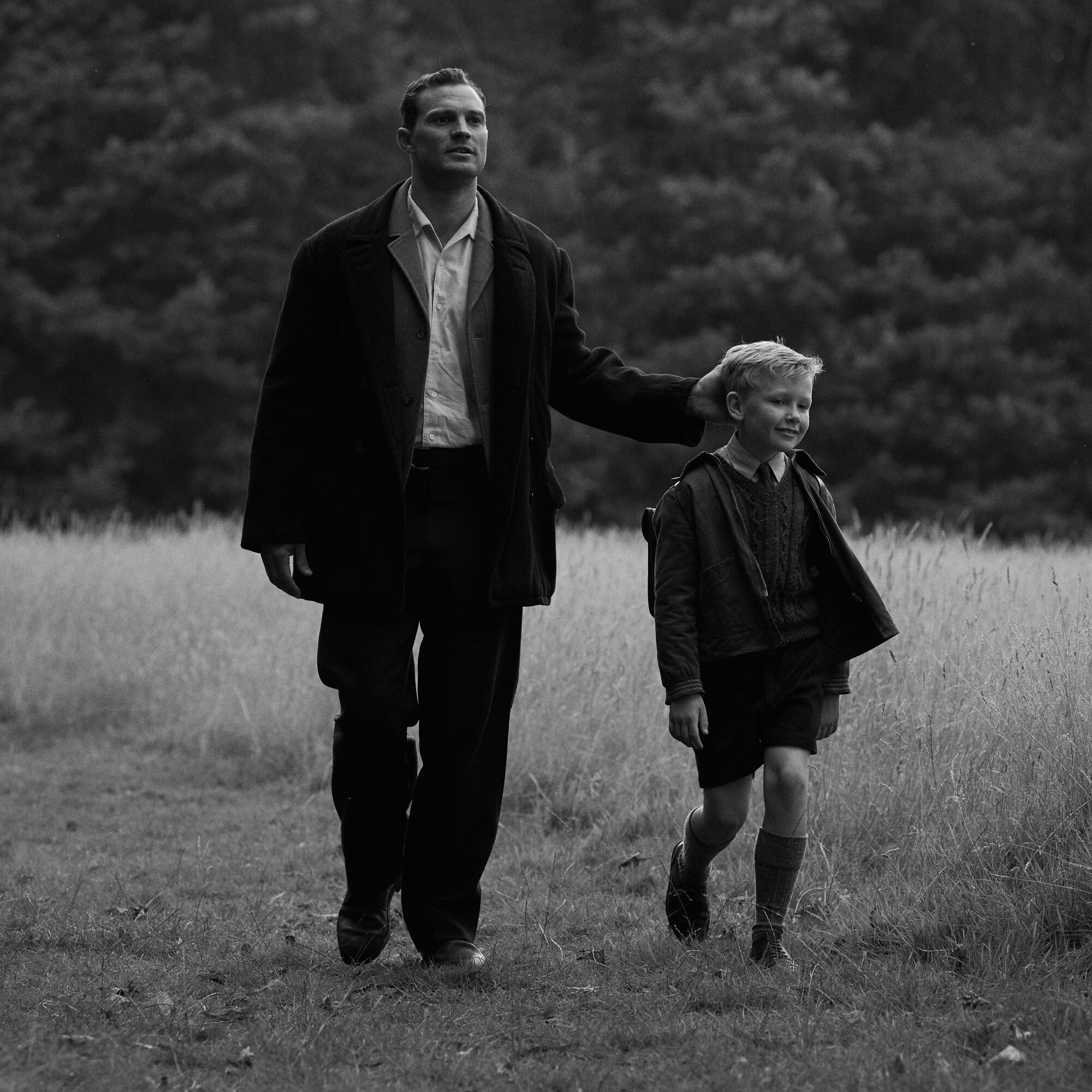
The visual palette of “Belfast” relies on a silvery, dreamlike tone not overwhelmed with moody shadows or deep blacks. “On telling the story, we wanted a style that didn’t get in the way,” adds the director.
Completing the look, the camera composition was reminiscent of a painter’s frame. “We put people in windows, behind bars or in the streets as a way to bring these human studies to life,” says Branagh. “Black and white gives unique framing to the visual landscape and often to the human face. I feel like Hollywood is capturing everyone’s secret heart. And it seems like, with black and white, it won’t let you hide that.”
In “Passing,” director Rebecca Hall adapts Nella Larsen’s novel of the same name, which follows two Black women who can “pass” as white while living in 1920s New York and the different choices they make.
Hall’s reasons for choosing monochrome were twofold. One reason was to whisk viewers away on a female-driven noir that felt as if it were made in Hollywood during that time period. The other was practicality — to illustrate a tonal credibility that these two Black women could indeed “pass” as white on screen.
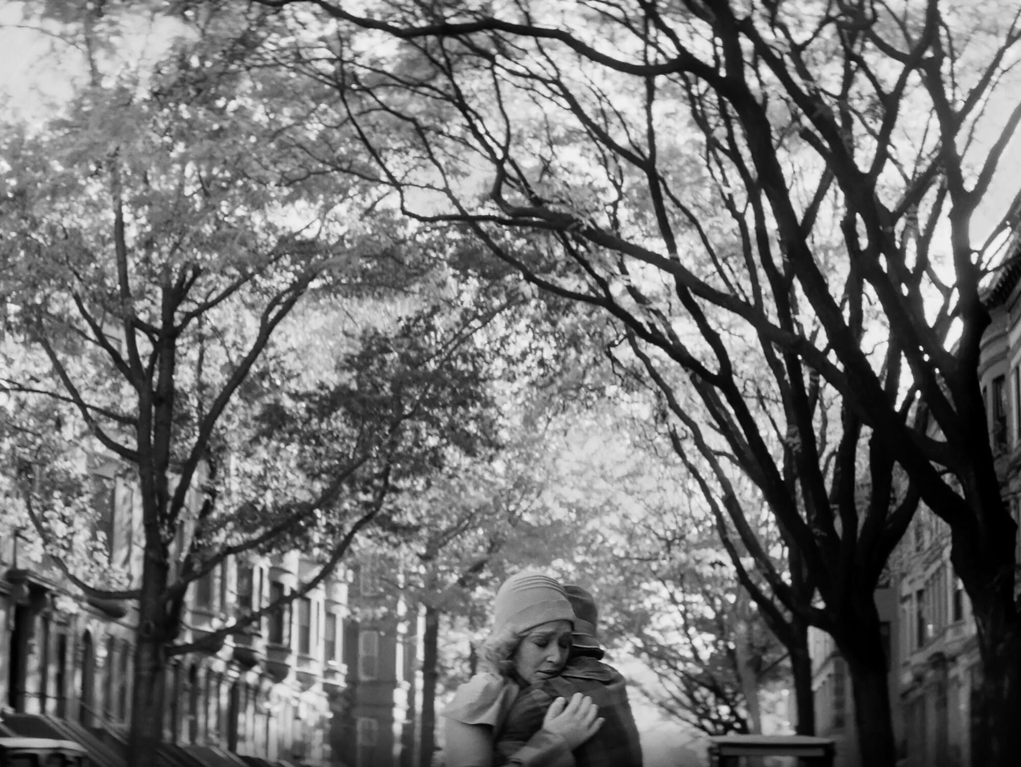
The director worked alongside cinematographer Eduard Grau to bring the multifaceted imagery to life. “The lighting and black-and-white look was to create an abstract space so we could play with shade and tone and shift how it looked and hopefully make a comment about the fictionality of the construct of race — that it is about context, and there’s a certain amount of slipperiness around the reality of it,” says Hall. “I think that is helped by the black and white enormously, and we pushed that.”
In Joel Coen’s Shakespeare adaptation “The Tragedy of Macbeth,” cinematographer Bruno Delbonnel visually translated the magnetic play into a movie rich with visual grammar built around shapes, textured lighting and high-contrast monochromatic images lush with detail.
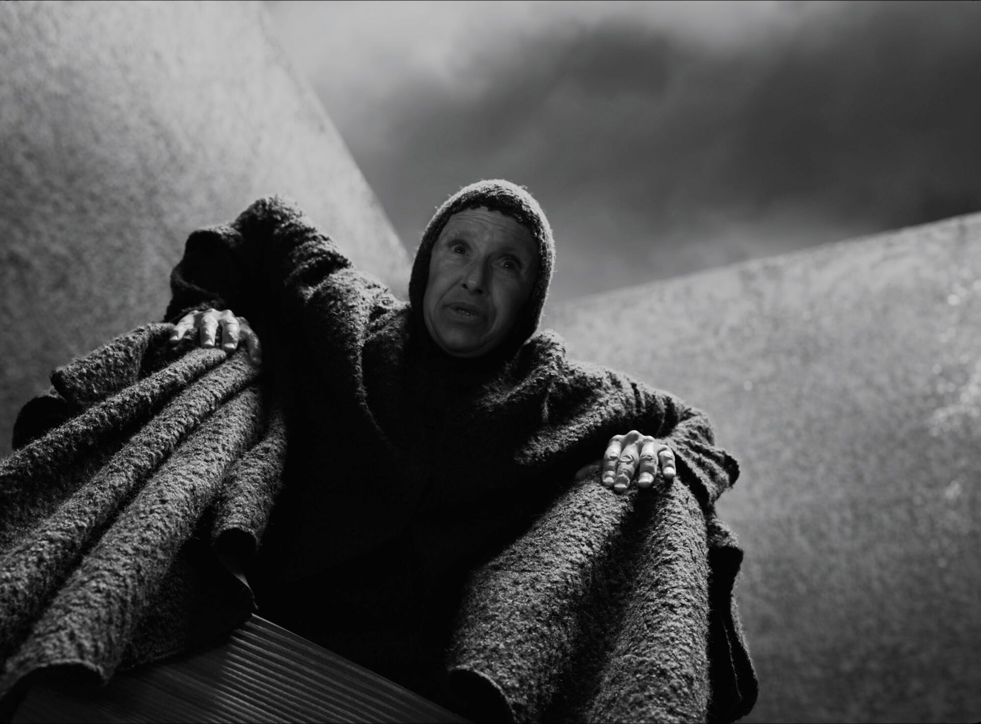
“Our idea was to embrace bare walls and use nothing abstract,” says Delbonnel. “So everything that was an obstruction to Shakespeare’s lines was avoided, including the use of color. The approach was about how we can make the audience connect with how beautiful the lines are and how powerful they are. So it was all about the actors, the characters, the mood and the situations to support the lines, more than anything.”
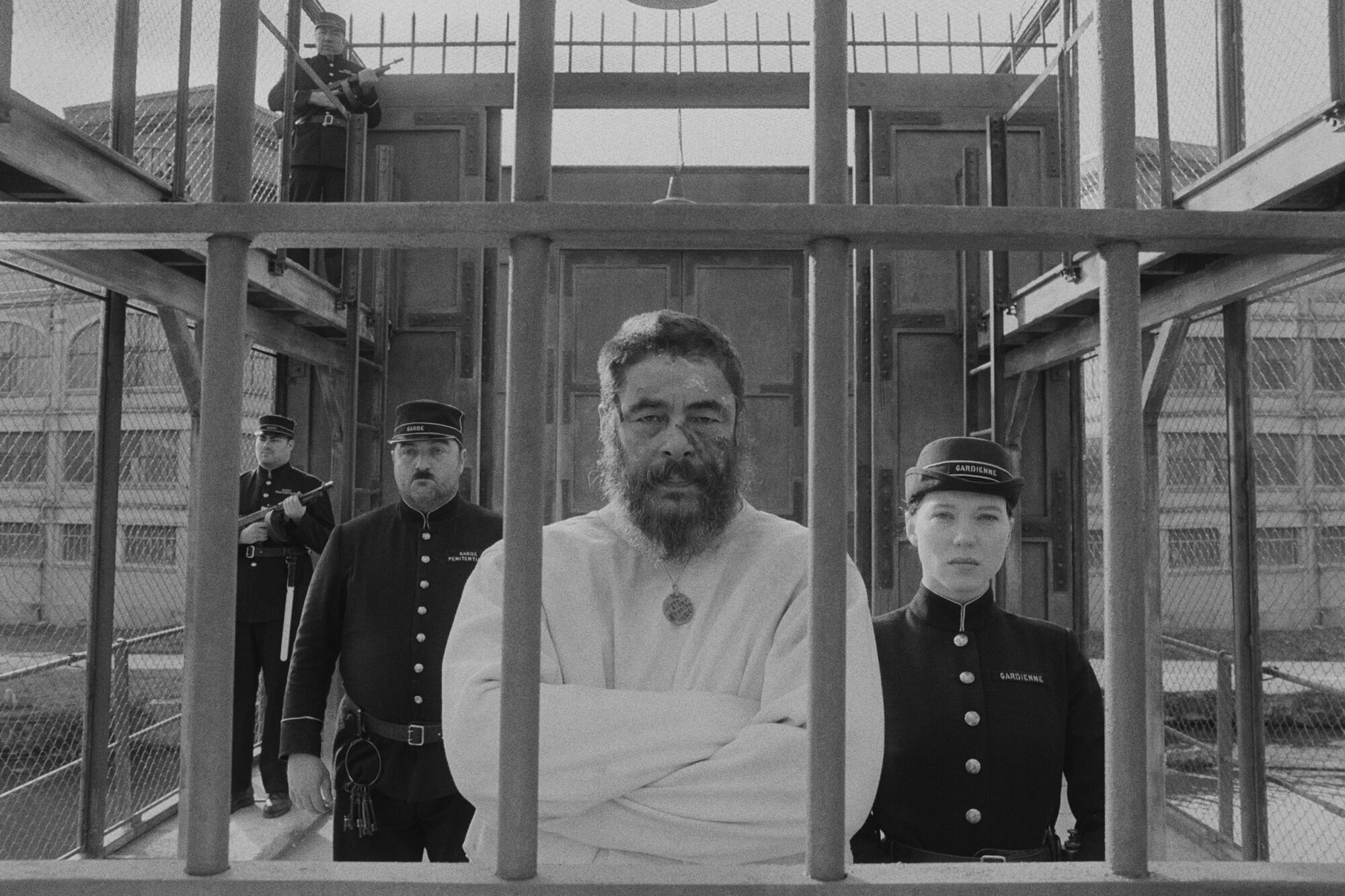
With Wes Anderson’s “The French Dispatch,” the story is broken down into different chapters, each having its own distinctive look that complemented the overall visual arc.
Cinematographer Robert Yeoman, who’s worked on a number of titles with the director, including “The Grand Budapest Hotel” and “Moonrise Kingdom,” admits that preparation was an intricate part of the pictorial process. “Initially, we were only going to shoot the story about the prison painter in black in white. But in prep, we did a lot of tests, and both Wes and I, and everyone really, responded to the black-and-white film. Wes thought to shoot more of it in black and white, including the final chapter,” he says.
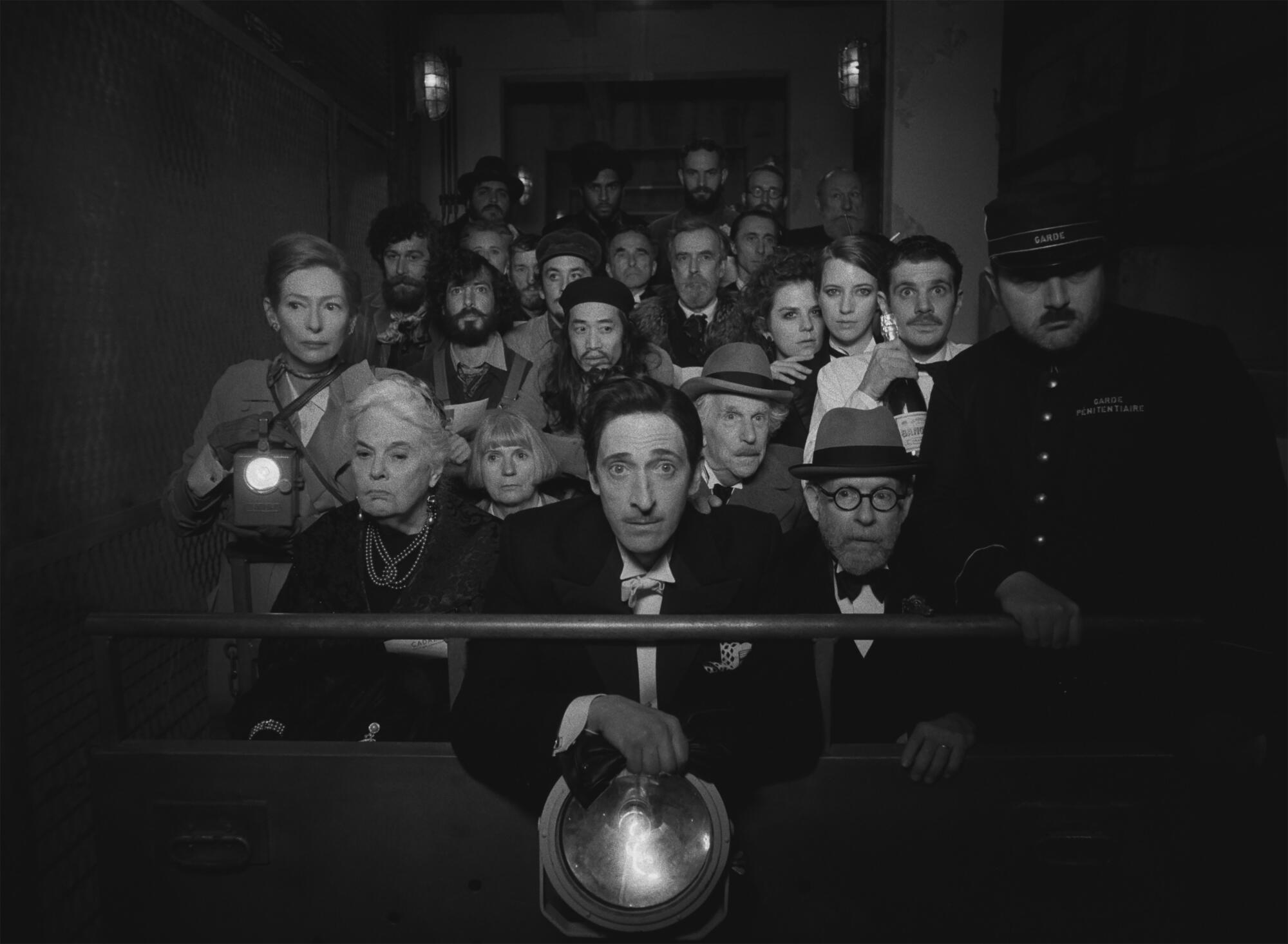
Visual inspiration stemmed from French New Wave films. Textured imagery and a potpourri of color and black and white motivated the frame, while a squarish 1.37 aspect ratio keeps the focus on the story. “We were trying to re-create that period and feeling of French films and felt that black and white often captures that better than color,” says Yeoman.
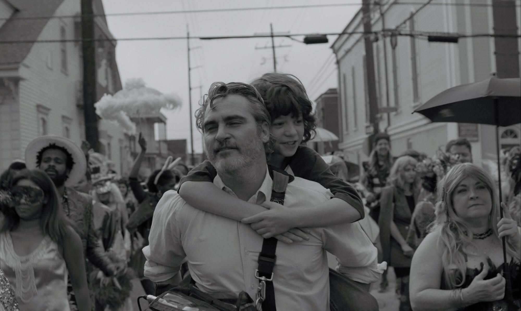
For “C’mon C’mon,” directed by Mike Mills and shot by cinematographer Robbie Ryan, the main reason behind the black-and-white palette was to bring uniformity to the four very different cities the story was filmed in.
The narrative follows Johnny (Joaquin Phoenix) as he fills in parenting duties for his sister, Viv (Gaby Hoffmann), as she helps her out-of-town husband (Scoot McNairy) find rehab. As a radio journalist, Johnny travels to Detroit, New York, Los Angeles and New Orleans with his nephew, Jesse (Woody Norman), in a moving story about finding yourself.
“The black and white brought the cities together and made them feel connected,” says Ryan. “As a big film fan, especially watching the old films of the ‘30s, ‘40s and ‘50s, which were mainly in black and white, it was quite a thing to be able to shoot in the same format as they did. That sounds nostalgic, but I think the graphic simplicity of monochromatic images makes it easy to tell a story more, as things focus into the faces and environment quicker in black and white. It’s a format very much back to being expected in cinema again, and I think that stems from an interest in seeing stories told in different ways.”
While shooting writer-director Aaron Sorkin’s “Being the Ricardos,” cinematographer Jeff Cronenweth looked to black and white for specific moments. The dialogue-driven biopic takes place over a contentious week of production on the classic sitcom “I Love Lucy” that threatens the marriage and careers of Lucille Ball (Nicole Kidman) and Desi Arnaz (Javier Bardem). Mostly shot in color, monochromatic imagery was used to invigorate the spirit of the iconic television show.
“Our idea was to never show the TV series as you would know it, however, we didn’t want to lose that wonderful part of the story,” notes Cronenweth. “What we did is when we see Lucy trying to solve comedic challenges or things that don’t work in a scene, which are presented to you in the writers rooms or at table reads, it’s in these moments she will reflect in her head, and it will become that scene that you would have seen in the television show. It’s all in her mind, but we are presenting it as if it was an event occurring on the show itself.”
When asked what makes black and white special for moviegoers, Cronenweth says, “The thing that’s most apparent is that there’s less distractions. You’re not distracted by the blue eyes or blond hair of a character. Everyone has a similarity, and it allows you to focus more on the film and what they’re saying, as opposed to the colors or wild things going on in the background. I think it’s a simpler way to tell a story without feeling disconnected, which sounds weird because it’s not in color and we live our lives in color.”
More to Read
From the Oscars to the Emmys.
Get the Envelope newsletter for exclusive awards season coverage, behind-the-scenes stories from the Envelope podcast and columnist Glenn Whipp’s must-read analysis.
You may occasionally receive promotional content from the Los Angeles Times.


