How architect Henry Cobb gave L.A.’s skyline its distinctive crown
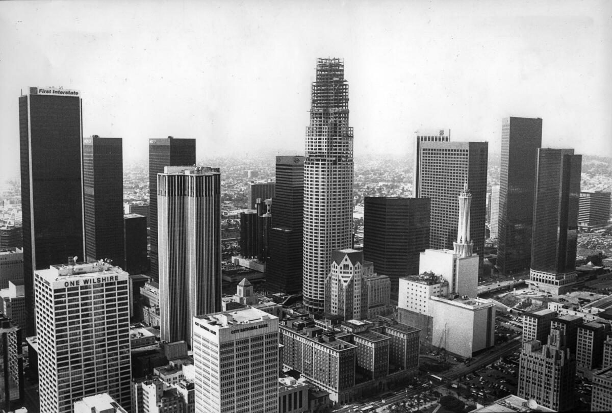
Tune in to an old episode of the 1980s legal drama “L.A. Law” and you will be struck by the height of the hair, the scale of the shoulder pads, the glimmer of the double-breasted suits. And, of course, there’s the opening pan of the downtown Los Angeles skyline, which is ... totally underwhelming.
A jumble of unremarkable boxy towers stand behind a scrim of yellow haze, which blocks out all views of the San Gabriel Mountains in the distance. Except for the telltale smog, it’s a skyline that could exist anywhere.
For the record:
2:29 p.m. March 7, 2020An earlier version of this story misidentified architecture critic Leon Whiteson.
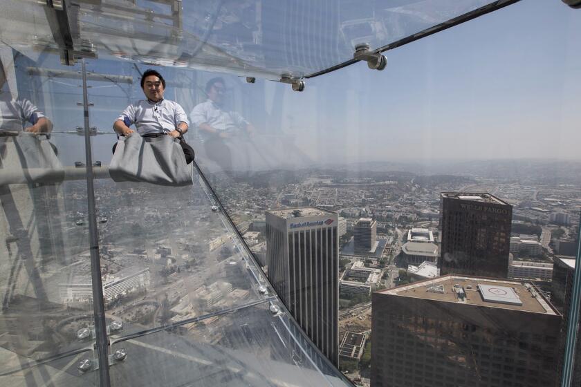
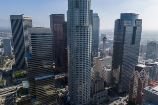
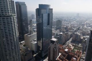
One building helped change the skyline we know today: the Library Tower, now known as the U.S. Bank Tower, completed in 1989. The 73-story building, which topped out at 1,017 feet, added height to the downtown skyline — it was, for a time, the tallest building west of the Mississippi. It also added some desperately needed pizzazz.
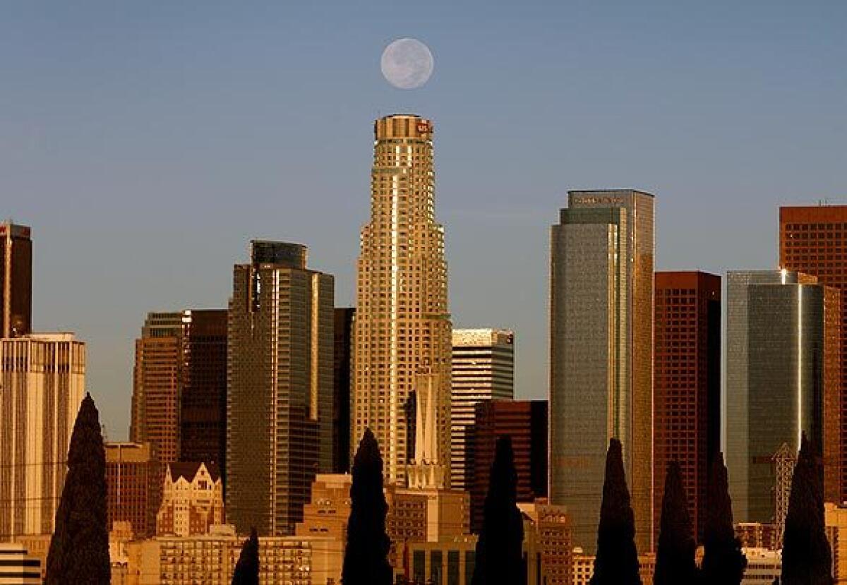
Instead of a rectangular monolith, like many of the era’s buildings, the tower’s body was rounded. And it consisted of a series of stacked volumes that grew slenderer and more circular as the tower rose. This was capped by a jagged crown that was illuminated at night.
Whatever you thought of it architecturally — critic Leon Whiteson once wrote that the building’s primary art form was not the architecture, but the “seven-year exercise in deal making” that got it constructed — it gave the L.A. skyline an unmistakable form.
The man who designed it? Henry N. Cobb of the New York-based firm Pei Cobb Freed & Partners. In 1989, when the tower was near completion, Cobb told The Times of his schematic, “We wanted to make a building that was more spirited than many big buildings downtown.” In that regard, the design was a success.
Cobb died on Monday at his home in Manhattan at age 93.
The architect was known for his decades-long partnership with the Pritzker Prize-winning I.M. Pei, not to mention the lengthy portfolio of commercial, educational and residential buildings that he designed around the globe in Modern and late Modern styles. The most famous and most critically acclaimed of these was the sleek John Hancock Tower in Boston that Cobb completed in 1976, a structure that, despite its height, remained deferential to a 19th century church nearby. (The building caused untold grief for its architect when windows popped out and fell during construction, a fabrication problem that was later resolved.)
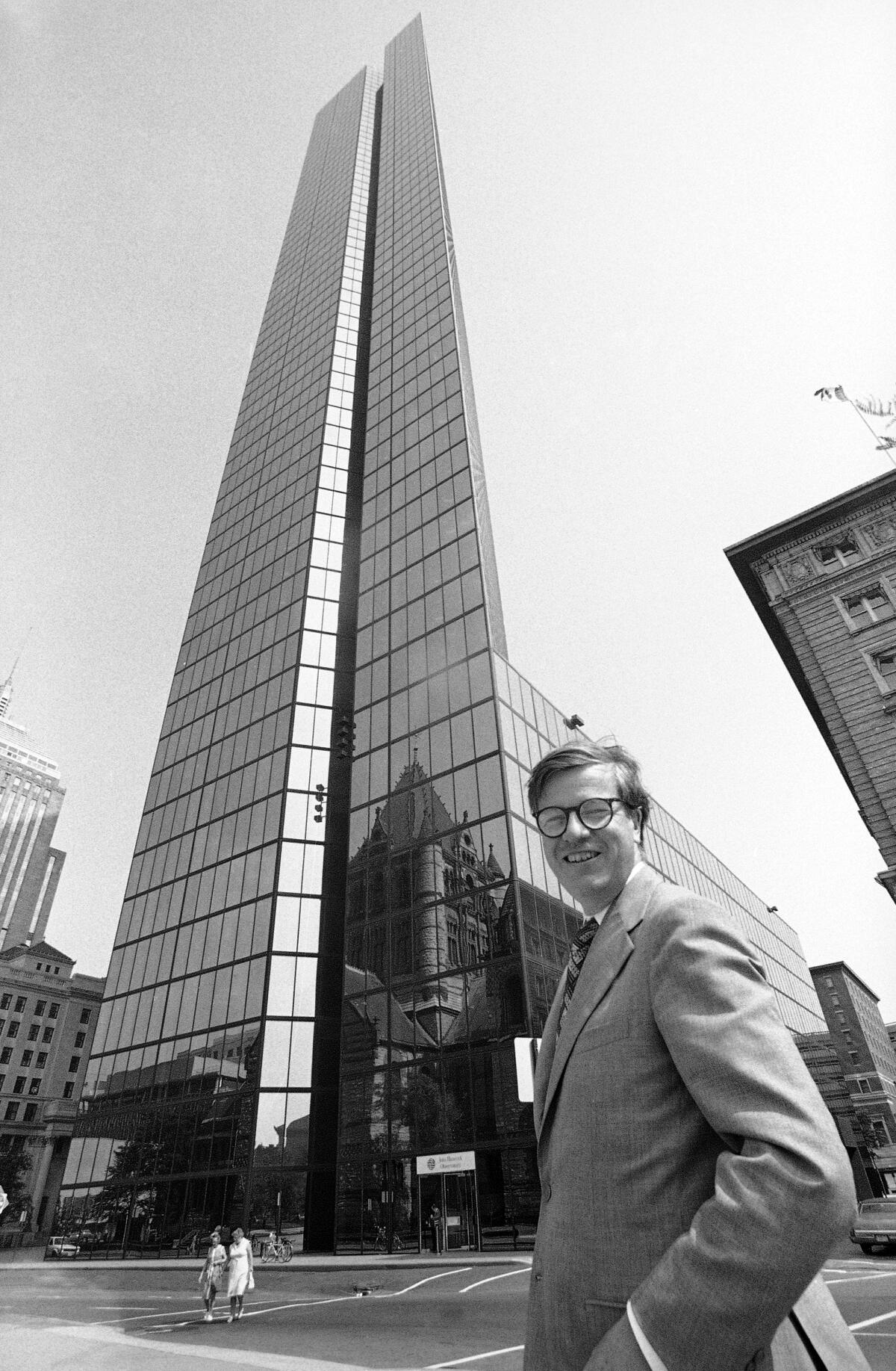
Over the years, Cobb and his firm worked on a multitude of projects in Southern California, including buildings for the Anderson School of Management at UCLA, office towers for the Spectrum Center in Irvine, and a pair of 46-story residential towers that are currently under construction behind Minoru Yamasaki’s Century Plaza Hotel in Century City.
But none of his SoCal buildings has ever been as recognizable as the U.S. Bank Tower.
If not exactly beloved, the building has become a de facto symbol of Los Angeles — promptly vaporized in the 1996 alien invasion flick “Independence Day” and razed by a magnitude 9.1 earthquake in the 2015 disaster movie “San Andreas.” It materializes in “Grand Theft Auto V” as the fictional Maze Bank Tower. And it can be seen lurking, half built, behind Michael Douglas, in the movie poster for the 1993 angry white guy drama “Falling Down.”
These days, to see an L.A. skyline without the U.S. Bank Tower is to see a skyline that doesn’t feel quite Los Angeles.
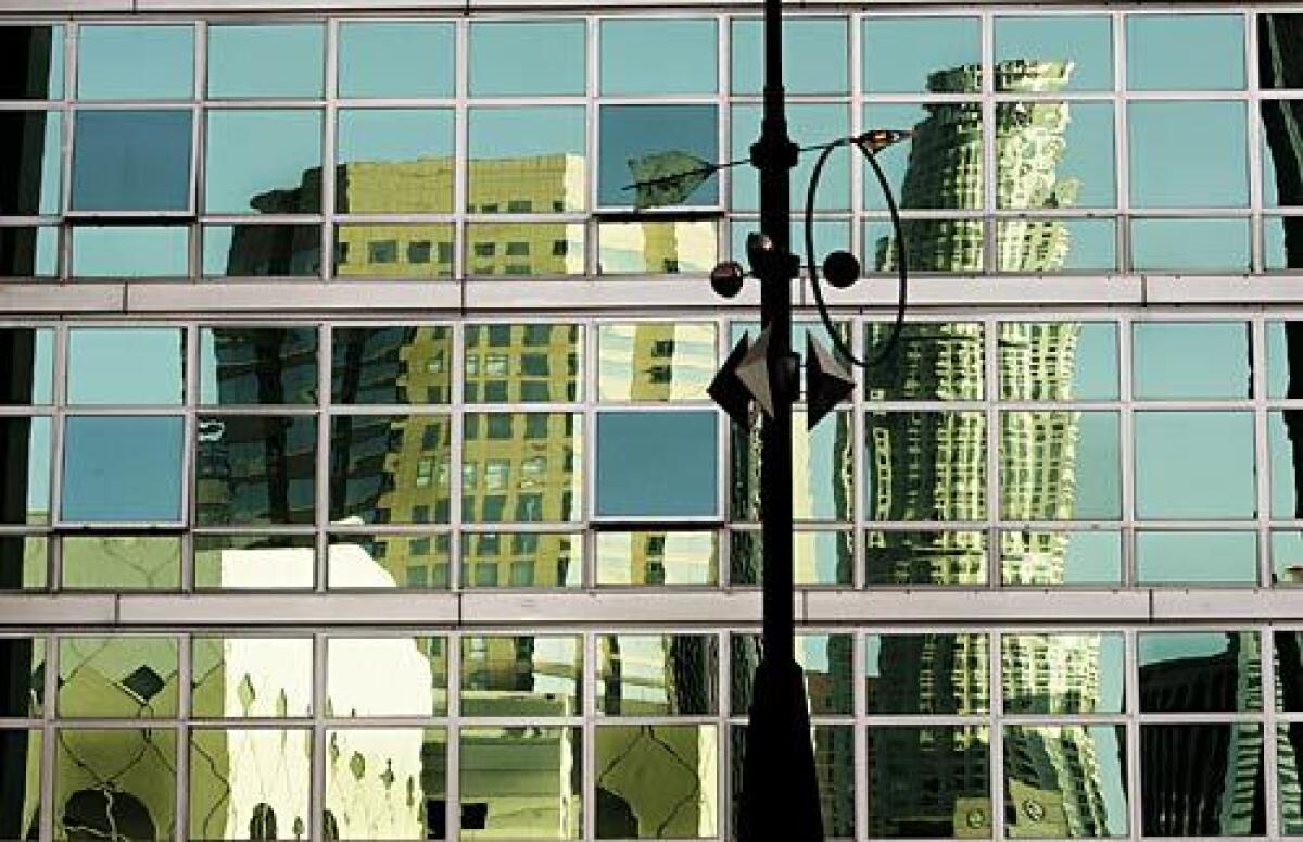
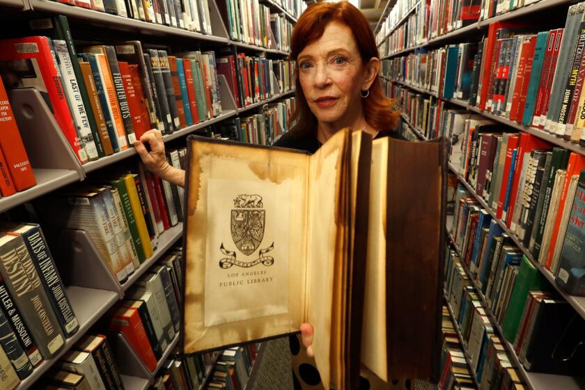
Interestingly, the building’s life is tied to the near death of L.A.’s Central Library.
That structure, an ancient-Modern temple designed by Bertram Goodhue in the 1920s — the last building he ever built — was in danger of being demolished by the time the ‘70s had rolled around. This had to do with a pile-up of deferred maintenance issues, outdated electrical and mechanical systems, and the fact that the library’s collections had simply outgrown the building. For a time, a plan circulated around City Hall to raze the Central Library and sell off the site as office space (an idea that spurred the creation of the L.A. Conservancy).
Enter developers Maguire Thomas Partners, who agreed to supply financing for the library’s renovation and expansion in exchange for the property’s air rights and some of its zoning credits, among various other factors. Over time, the developer contributed more than $125 million to the library’s upgrade, a project that was further complicated by the devastating arson fires of 1986. (The library reopened, with an addition by Hardy Holzman Pfeiffer and Associates, in 1993.)
But their contributions meant that whatever tower Maguire Thomas planted across the street from the library could be taller than would ordinarily have been allowed. At the time, the tallest building on the West Coast was the Columbia Center in Seattle, which was 76 stories tall with a height of 943 feet. The proposed Library Tower, as it was then called, would be 74 feet higher.
Cobb told The Times in 1990 that the aim wasn’t simply to make a tall building, but to create a structure that respected what was already there: “Granting primacy at street level to Goodhue’s great library was a major concern.”
Architect Scott Johnson, a founder of Johnson Fain, the firm that designed Fox Plaza (the Century City tower made famous by Bruce Willis’s “Die Hard”), says the building helped create a visual marker for downtown at a time when tall buildings were scattered arrythmically along Bunker Hill and the burgeoning financial district.
“If you thought of the center of downtown as having a cathedral and campanile, you can think of the library as the cathedral and the tower as the campanile and the park is the plaza,” he says. “You have the traditional center of the city elements there. Library Tower is a piece of that. If you are driving up the freeway, it tells you that’s the center.”
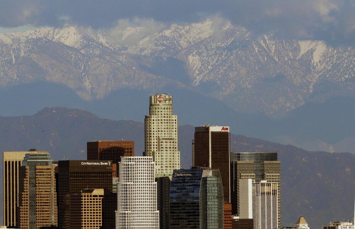
The tower also came at a time when Los Angeles was growing and in search of a new image.
The 1984 Olympics had given the city a refreshed international profile. As Times columnist Scott Harris wrote in a piece titled “‘Chichi’ Architecture” in 1988: “Los Angeles, after an awkward, protracted adolescence seems to be shedding its trendy tendencies, groping for a more permanent, more classic sense of style.”
“We don’t want the city to look like it does anymore,” stated Merry Norris, who was then serving as head of the Department of Cultural Affairs. “There are precious few buildings one can point to with pride. It’s important to make this a city of which to be proud.”
“A machine that makes the land pay.”
Cobb’s U.S. Bank Tower also came at a time when architectural styles were changing. The austerity of Late Modernism (all those glass boxes) was giving way to Postmodernism, with its deconstructed shapes and its decorative and historical flourishes.
His buildings remained generally simple. Cobb was never a flashy designer, and he described the U.S. Bank Tower as “a strong, spare building, very authoritative, very Western.” But its circular form, its intersecting shapes (a square inside a circle) and its elegant crown (evocative of the Art Deco elements that decorate Goodhue’s library below) certainly leaned into the Postmodern.
“As shapes and features began to explode and change in the ‘80s,” says Johnson, “this was a building that took advantage of that freedom and invention.”
In a 1987 critique that noted the generally dull skyline that figured in the opening of “L.A. Law,” Times urban design critic Sam Hall Kaplan noted that the tower could give “the Los Angeles skyline a stylish focal point it has long lacked.”
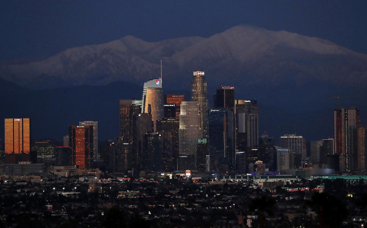
The U.S. Bank Tower is no longer the tallest building in the West nor in Los Angeles. (It has since been outdone by Salesforce Tower in San Francisco and the Wilshire Grand Center in Los Angeles.) Nor does it make lists of must-see architecture in L.A., which generally prefer buildings like Frank Gehry’s Disney Hall and one or more Case Study houses.
As a building, I find the tower more appealing from a distance than I do at ground level, where a recent lobby renovation has left the ground floor feeling placeless and anodyne. But as part of the skyline, I always imagine the tower as a chess piece, handsomely bearing her crown. Other buildings have come up around her, but she holds her own. And whenever I see her, it means that I’m home.
For that, we have Henry Cobb to thank.
More to Read
The biggest entertainment stories
Get our big stories about Hollywood, film, television, music, arts, culture and more right in your inbox as soon as they publish.
You may occasionally receive promotional content from the Los Angeles Times.
