Is there a compound word that describes the feeling of alienation induced by really wanting to embrace a new piece of architecture but being viscerally unable to do so? A disarchpointment? A designchantment? A stuporstructure? Because I could really use a word to describe my feelings toward the first major building in Los Angeles by the international design studio Office for Metropolitan Architecture (OMA).
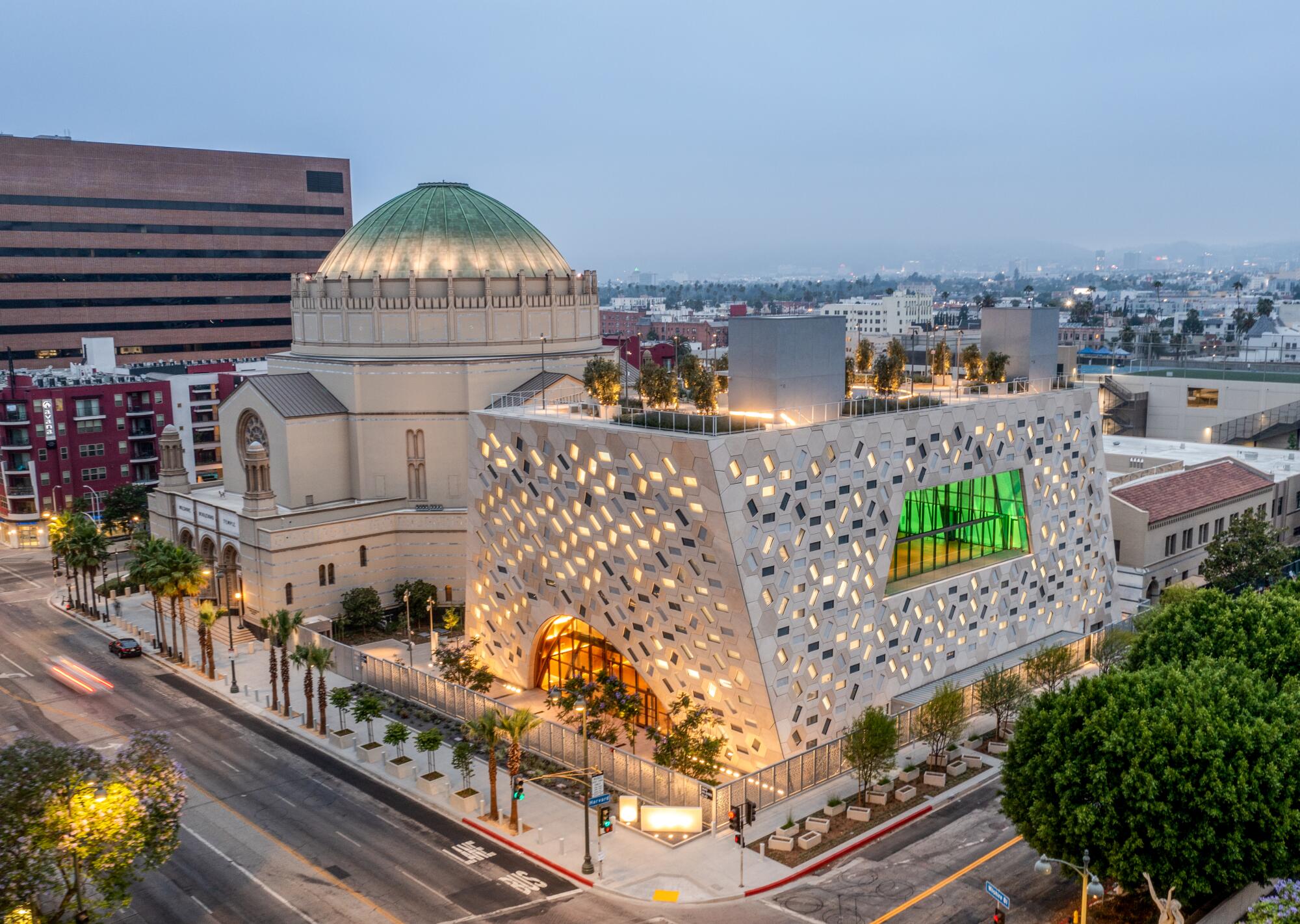
The building in question is the new Audrey Irmas Pavilion, a leaning and gleaming 55,000-square-foot event space for Koreatown’s Wilshire Boulevard Temple — which, had the COVID-19 Omicron variant not touched down with such sticky ferocity, would have held its official opening last week. (That event has been delayed until further notice.)
It would be cliché if it wasn’t true.
OMA was founded by Rem Koolhaas, but the Pritzker Prize-winning Dutch architect was only minimally involved in this project. The pavilion’s design was instead led by Shohei Shigematsu, a partner in the firm’s New York office — with Koolhaas contributing the design of the mezuzas affixed to key doorposts in the pavilion. On board as executive architect was the L.A. firm Gruen Associates.
One of Shigematsu’s preferred ways of describing the building — a three-story parallelogram draped in a honeycomb pattern that angles into an architecturally significant stretch of Wilshire — is as “a machine for gatherings.”
“Machine” is a fair description. But since this is L.A., the rules require me to employ showbiz similes. I will therefore note that the building’s profile, from certain angles, bears a striking resemblance to the irregularly angled Jawa transports from “Star Wars.” (Sorry, architects. These are the rules.)
In Seattle’s library, Rem Koolhaas has created a protective shell and filled it with new ideas.
Before diving into the nitty gritty, I want to commend Rabbi Steve Leder and the congregation at the Wilshire Boulevard Temple for aspiring to something daring. The path of least resistance would have been to put up a derivative event space that vaguely resembled the Byzantine-style architecture of the existing temple in some bland, new-ish way. That would have been a building that neither pleased nor offended; the sort you walk past and never think about again. And that would have been a bummer, since the temple is such an important part of Southern California history.
The Wilshire Boulevard Temple is the third home of the Congregation of B’nai B’rith, the oldest Jewish congregation in Los Angeles, which was founded in 1862 — just a dozen years after California became a U.S. state and 14 years before the transcontinental railroad arrived in the city. In the 1920s, the congregation acquired a property at Wilshire and Hobart boulevards, in what was then a tony, residential part of L.A. — the “Fifth Avenue of the West,” as described by the era’s eager boosters. There, architects S. Tilden Norton, A.M. Edelman and David C. Allison designed a temple sanctuary, completed in 1929, that bears Byzantine and Romanesque flourishes with a dramatic dome that spans 100 feet. There are, naturally, some resplendent touches: black marble columns, a brilliant rose window and bronze chandeliers.
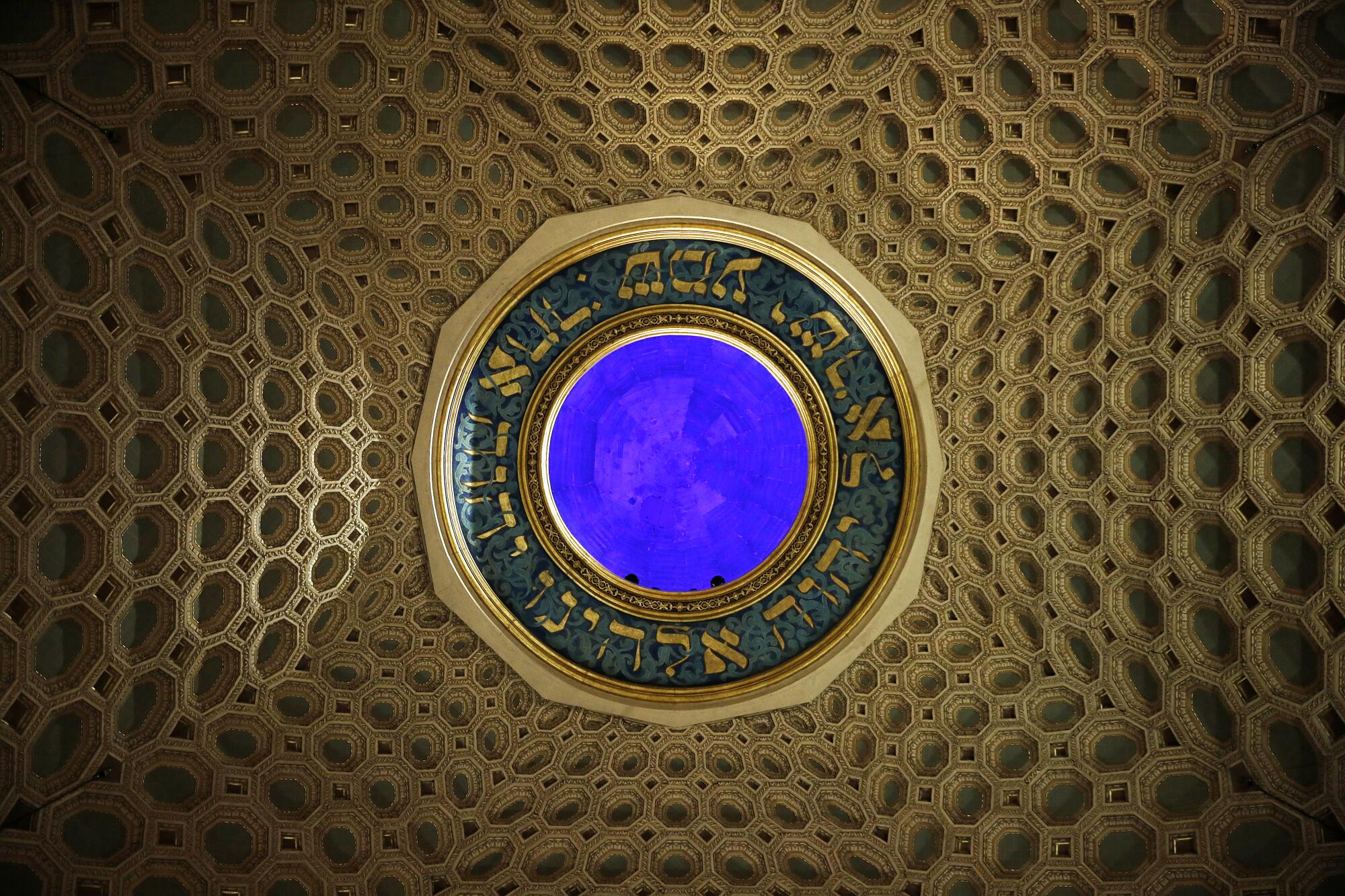
The building also bears some of the visual sleights of hand borrowed from the industry that helped build it. Among the temple’s most important benefactors were Hollywood film moguls Louis B. Mayer, Irving Thalberg, Carl Laemmle and Sid Grauman. This accounts for some of the architecture’s cinematic touches: sanctuary seating arranged like a movie theater and architectural elements that employ illusion — such as interior stone walls that aren’t stone but a much lighter composite (just knock on them), and a dome whose cerulean oculus comes courtesy of skillfully deployed colored lights. It is a building that carries early Hollywood in its bones. And it’s looking spiffy, having received a meticulous $47.5-million renovation in 2013.
Rabbi Steven Z.
Plunking some tedious event hall next door would, therefore, have been a disappointment — more so given that the temple’s neighbor to the east is the starkly beautiful St. Basil’s Catholic Church, a soaring Brutalist structure, dedicated in 1969, that was designed by the firms of A.C. Martin and Emmett L. Wemple and that features stunning three-dimensional stained glass panels by the late L.A. artist Claire Falkenstein.
The history and location are why I wanted to love — love — the new Audrey Irmas Pavilion (which bears the name of the patron who gave the lead gift on the $95-million project). But OMA has delivered a building that is hard to love.
That is not surprising, coming from a firm known for its brash designs. OMA designed the pronged headquarters of China Central Television (CCTV) in Beijing (completed in 2012) as well as the Seattle Central Library in Washington state (2004), a critically well-received structure whose staggered forms appear to want to burst from a cage-like skin.
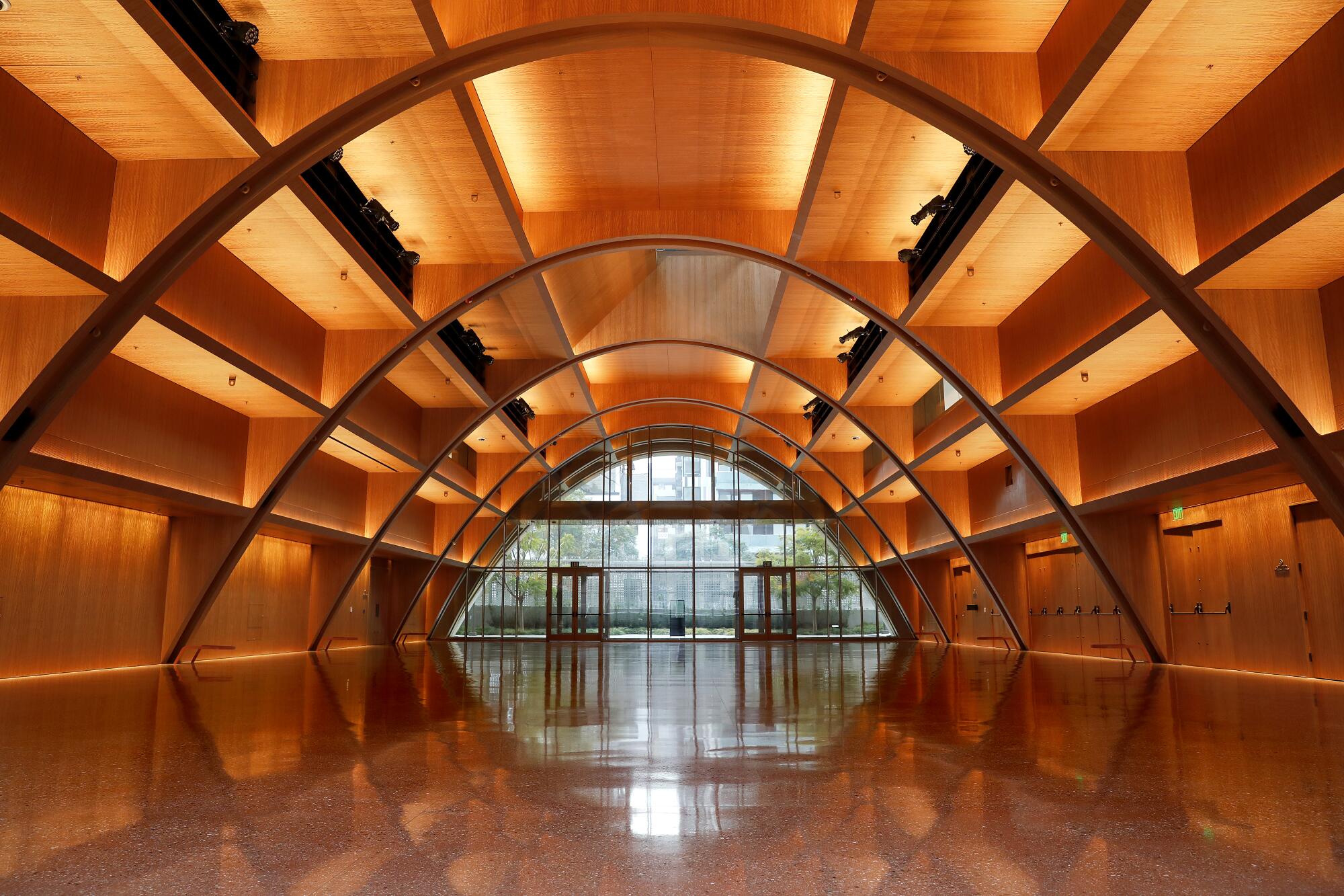
The three-story Audrey Irmas Pavilion makes deferential nods to the Wilshire Boulevard Temple. The honeycomb pattern inside the temple’s dome inspired the honeycomb pattern on the new pavilion’s exterior. The dome’s sweeping arch influenced the form of the pavilion’s ground-floor event space, an extruded arched space that checks in at nearly 14,000 square feet. The pavilion’s second story contains a glassy indoor-outdoor chapel and event terrace that respectfully frames views of the temple’s dome and stained glass windows. In addition, the pavilion leans away from the temple to create a sense of openness between the buildings and so that the interstitial outdoor spaces might feel less like alleyways and more like courtyards.
But what sounds good on paper doesn’t always congeal in real life.
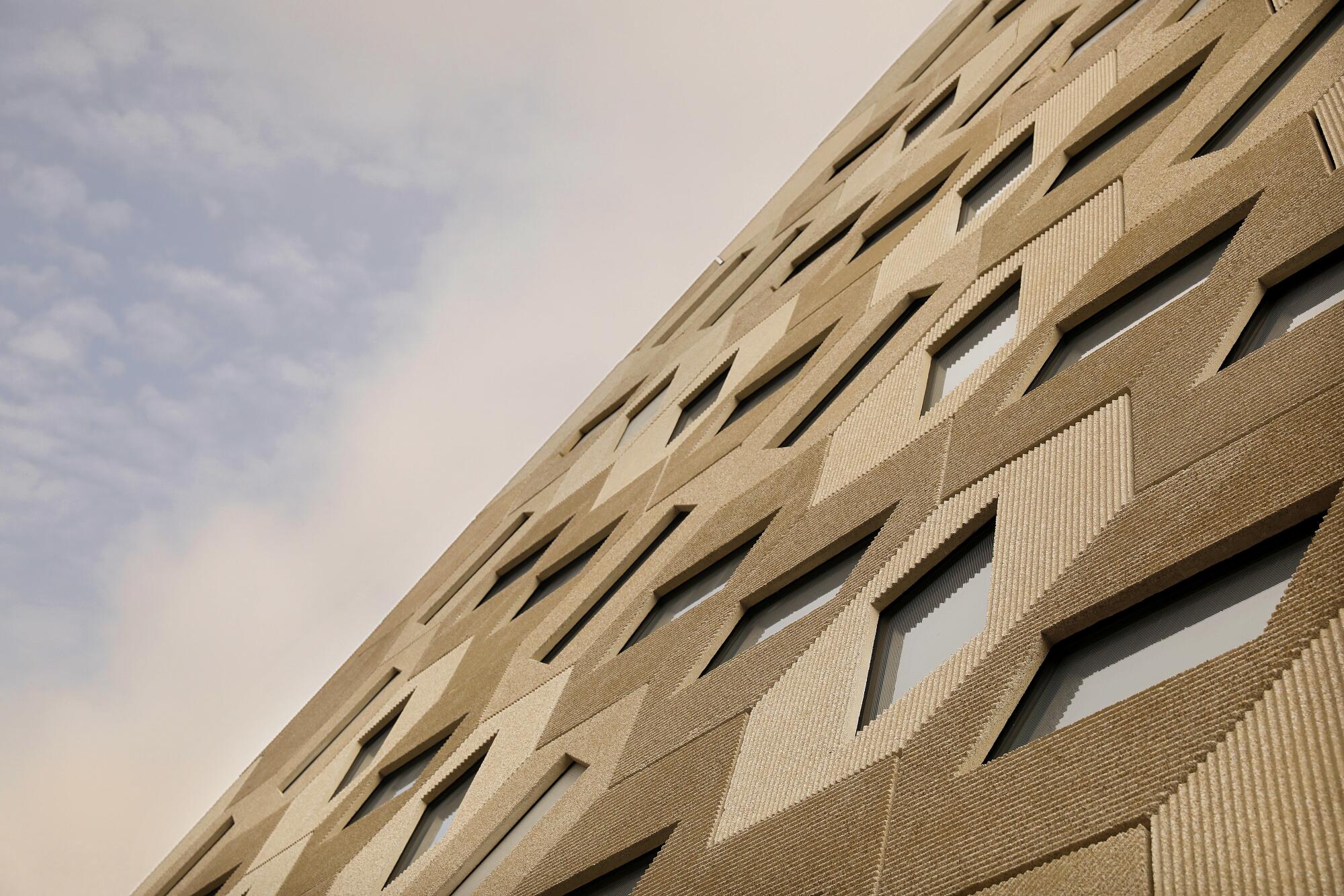
The building’s deferential lean can feel like a recoil at certain angles. And there’s the skin. To give the building its honeycomb pattern, Shigematsu and his team encrusted the facade with 1,230 hexagonal panels made from glass fiber-reinforced concrete. Each panel is set at a unique angle, and each contains a window that is set at a unique angle. The panels are all the same buff-colored concrete, but they are ridged, and depending on the angle of the sun, the plays on texture and light can make it seem as if they are different shades. It’s relentless pattern-making — and, when combined with the building’s unusual angles, provides few, if any, spaces for the eye to rest. Coco Chanel once famously said, “Before you leave the house, look in the mirror and take one thing off.” OMA’s pavilion puts it all on.
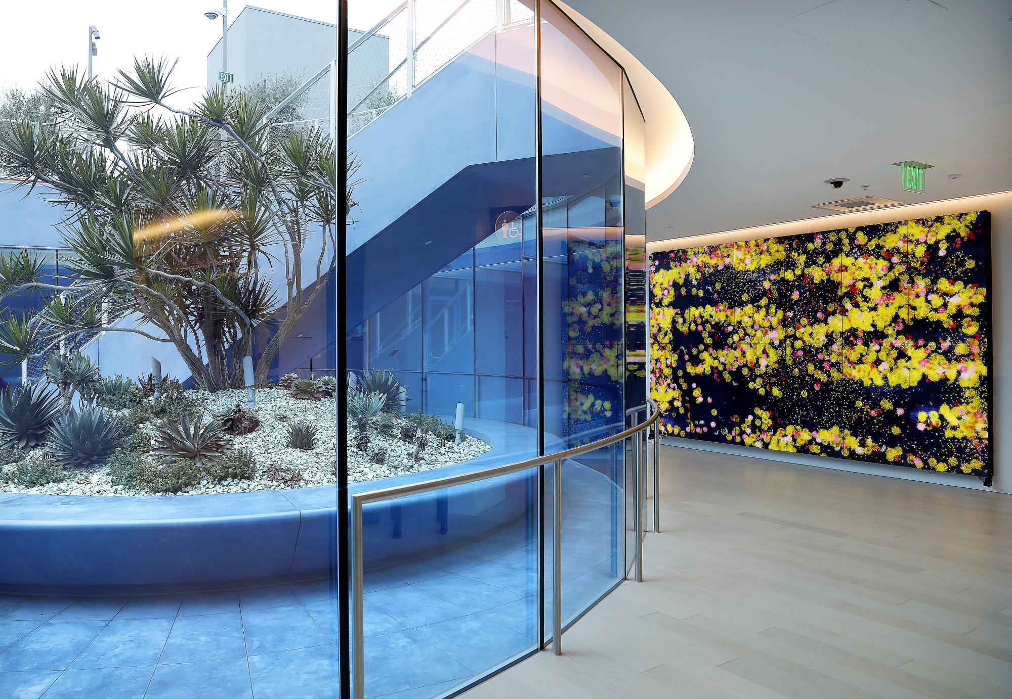
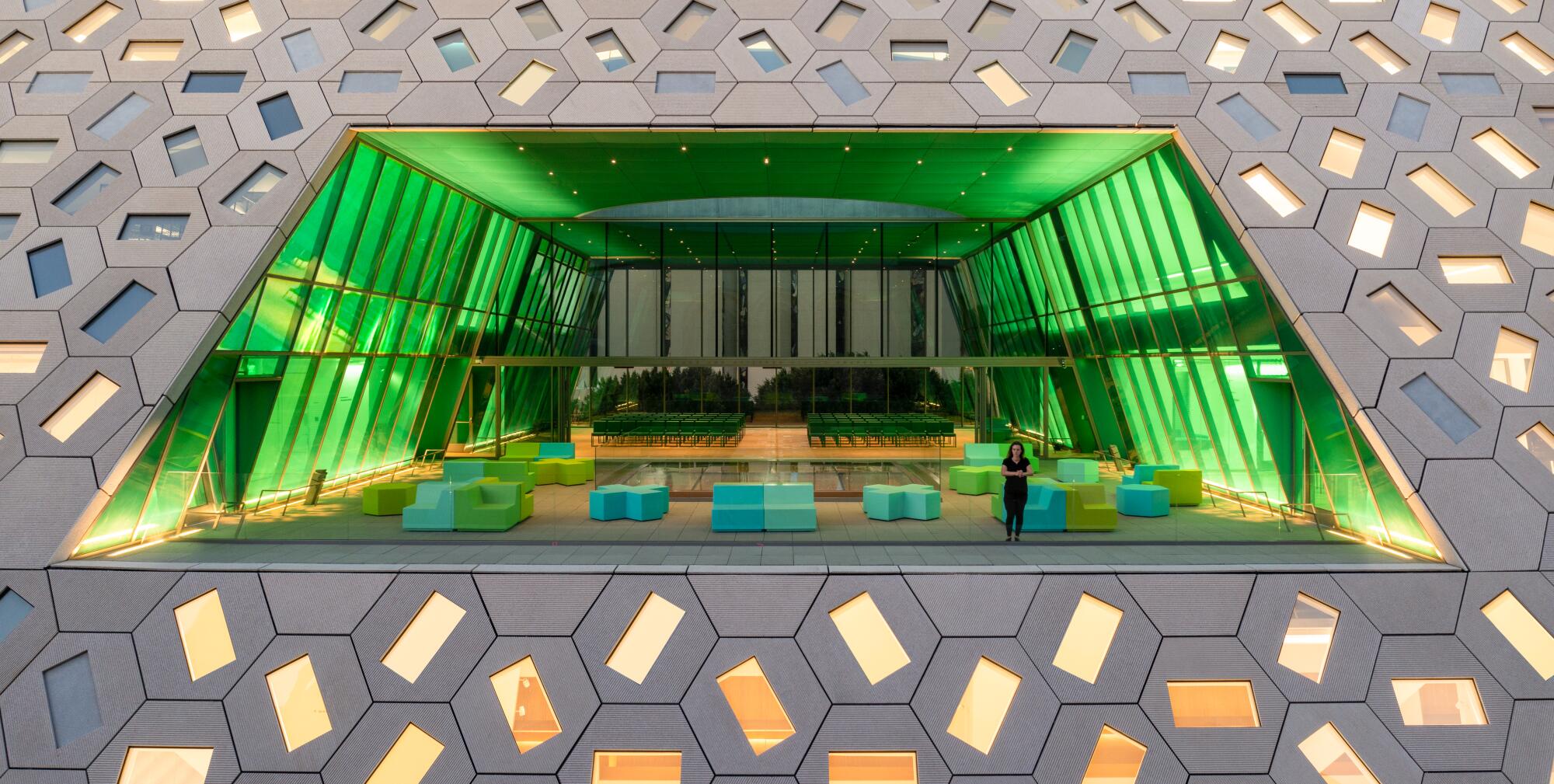
Other design elements, likewise, lack subtlety. As you ascend the building’s three stories and approach the sky, different colors are introduced. The ground-level event space is dressed in a palette of earth tones: Red terrazzo tile on the floor is paired with the warm Sassandra wood veneers of the arched ceiling. Climb a level, and you’ll find yourself in the glassy indoor-outdoor chapel and event terrace, which is encased in an electric shade of emerald green glass. Keep climbing to the third floor and you’ll encounter a sunken garden (with a landscape design by Mia Lehrer of Studio-MLA) that is surrounded by walls painted an azure blue.
OMA is known for its radical color treatments, such as the fiery red hall inside the Seattle library. But here, in what is purportedly an event space for a religious organization, the site of weddings and family reunions, the palette comes off as Dr. Seuss meets Miami Beach.
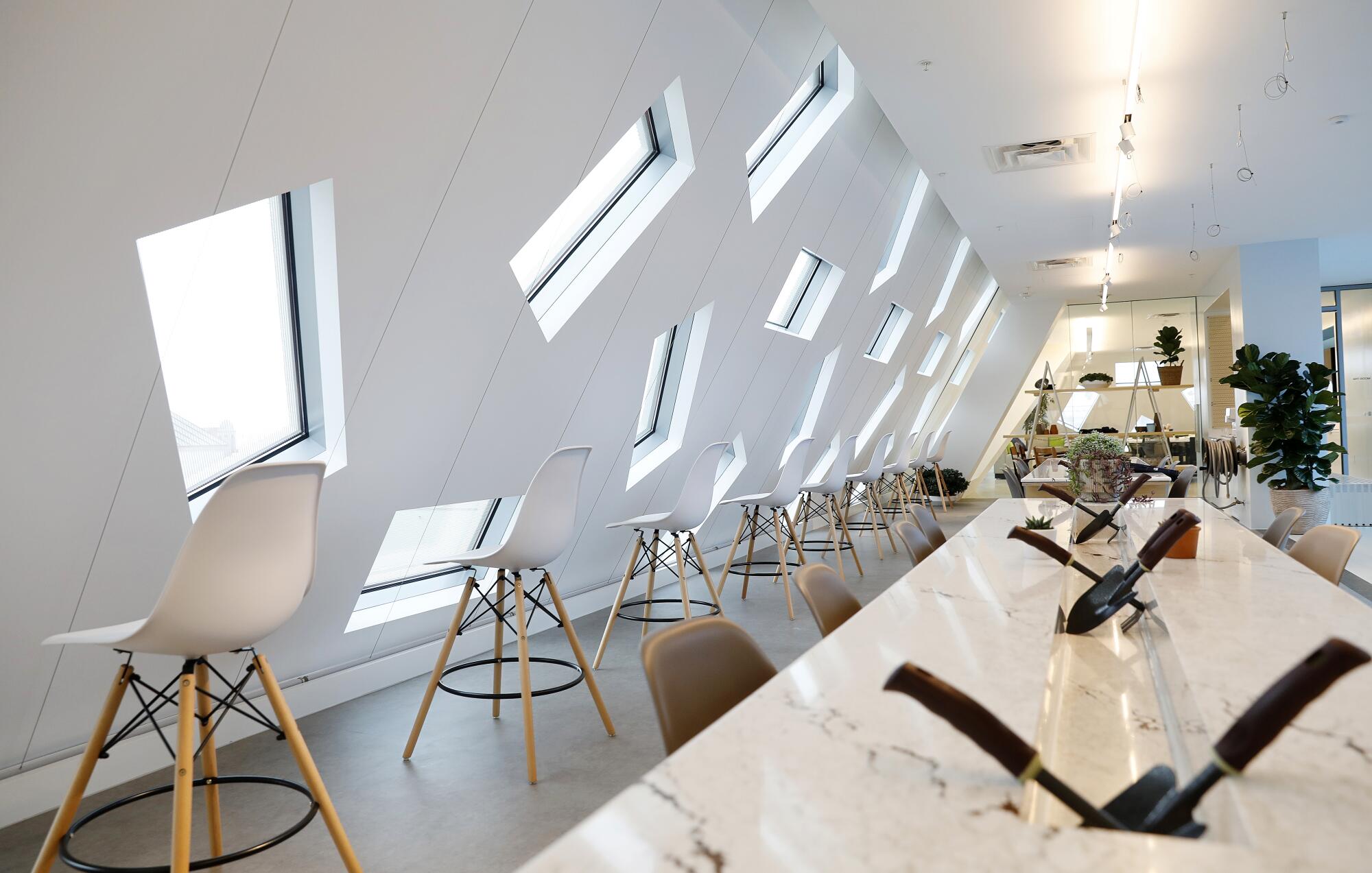
Also on the third floor of the pavilion is GenSpace, a new organization established and funded by L.A. philanthropist Wallis Annenberg to serve as a wellness and cultural center for neighborhood seniors. I can’t think of an architecture more ill-suited to this purpose. The building’s angled rooms of gleaming white are the sort of spaces that seem designed to harbor a tech company or a graphic design firm, not a senior center that will host messy gardening and art-making classes. Installed within one of these pristine rooms is a garden hose, an addition that no doubt sent a chill down the spine of the architects (not to mention anyone who works in maintenance).
And, of course, there are the Koolhaas-designed mezuzas, the small cases attached to doorways that carry a piece of inscribed parchment scroll — an object that serves as a reminder of faith. Koolhaas rendered these as rectangular stone prisms that vary in color depending on the floor. Given the lightness of some of the interiors and that many of the mezuzas are attached to glass doorways, the material feels heavy. But the design could make starchitect-designed mezuzas a thing.
None of this means that the Audrey Irmas Pavilion doesn’t have inspired moments.
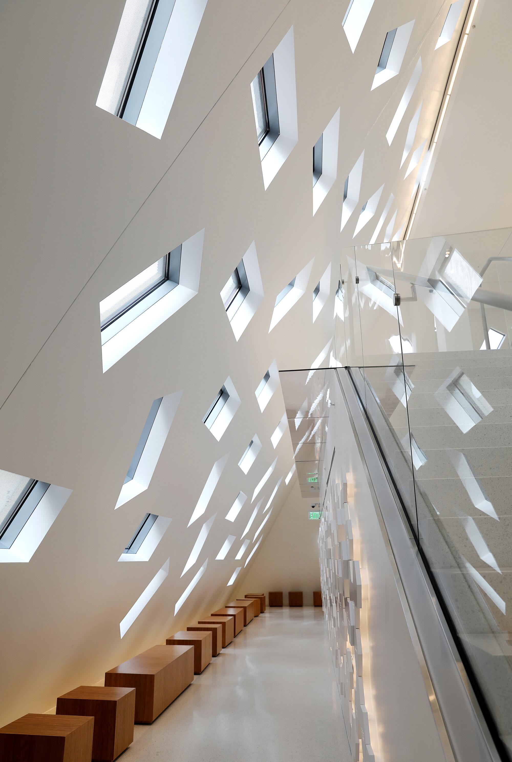
Out-of-town architects, often seduced by visions of L.A. car culture, have a knack for creating buildings that are great to drive past. Think of Rafael Moneo’s cathedral and Coop Himmelblau’s performing arts high school, which so dramatically frame the 101 Freeway downtown. The Audrey Irmas Pavilion is no exception. Travel along Wilshire Boulevard in either direction and there is a moment in which you’ll catch sight of OMA’s building leaning out into the road, like some otherworldly neolithic presence. In the afternoon light, the windows sparkle — dappling the temple sanctuary with reflected light, but also creating a confetti pattern inside the pavilion. During that magic hour, the lobby area of the event space transforms into a dazzling light show.
Also seductive are the views from the emerald chapel and terrace on the second floor. On the floor of the terrace is a glass cutout that serves as a skylight to the main event space below. This creates a horizontal pool of glass that has the effect of perfectly capturing the reflection of the temple dome next door. It’s a flawless alignment of materials and framing.
The building also smartly takes advantage of the roof, which has a landscaped terrace that encircles the sunken garden and that from above looks like a pool. The views, which reach to the Hollywood Hills in the distance, are fantastic. Pandemic or no pandemic, this breezy setting will be the space to party.
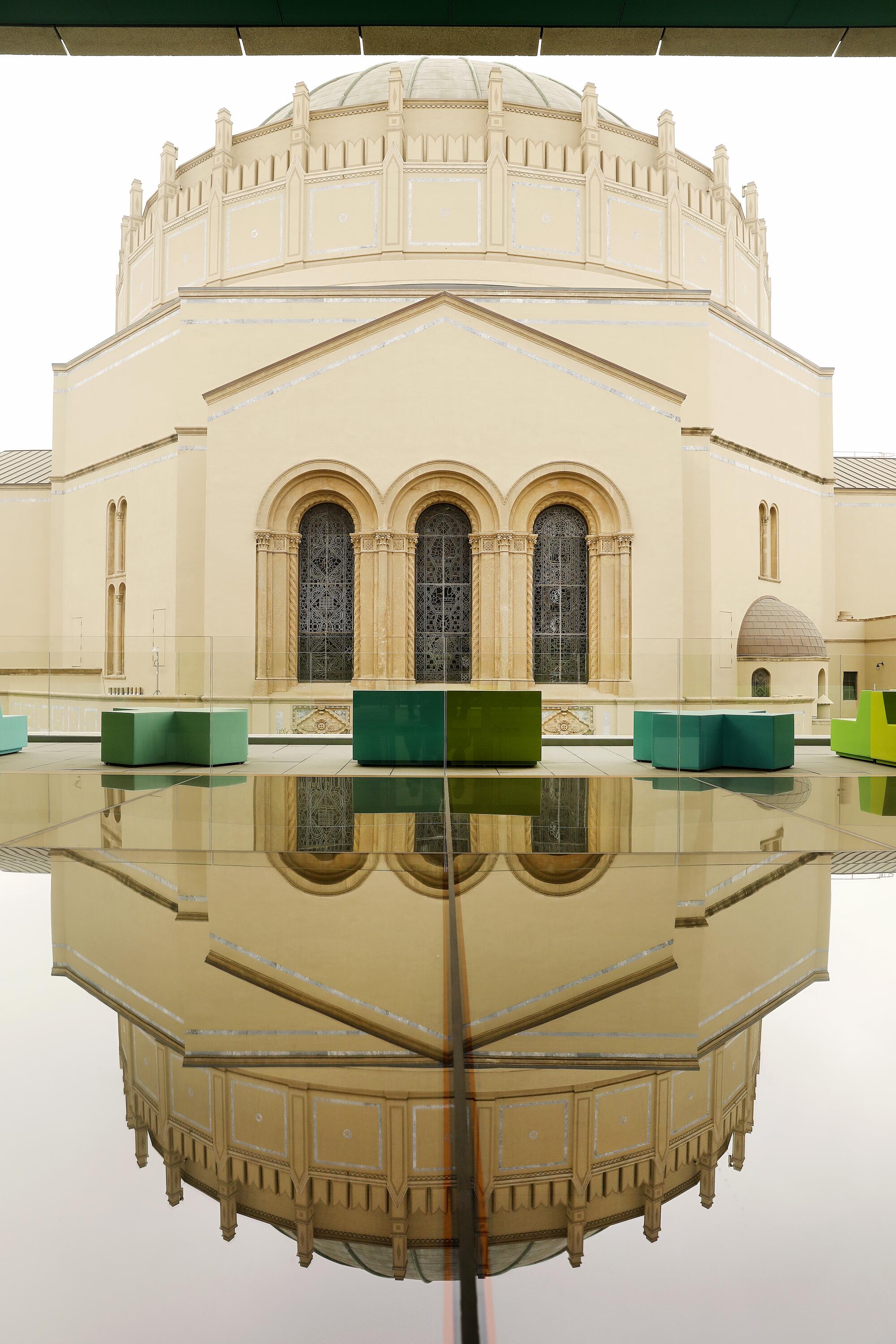
But ultimately, OMA’s building leaves me wanting. On their own, many of the ideas contained within the pavilion are compelling. Piled together, they form a jumble — one in need of careful editing and even more careful synthesis. It’s a building that gets stuck inside its own head. And that’s the sort of building that’s hard to love.
In 1977, The Times described Bernard Judge’s Los Angeles ‘Tree House’ as ‘a lark of a house.’ In the wake of the architect’s death we visit the unusual home.
More to Read
The biggest entertainment stories
Get our big stories about Hollywood, film, television, music, arts, culture and more right in your inbox as soon as they publish.
You may occasionally receive promotional content from the Los Angeles Times.
