Downsizing to a rental means a brighter, more colorful life for this KTLA news anchor

- Share via
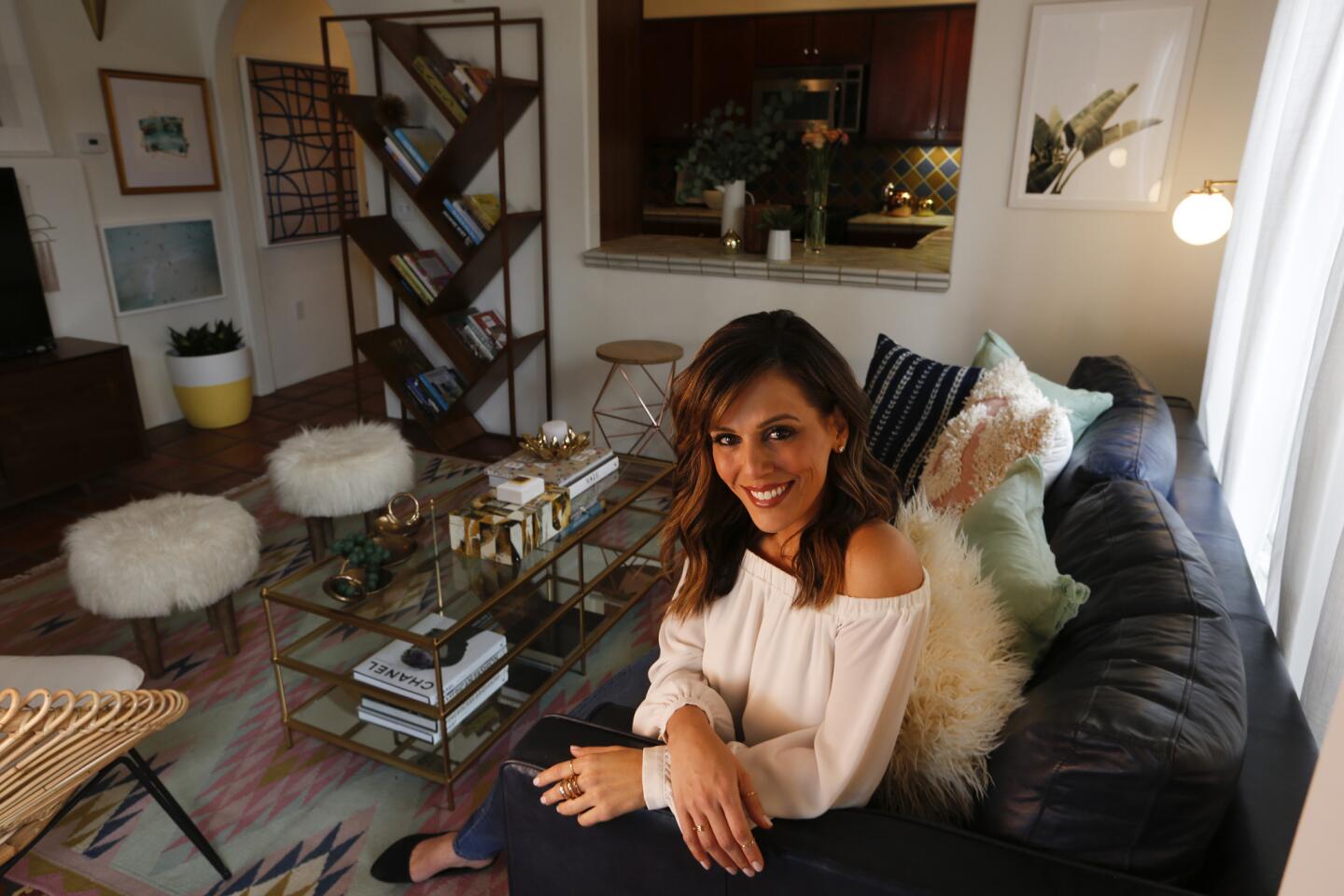
Megan Henderson had to deal with the inevitable “What do I keep?” question when she downsized from a 2,200-square-foot house in Beachwood Canyon to a rented townhouse about half that size in West Hollywood. The KTLA morning news anchor also was disenchanted with the neutral palette that had suffused her previous home.
“I was afraid of color,” Henderson said. “I knew I had to incorporate it somehow but it would always go wrong.”
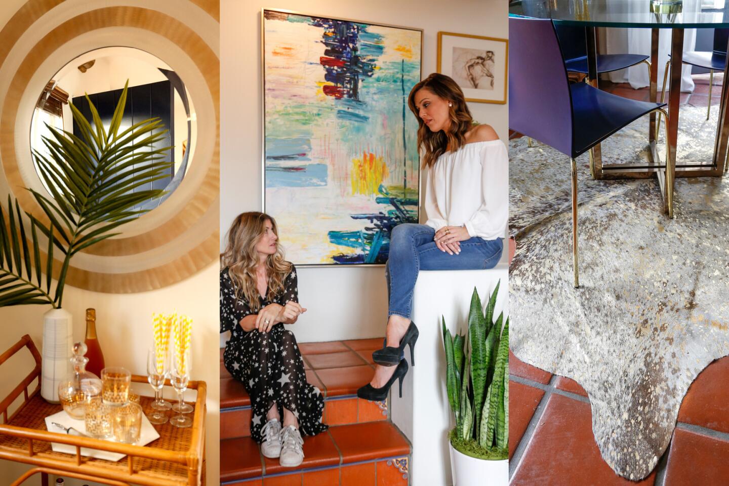
Enter Dee Murphy, founder of Los Angeles-based Murphy Deesign, who favors color and patterns in her aesthetic. Murphy helped Henderson winnow through all that beige furniture and embrace a more modern and upbeat design plan — while working within a smaller space that couldn’t be radically or permanently altered.
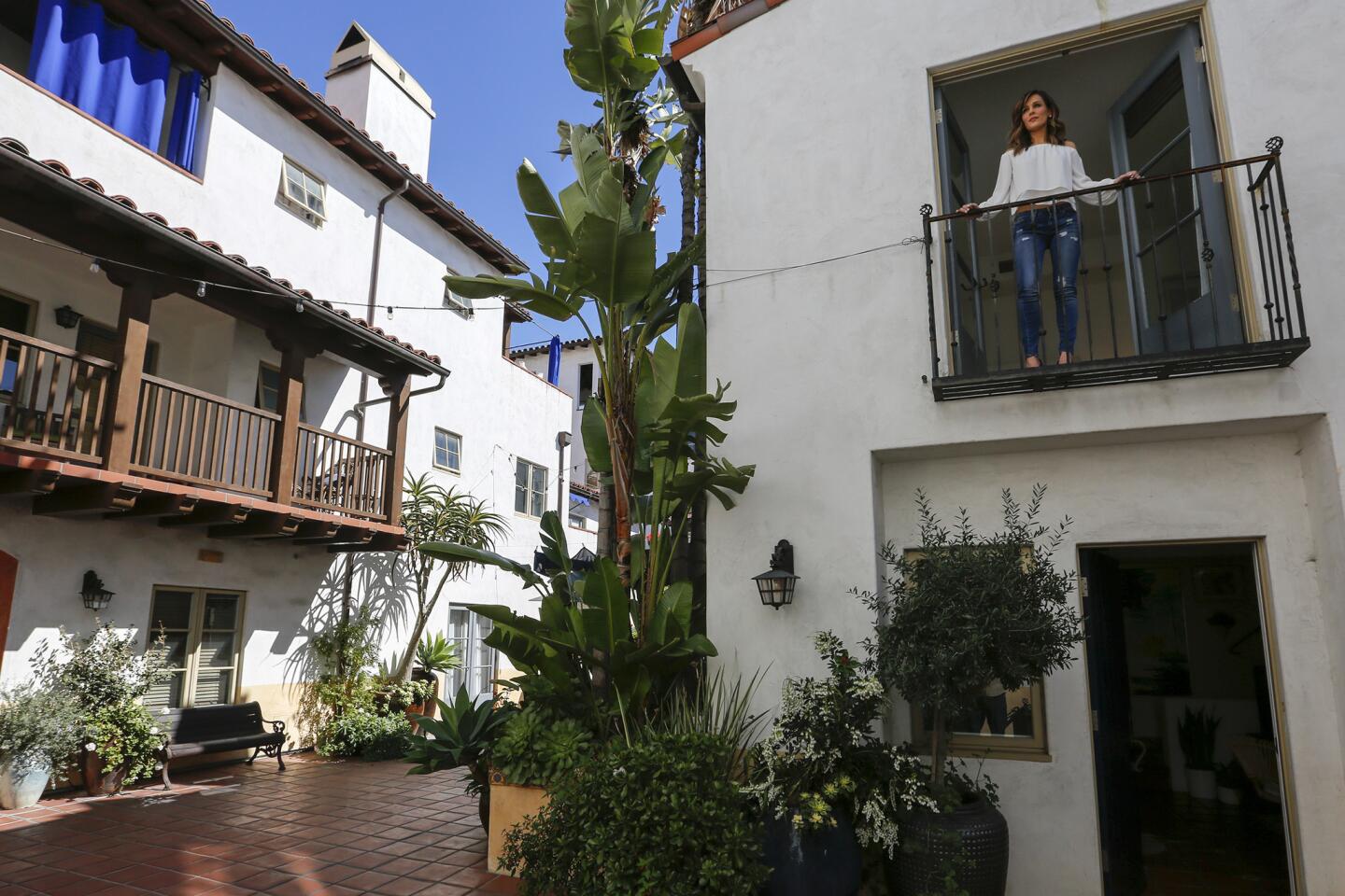
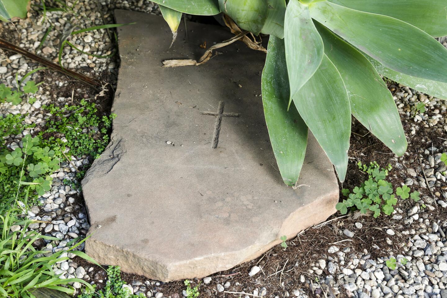
Murphy was also tasked with figuring out how to change the configuration of the living and dining spaces that Henderson described as “awkward.” They wanted to make use of every inch of space while avoiding clutter and finding a way to reflect the Spanish-inspired exterior of the historic development. (Legend has it that one of famed illusionist Harry Houdini’s beloved dogs is buried in the courtyard.)
Here’s how they did it:
Switching things around
When Murphy first saw the space, the areas allotted to the living and dining sections felt confusing.
“There were no clear boundaries or obvious ways to dedicate it,” Murphy said. “The TV plug was in the wrong place, and there was room for only a miniature sofa. We knew it wasn’t going to work.”
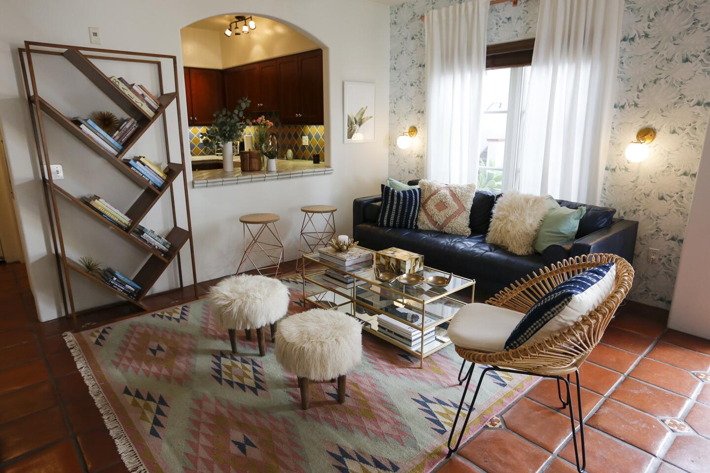
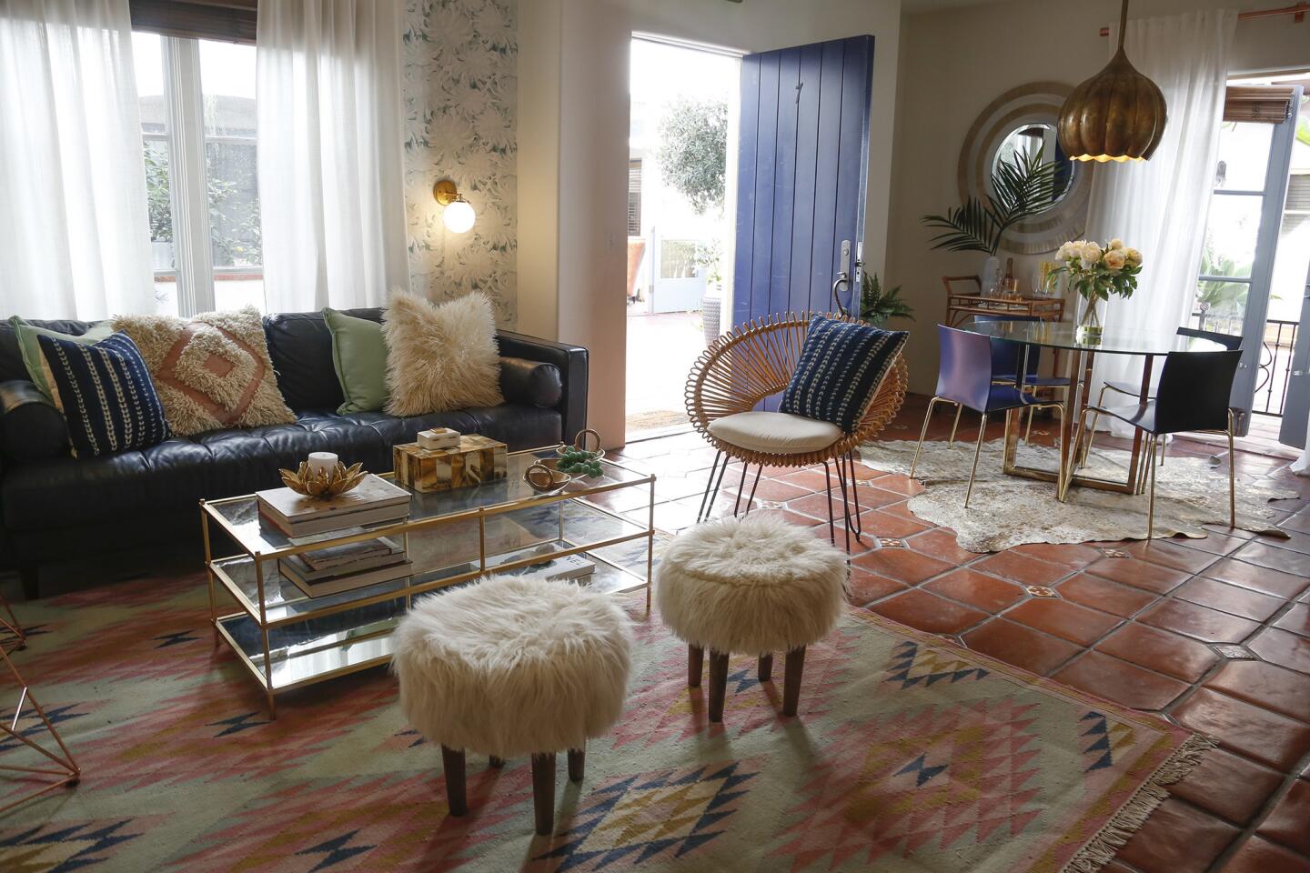
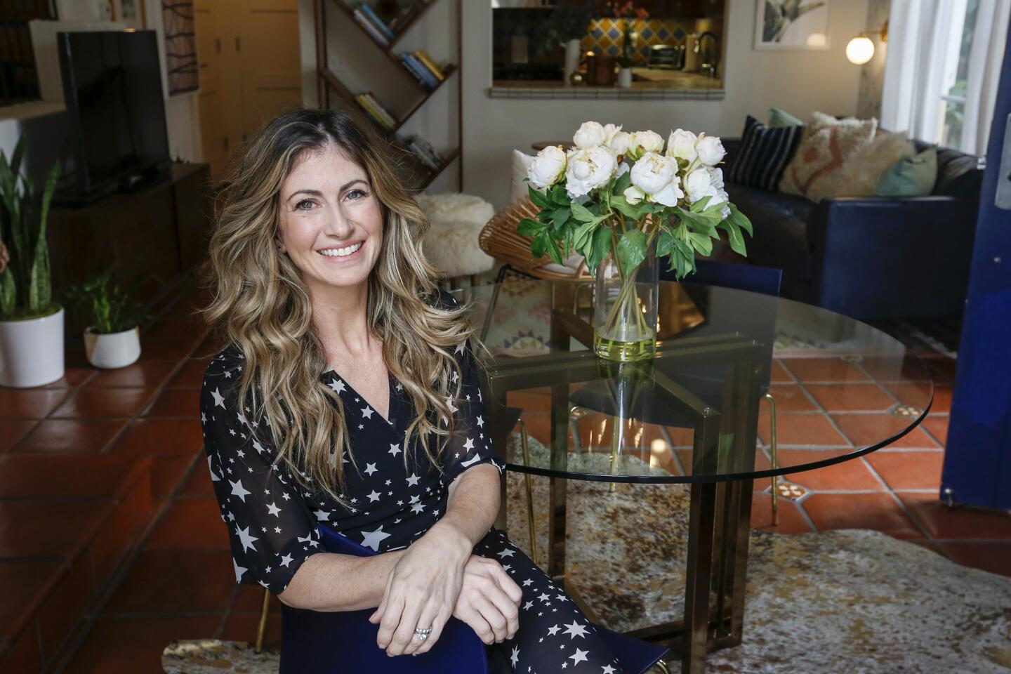
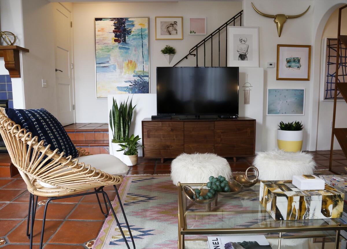
She found a slightly rustic pastel pink-and-sky blue- hued rug from Lulu & Georgia, and used that as a jumping-off point.
“It has a lot of color and was our first piece, and then we worked from there,” Murphy said. The rug sits atop the original Spanish tile flooring and adjacent to a navy sofa custom-made by Article.
“We wanted the couch to be a grounding color, and something more masculine, next to the pastels,” said Murphy, adding that customization through online sources has become increasingly affordable. (At Article, two-seater couches in a customer’s pick of color start at under $1,000.) “You get to have a lot of choices at prices that won’t scare you off,” Murphy said .
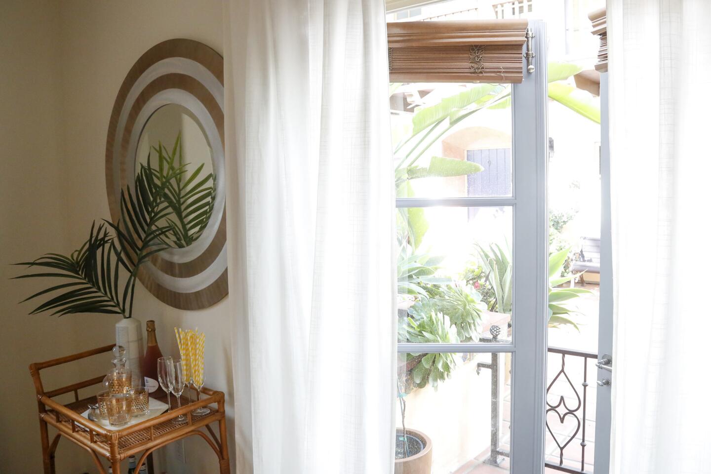
A small dining table is off to one side, near a bar cart. With a vintage credenza and rattan chair from Sunbeam Vintage, mint-colored pillows and planter and low pendant lighting above the dining table, the space that was once off-putting is now warm and inviting.
Temporary trappings
A chief concern, relevant to many across Los Angeles, was the limitations that come with living in a rental.
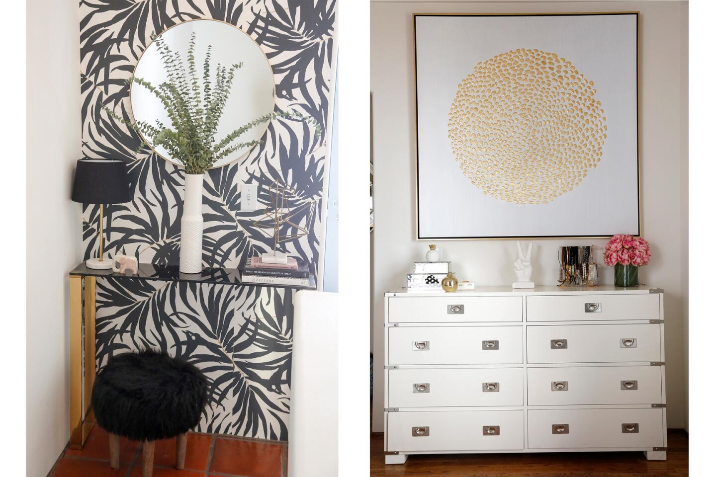
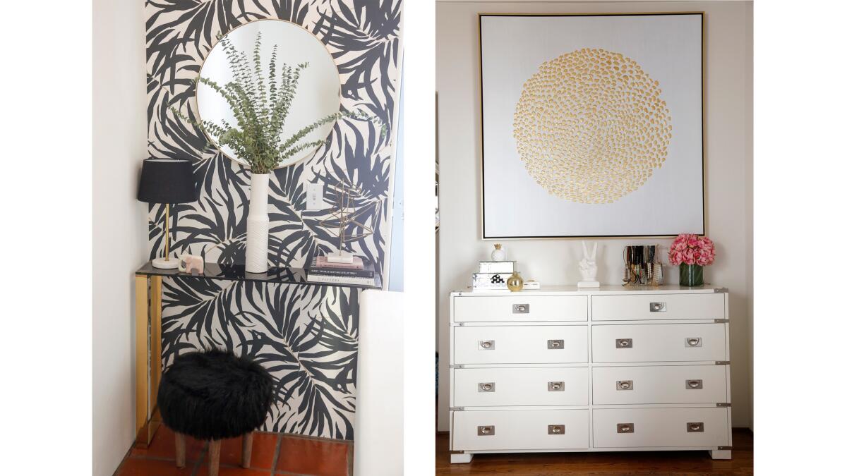
“You can always change the fixtures of an apartment you don’t own,” said the designer, just hold on to the originals to return to the owner when you move. Another solution to a drab rental? Removable wallpaper in a subtle palm pattern, which she found on Etsy. It went onto the plain white walls.
“It won’t ruin your walls, and you just peel it off when you’re done,” she said. “The colors and print are calming but reflect that California vibe. We didn’t want to do anything too crazy but it should still be fun and playful.”
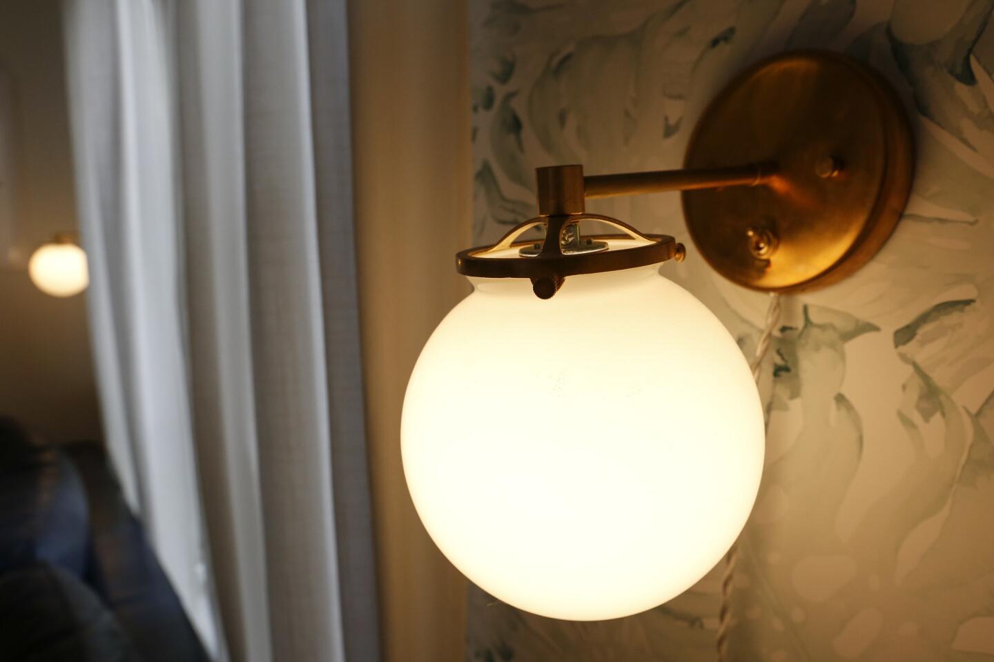
She added plug-in sconces (from Sazerac Stitches) that were a more interesting option than conventional tableside lamps and are “an easy fix to add personality.”
Upstairs, outside the master bedroom, Henderson, did a little decorating of her own, thanks to inspiration from Murphy: She created a small focal area with a palm-print temporary wallpaper behind a slender console table, adding a pop of interest to what would otherwise be an unused space.
Letting go
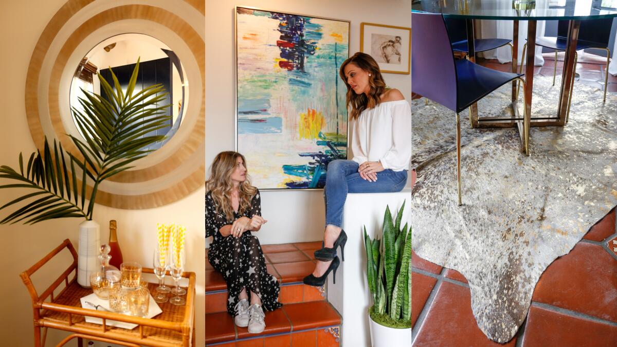
Client and designer worked together on what to donate or toss and what to incorporate into the new home. Henderson used to live in Wichita Falls, Texas, where she acquired many of her pieces.
“But a lot of it didn’t feel like California,” said Henderson. “I invested in good furniture 10 years ago for the first time in my life, and letting go of stuff that you invest in early is difficult. So I hung on to things longer than I should have. It was time for a change, and for my place to reflect something that was more me.”
Mixing it up
Henderson said she had to resist the temptation to go for the easy fix — outfitting the town house in everything from one store.
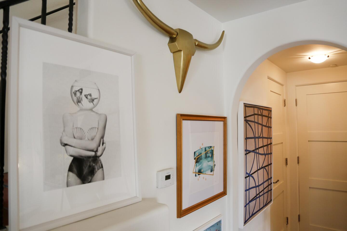
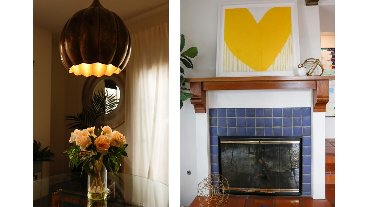
“With Dee, I knew everything would be interesting and different. I’d never have thought of putting certain things together, but it looks so cohesive,” she said. An example: a large pair of brass horns, an ode to Henderson’s time in Texas, occupies pride of place in the living area, close to a bright, sunny print of a yellow heart by artist Kerri Rosenthal in a piece called “Mad Love.” Henderson balked the first time she saw it.
See more photos of the West Hollyhood townhome »
“I thought, ‘Oh, that’s so yellow!’” she said. “Of course, I love it now.”
Maximizing space
Once Murphy and Henderson decided where the television would be, they wanted to think differently about it.
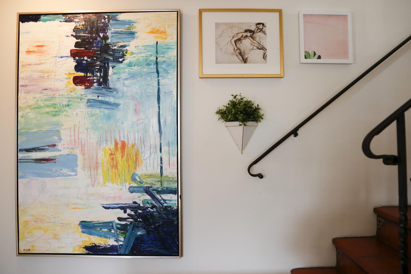
“We didn’t want it to be a big focal point of the room,” Murphy said. Henderson purchased a low sideboard from Sunbeam Vintage to hold the TV, and Murphy added various small artworks and plants around it “to create a 3-D gallery situation.”
“It has all these points of view — the walls lent themselves to that, and we wanted to utilize different parts of them,” she said.
Mellowing out
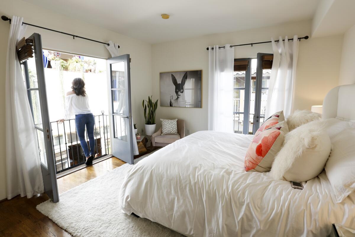
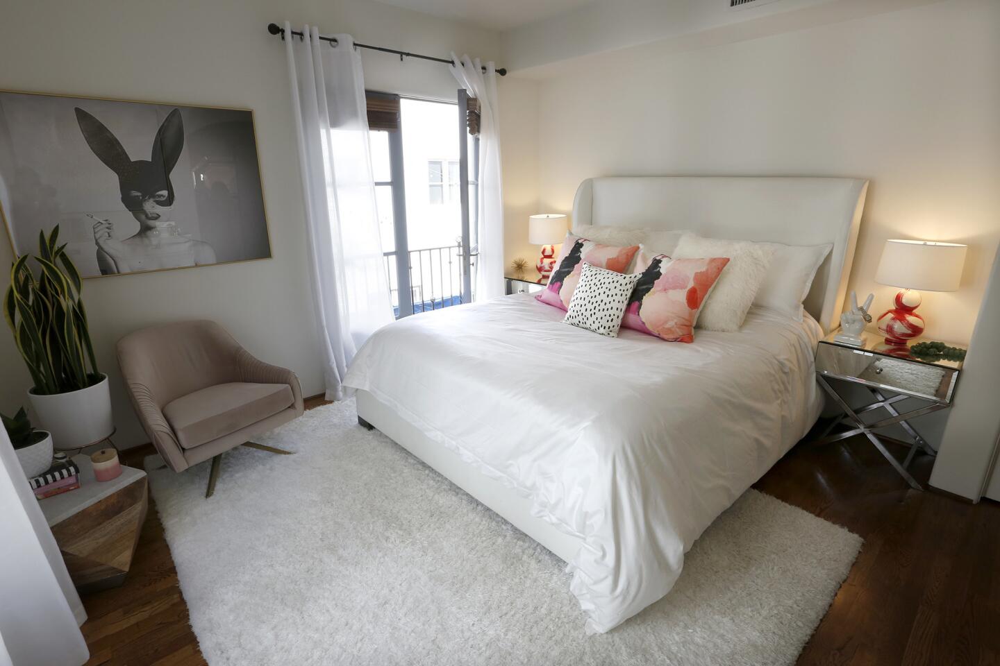
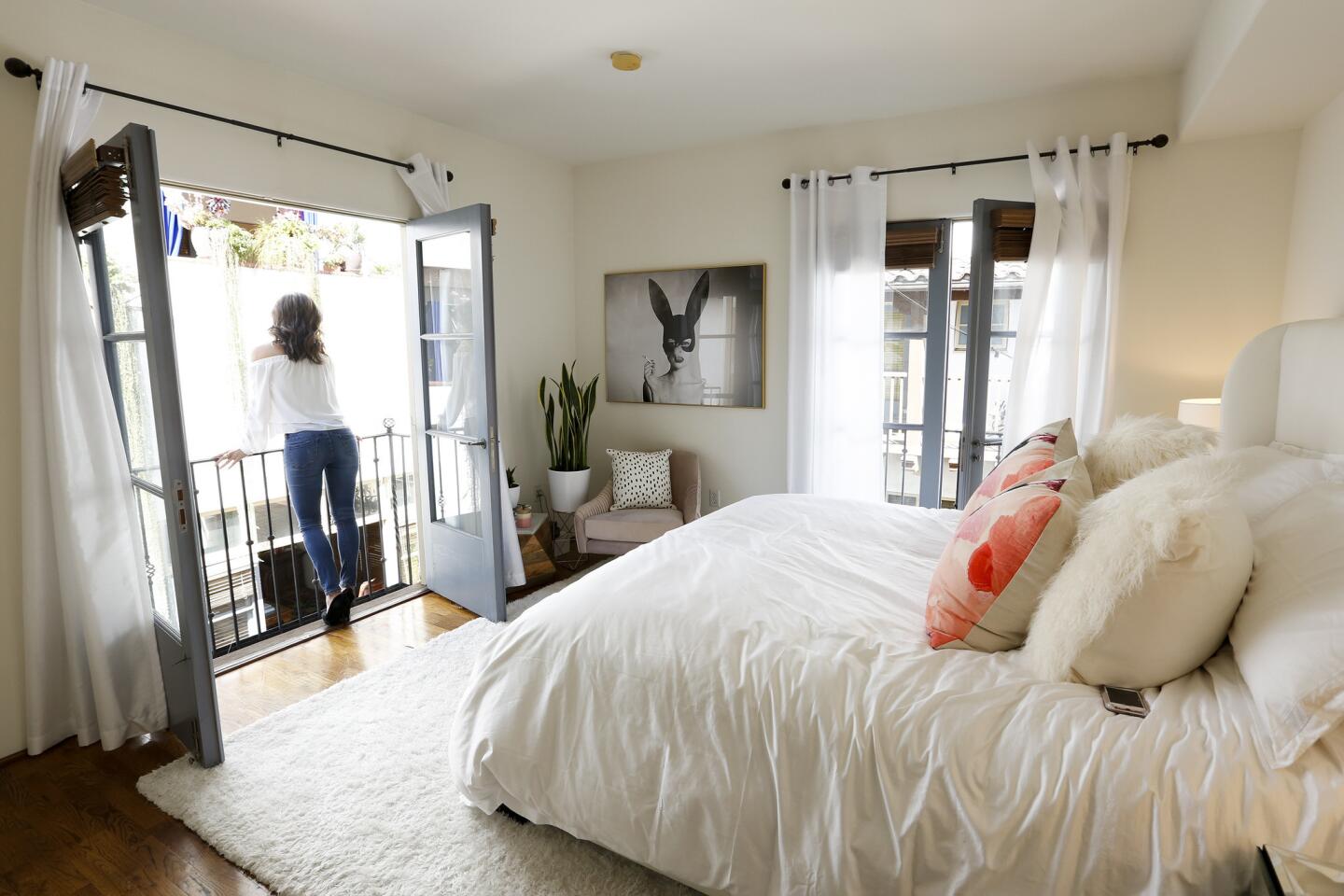
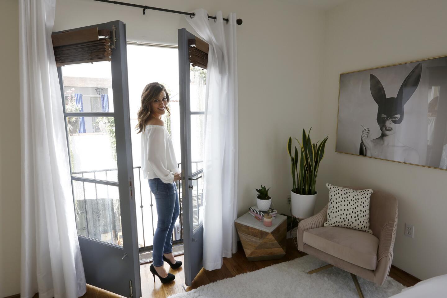
When it came to the master bedroom, Henderson wanted to keep the palette neutral and calm, so she stuck with predominantly white furnishings.
“I wake up at 2 a.m. to be at work by 3:15 a.m.,” she said. “I needed to keep the space mellow.”
She used the bed and nightstands from her previous home and added pretty lamps with a swirl of color from Jana Bek, a beige chair from West Elm and a dresser from Pottery Barn. Additional punches of color come from the cushions on the bed, done in a painterly watercolor pattern and acquired from Consort Design.
“I’m thankfully not a clutter person,” Henderson said. “I tend not to collect unnecessary things, which is good. I also feel like I’m done with decorating this place, which is also good. I’d rather not get rid of things again, so I wanted to choose pieces that can work anywhere.”
For an easy way to follow the L.A. scene, bookmark L.A. at Homeand join us on our Facebook page for home design, Twitter and Pinterest.
MORE SMALL SPACE STORIES:
Before & After: See the dramatic ‘jewel box’ garden makeover
Designer’s duplex connects him to clients, community in West Hollywood
Small-space living: 18 interiors to inspire
Now this is how you style a 700-square-foot rental
More Southern California home tours
