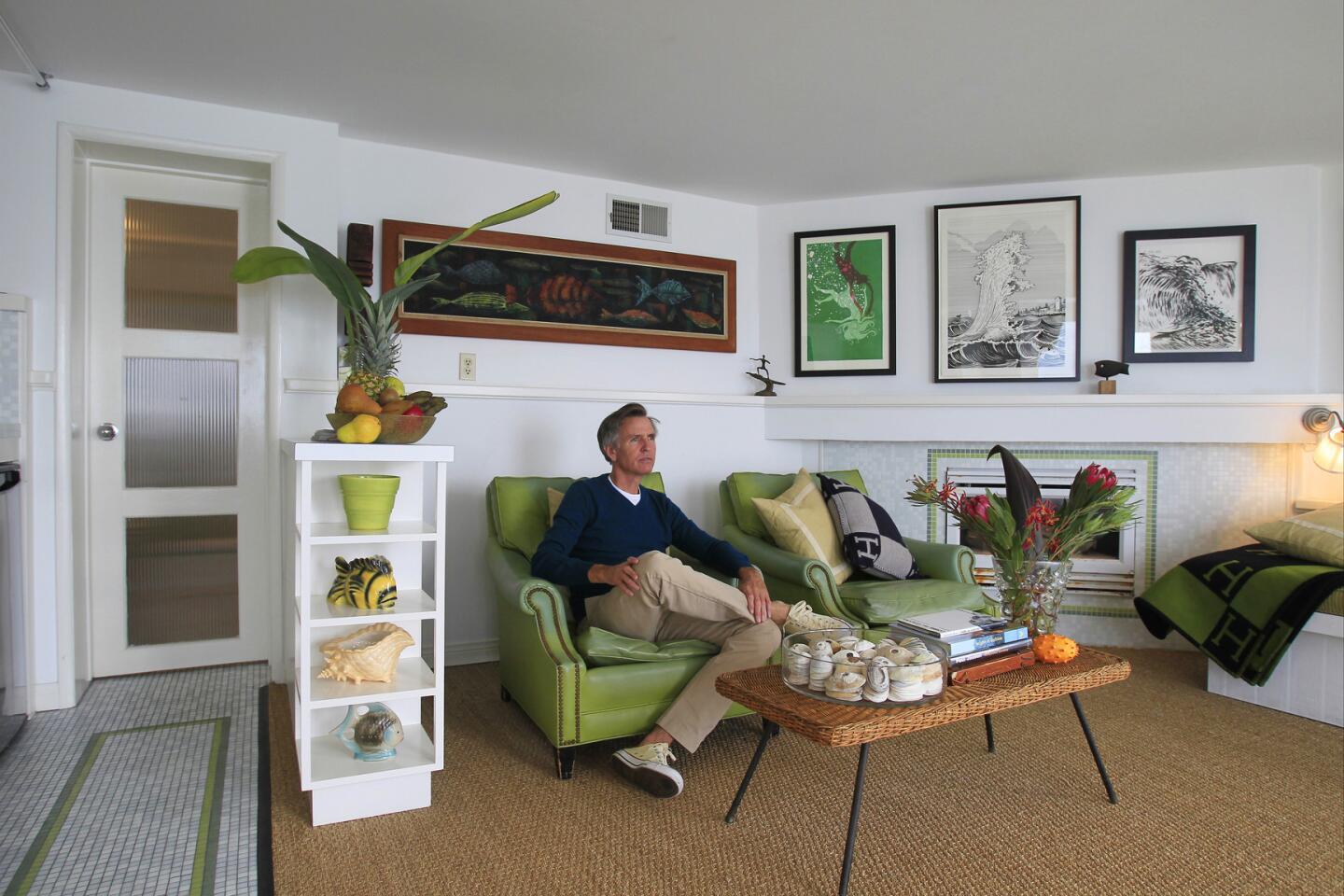
Tiny Laguna Beach condo feels roomier with ship-shape design concepts
- Share via
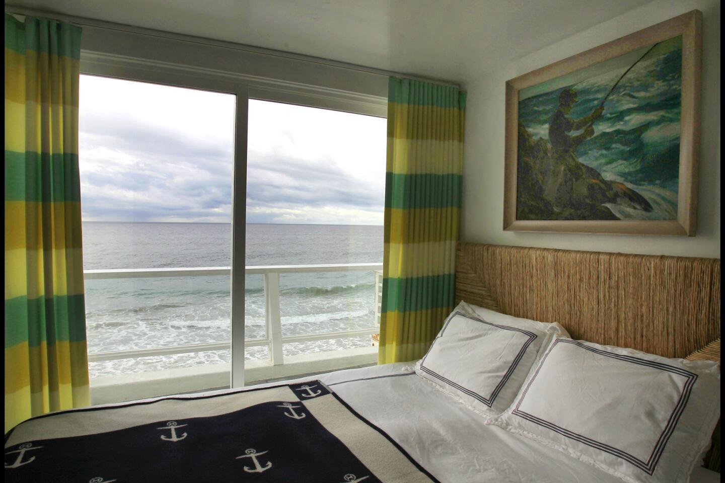
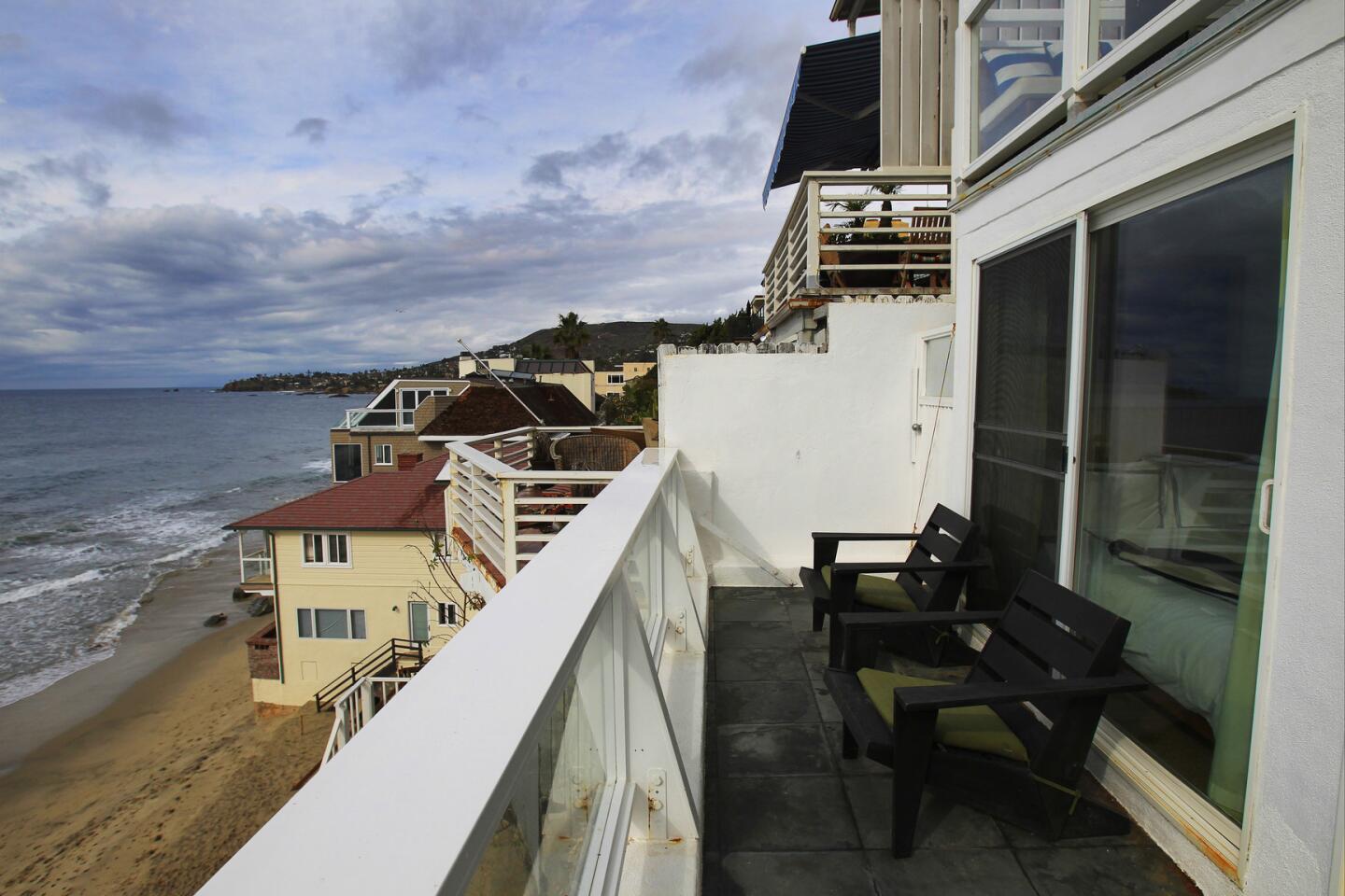
There are walk-in closets in Malibu larger than Steven Jones’ Laguna Beach home. So when it came time for the designer to decorate his 320-square-foot pied-à-terre overlooking St. Ann’s Beach, he treated the space as if he were designing a boat. “Everything had to be very intentional and purpose-driven,” says the former vice president of visual merchandising for Quiksilver, who cut his design teeth creating environments for the surfer fashion industry in the ‘80s.

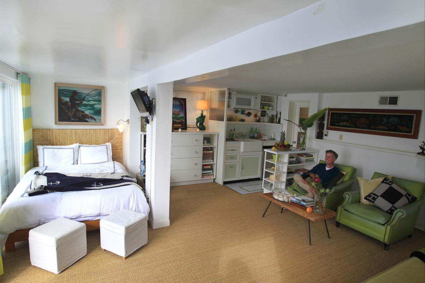
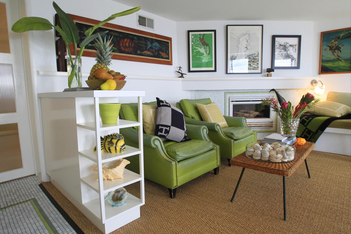
He began by stripping the apartment of its Mediterranean villa trappings with the idea of turning the condo into a classic 1940s beach abode. Painting the brown-and-beige walls a bright white made the space appear larger. In addition, “the light comes in and bounces around, lightening the room,” says Jones. “It also creates a gallery-like backdrop where anything you put on the walls is going to pop.”
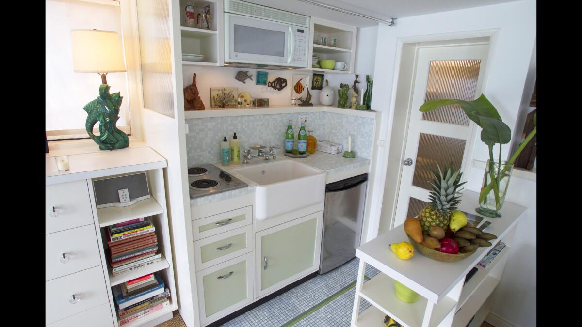
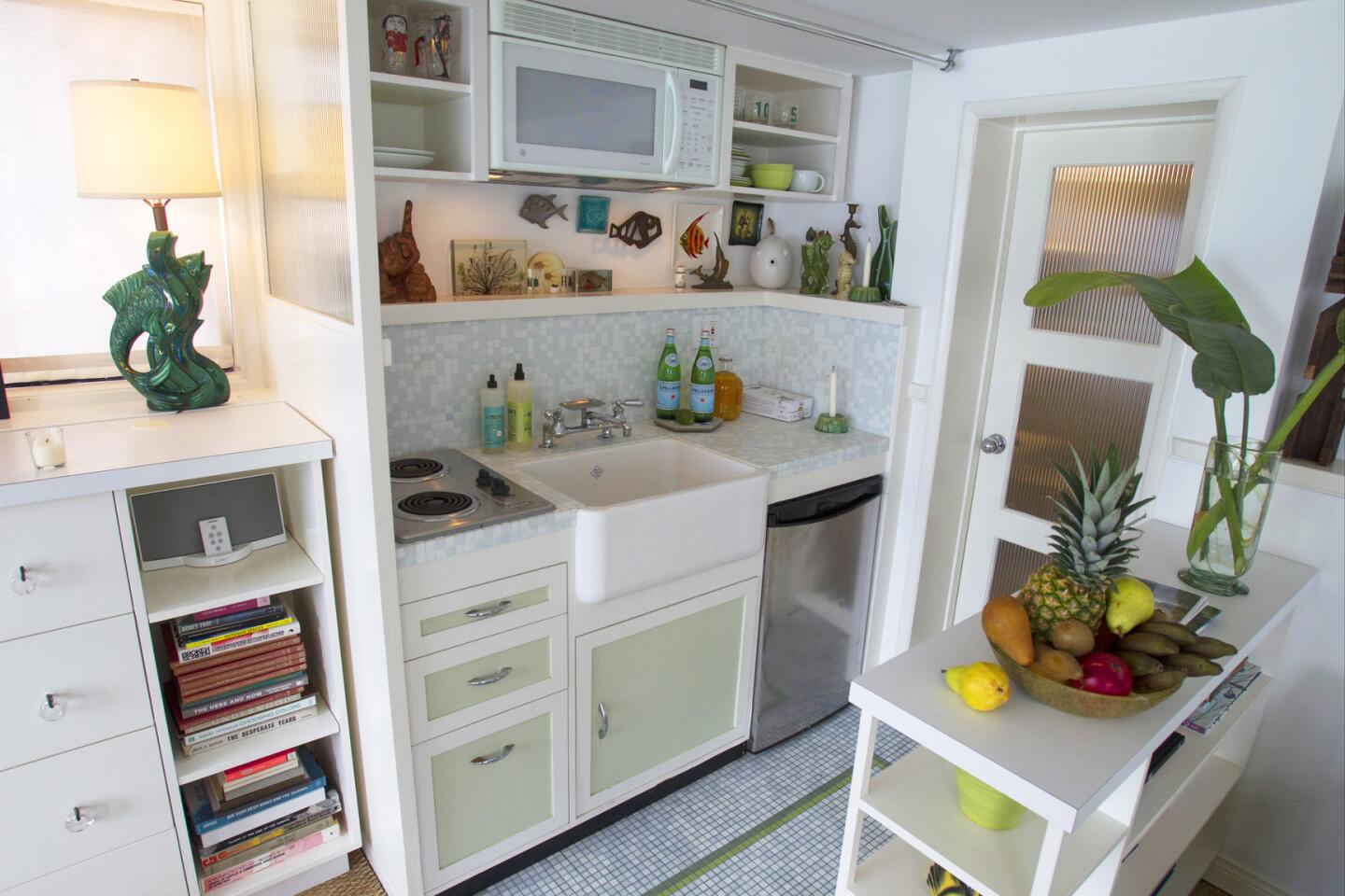
Jones advises keeping the material palette “super simple” when designing a small space, “to keep the busyness down.” In addition to painting all surfaces white, he kept other interior appointments — appliances, sinks, countertop and window shades — a snowy hue as well. He also used the same 1-inch glass tiles in the kitchen backsplash and floor, as well as the bathroom floor and the living room fireplace surround.
Stunning photos, celebrity homes: Get the free weekly Hot Property newsletter >>
Replacing the dark shag carpet with a lighter wall-to-wall sisal helped to unify and enlarge the space, while removal of the acoustic cottage cheese ceiling created a sleeker, modern aesthetic. Jones also replaced the makeshift hot-plate kitchen with a ship-tight galley and added a shelf above the farmer’s sink to showcase knickknacks.
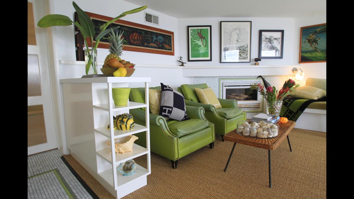
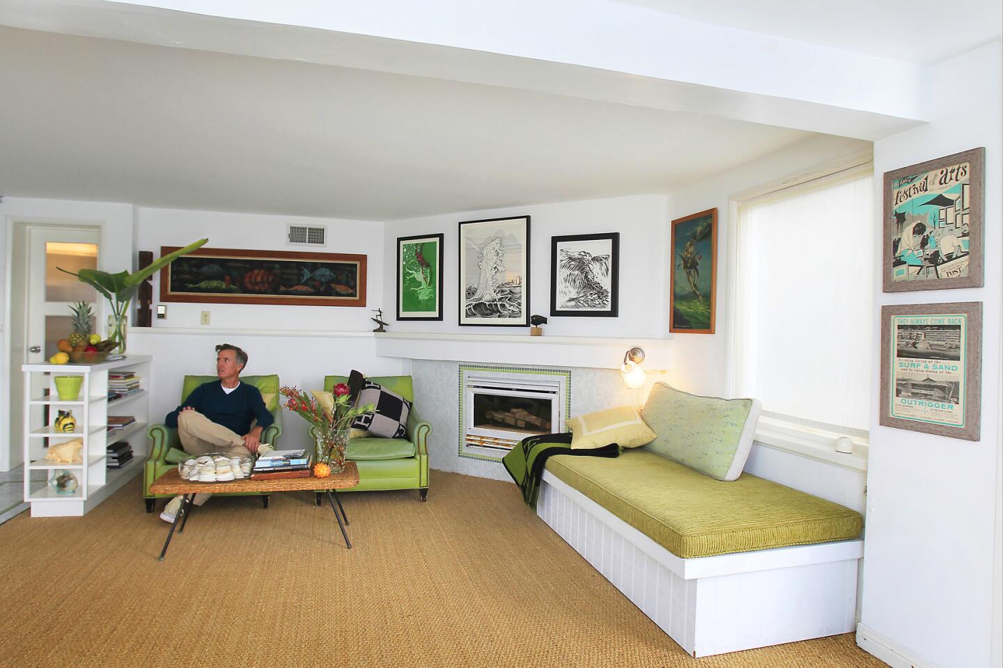
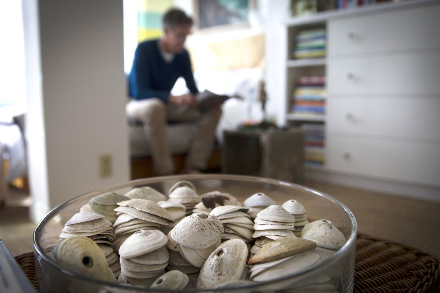
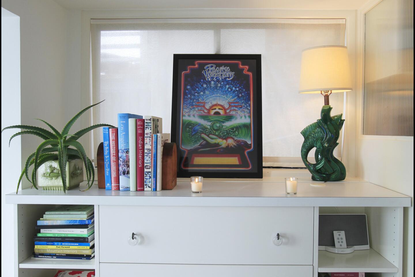
Multifunctional pieces are another good idea for a small space, he says. To divide the kitchen area from the living room, the designer built a low wall that doubles as a bookcase. His new custom-made daybed features a lift-up storage compartment underneath, while a new dresser that separates the kitchen from the bedroom space has shelves on either side for books. He also built it shallow, 15 inches deep, “so it didn’t stick too far out into the room.”
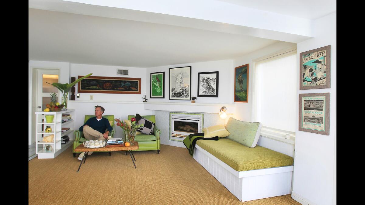
Other furnishings were well-edited to a few essential pieces — a lounge and a pair of vintage chairs, a coffee table, a bed — even though Jones, an avowed flea market addict, owns two 40-foot-long shipping containers bulging with retro furnishings and had loads of pieces from which to choose. (He uses them in the boutique real estate company Better Shelter that he started after leaving Quiksilver in 2005. The company specializes in renovating homes by adding age-appropriate details — light fixtures, stained glass, architectural trim, hooks, handles and door pulls — and then stages the houses with a combination of flea market finds and more contemporary pieces from Ikea, West Elm and CB2.)
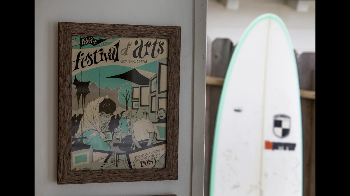
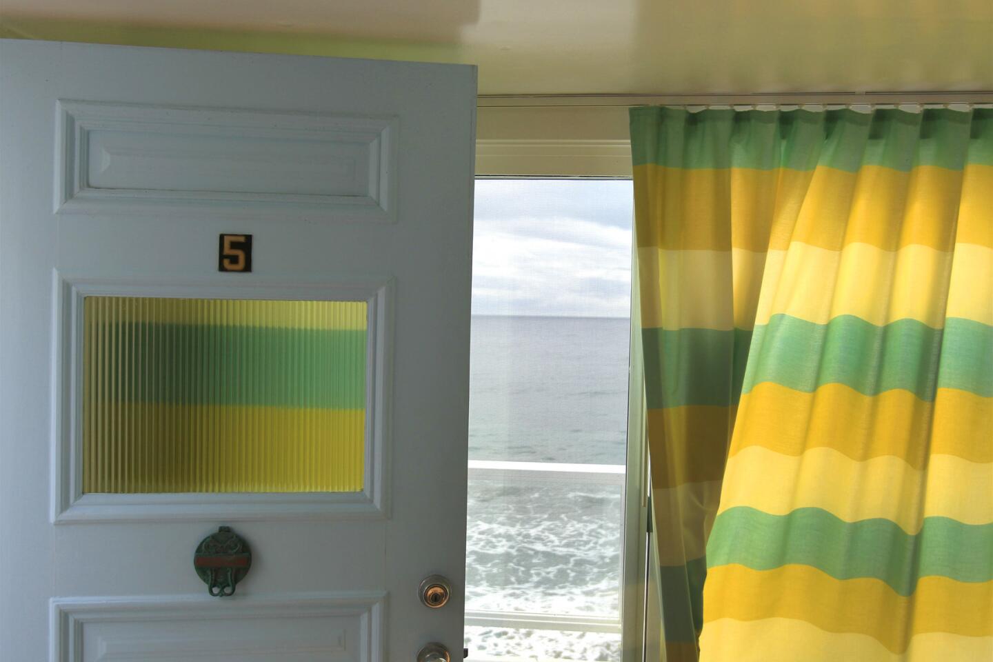
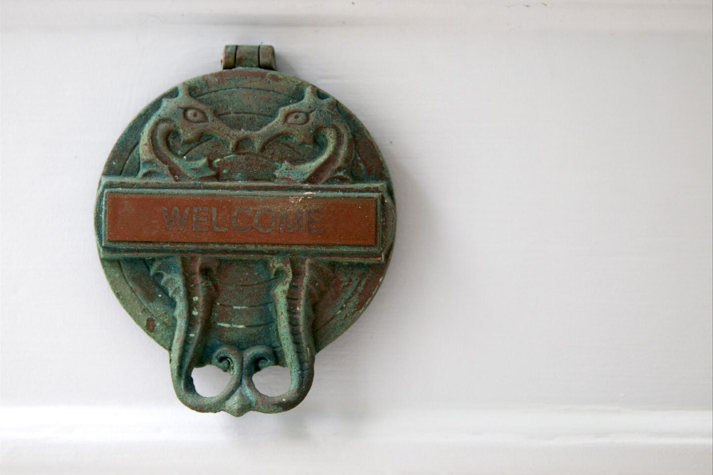
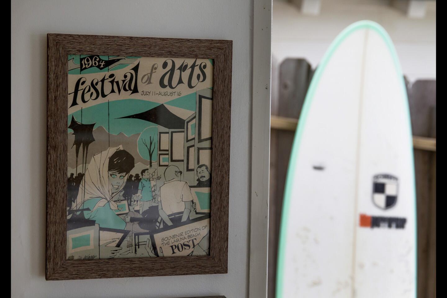
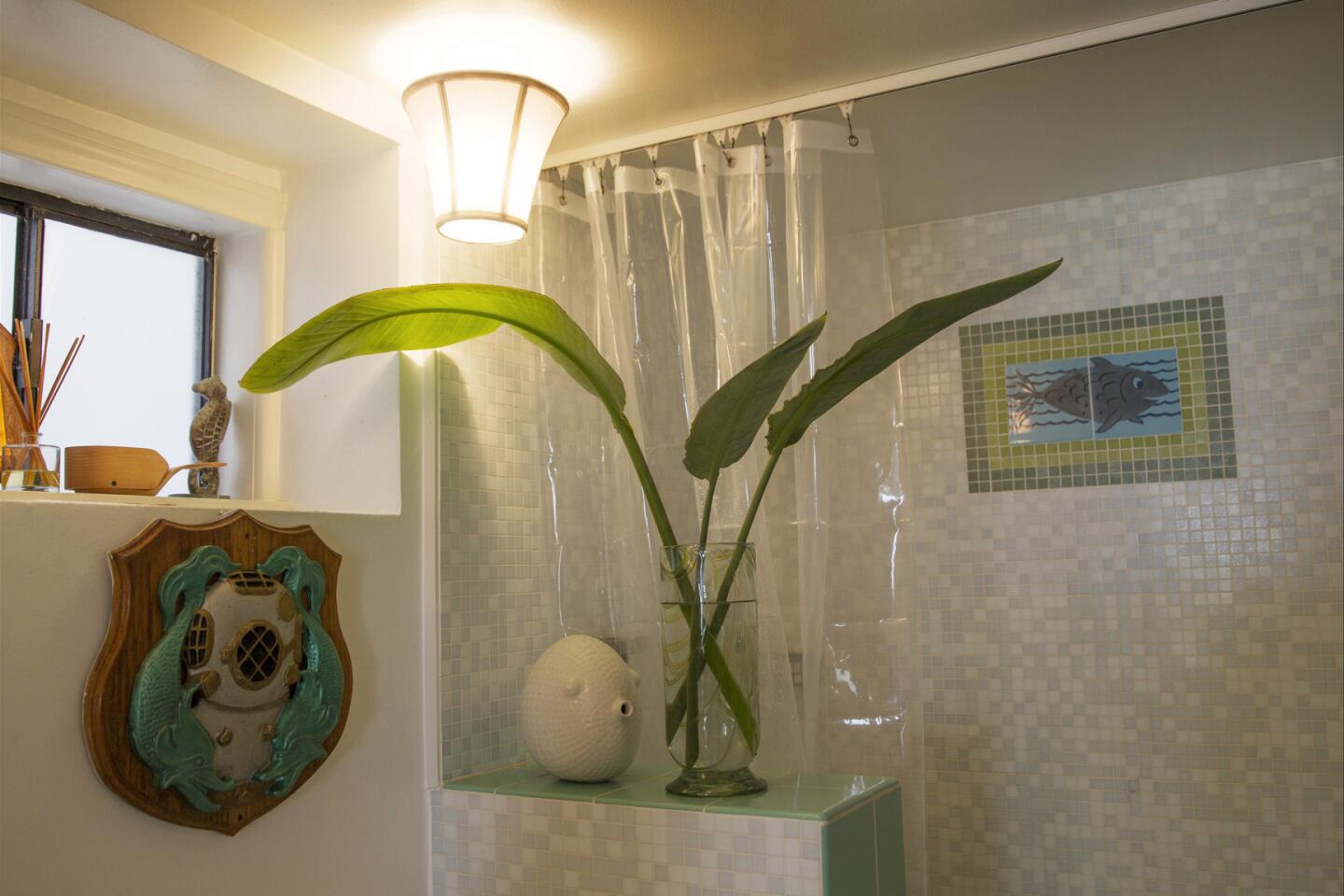
Jones applied the same design recipe to his tiny lair where items from his quirky collections were combined with architectural remnants. Walls were hung with surfer art, and he brought in some campy accessories, such as his ‘50s leaping fish lamp, sea horse candlesticks and an array of fish objets. He inserted a 1940s paneled front door with vertical reed glass, which sets the period tone upon entering. Lucite door knobs on a new dresser and a period pedestal sink, toilet and medicine chest added authenticity. “I wanted to make it look as if everything had always been here, as well as add some personality to my little stucco box.”
Home tours: A peek inside the houses of Los Angeles
MORE HOME TOURS
Feng shui and a center split open up a La Cañada Flintridge home
Meghan McCain’s home: She calls her style ‘Scarface meets Graceland’
See how this remodel perfectly captures California’s indoor-outdoor living
