Milan furniture fair 2010: The good, the bad and the puzzling
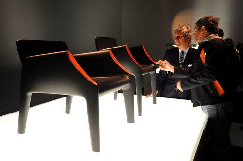
At the 2010 Salone Internazionale del Mobile, the Milan furniture fair where the world’s greats in home décor are gathered to premiere their 2010 collections, Philippe Starck strode up to the pedestal where the designer’s new outdoor chairs were perched like art. He ran his fingers over the soft curves of the silky polyethylene, and as cameras flashed and onlookers nudged closer to hear his verdict on the display, Starck didn’t say much of anything to Claudio Luti, owner of manufacturer Kartell, also pictured here. Instead, Starck peered into an armrest, where gloomy black suddenly gave way to sunny orange, and he smiled. A light at the end of the tunnel. Optimism reins at this year’s show. Hop along for a tour of the bright (and not so bright) ideas to premiere this year. (Franco Forci / For The Times)
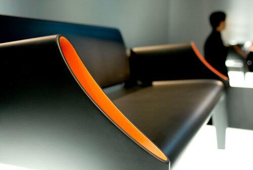
Starck’s Magic Hole, created in collaboration with Eugeni Quitllet, comes as chairs of two sizes as well as a sofa. The prototypes on display were a midnight black with a blast of orange filling the hollow armrests – voids intended to be pockets large enough for a magazine or newspaper – perhaps patio reading for sunnier days ahead? (Franco Forci / For The Times)
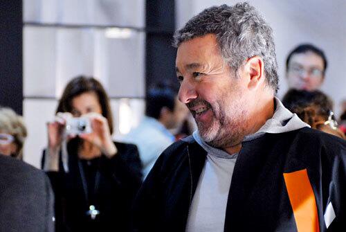
The designer likes what he sees. For dozens of more designs, keep clicking. (Franco Forci / For The Times)
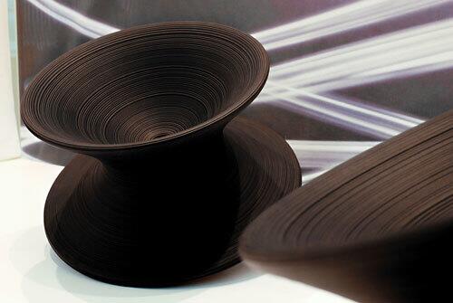
Italian manufacturer Magis showed designer Thomas Heatherwick’s Spun, which looked like a Claes Oldenburg sculpture of a giant spinning top. It worked like one too: Sit, lean back, twirl like a toy. A demonstration video was, well, dizzying. (Franco Forci / For The Times)
Advertisement
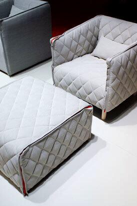
Quilted upholstery continued to be a big trend this year. The Swedish firm Gärsnäs went a step further, introducing a quilted chair that could be easily removed for dry cleaning, encouraging consumers to feel comfortable choosing light colors for everyday furniture. (Franco Forci / For The Times)
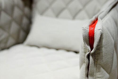
Rather than try to disguise the key feature, Gärsnäs emphasized it with a thick red zipper that added a lighthearted touch to the quilted cover. Removable upholstery was a noticeable trend this year as manufacturers worked hard to win back customers still skittish about investing in big-ticket purchases. (Franco Forci / For The Times)
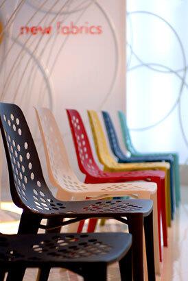
Rarely has sheet metal possessed so much levity. Working for the Italian company Emu, the Israeli-born, Paris-based designer Arik Levy created outdoor chairs called Pattern, whose visual lightness belied their heft. The honeycomb cuts in the metal heightened the airy effect, as did the color palette, which included cotton candy blue, deep teal and cherry red in a striking matte finish. Colors sang out this year without being too loud – one way a sense of optimism permeated the show. (Franco Forci / For The Times)
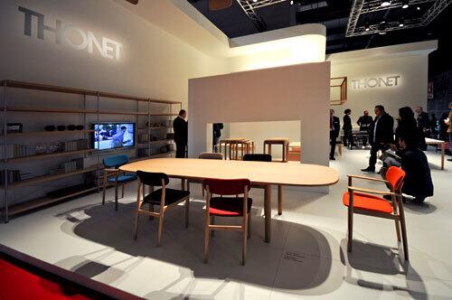
Thonet, the company whose iconic bent-wood chair was first manufactured in 1856, added some modern pop to its collection this year. Naoto Fukasawa-designed dining chairs that premiered at the Salone were reserved in form but uninhibited in color, showing in tangerine, plum and cranberry (though a representative promised upholstery came in practically every flavor). (Franco Forci / For The Times)
Advertisement
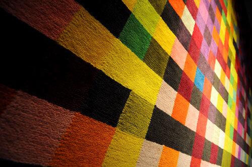
This year the Spanish company Nanimarquina departed from boundary-pushing rugs that simulate thick fields of spring flowers or thousands of red rose petals scattered on the floor. Instead of such highly tactile shapes, the new Digit collection by emerging designer Cristian Zuzunaga took the form of flat rugs in deeply saturated hues. The color blocks, Nanimarquina export manager Benoît Anicet said, were an extension of last year’s craze for pixilated patterns. But hung like artworks on the exhibition booth walls, the carpets didn’t look derivative at all. They were confetti frozen in the air, a celebration in abstract. (Franco Forci / For The Times)
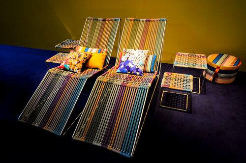
Missoni, the fashion house famous for its stripes, brought them in a different way: The Cordula chaise was strung with polyester cords in sunflower yellow, lavender, juniper and sky blue. Stretched on a minimalist tubular frame, the seating was a bright departure from the chunky wood and glossy metal that dominates so many outdoor collections. (Franco Forci / For The Times)
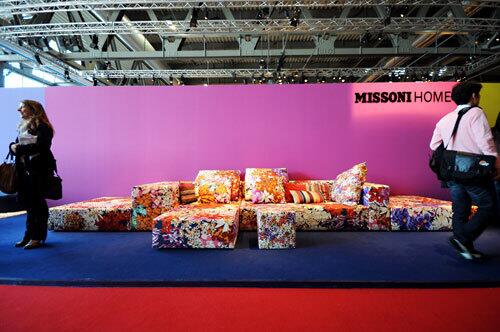
Hot look: Missoni’s recent forays into prints that emulate digitized art continue, but at the Salone those looks were combined with new designs that declared an unabashed devotion to florals – busy, wild and pulsing with life. (Franco Forci / For The Times)
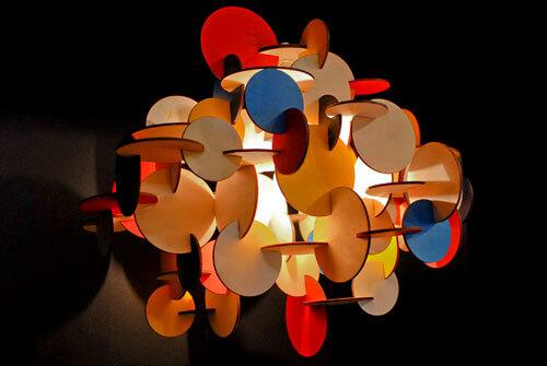
Normann
Advertisement
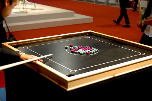
Normann Copenhagen also premiered its Bob table, a contemporary take on a traditional Danish game akin to billiards. The idea: We all could use a little more fun in our lives, couldn’t we? The sentiment was great. We’re just not sure whether we would mount the piece on the wall when not in use, as was suggested. (Franco Forci / For The Times)
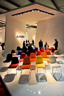
Zanotta painted a rainbow with its new Ella chairs, which come in leather or removable fabric. Suspension springs allow the chair to provide more comfort than the streamlined seat might suggest. The look reflected much at the show: spritely but not garish, more pleasant than glamorous. (Franco Forci / For The Times)
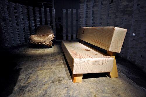
Fans of manufacturer Moroso still giggled at the 2009 Soft Wood sofa, designed by the Swedish design studio Front and upholstered in fabric patterned like wood grain. This year at the Milan show, the sofa was paired with a new chair by Front. The new seating practically bubbled with effervescence: Beads of different sizes had been strung together and draped over a scoop chair. The little orbs were actually birch, which explains the tongue-in-cheek name: Wood chair. (Franco Forci / For The Times)
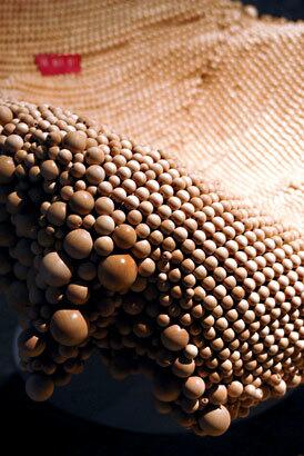
More than a few passersby also seemed tickled at the idea of such high design echoing pedestrian car seat covers. (Haters, just remember: Don’t blame the messenger.) Yes, the Wood chair is comfortable, manufacturer Moroso promised, but show-goers wouldn’t know it. A red sign on it admonished, “Do not sit.” (Franco Forci / For The Times)
Advertisement
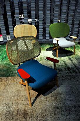
Riffs on the cane-back chair were popular this year. Her eminence Patricia Urquiola – the Spanish design queen whose hand touched manufacturers’ booths all across the Salone’s contemporary furniture halls -- premiered her Klara chairs for Moroso. By overscaling the backrest and by juxtaposing a simple wood frame with bold colors for the seat and arms, Urquiola had fun with her update. (Franco Forci / For The Times)
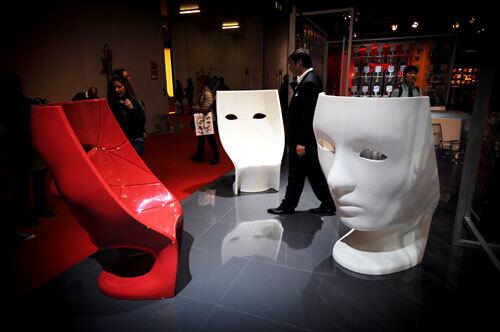
Show-goers seemed delighted by the theatricality of designer Fabio Novembre’s masks-as-chairs. Called Nemo, the indoor-outdoor seating was meant to function practically and metaphorically, each occupant taking shelter behind an emotionless facade. The effect was oddly mesmerizing until one wiseguy rested his arm in the eye socket. Ouch. (Franco Forci / For The Times)
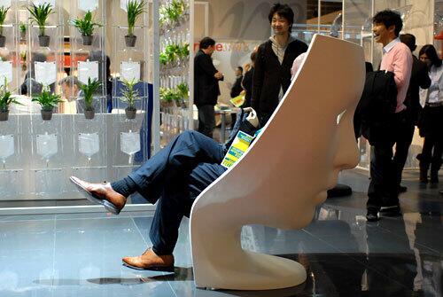
Let the giggling begin. (Franco Forci / For The Times)
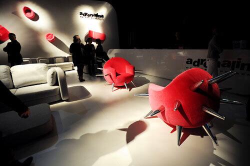
Head scratcher: The Adrenalina booth declared, “We are different.” Why, yes, you are. (Franco Forci / For The Times)
Advertisement
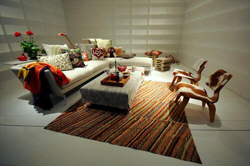
Recession? What recession? Vitra’s room displays were bright and buoyant in spirit, centered on the new Suita collection of furniture from Antonio Citterio. Note the raised headboard behind the chaise and the optional shelf mounted onto the back of the sofa. (Franco Forci / For The Times)
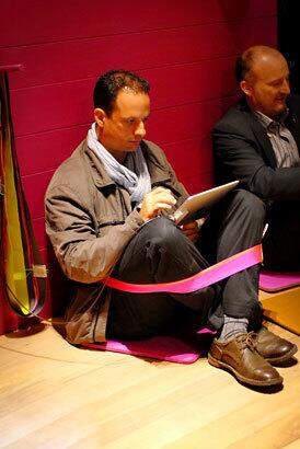
Vitra called it Chairless, and the concept was to provide a comfortable way to sit on the floor while keeping hands free. No propping up the upper body to keep from falling over, no hugging your bended legs to prevent overstretched hamstrings. Instead, a strip of fabric slips over your head and around your waist and shins. That’s it. Skeptical crowds filed into a testing room painted hot pink, donned Chairless and laughed at an idea so simple, it was silly. The funny thing: The design actually worked. (Franco Forci / For The Times)
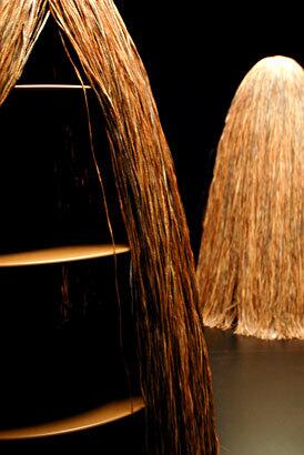
The Campana Brothers, Humberto and Fernando, called their new storage unit Cabana, but it looked more Wild Thing than beach hut. Anyone who got beyond the wigged facade found the unit filled with ideas, though. How often does storage come in a shape that’s not boxy? Plus the fireproofed raffia cover provided more angles of access than a conventional door. (Franco Forci / For The Times)
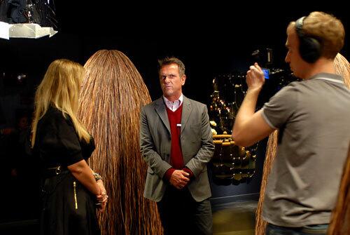
Designer Fernando Campana fields questions – lots of questions -- in the Edra booth of the Milan furniture fair. (Franco Forci / For The Times)
Advertisement
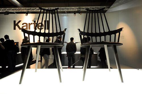
Cheery colors were one story at the fair, but we would be remiss without acknowledging that black and white was another. Kartell, the company that turned jewel-toned plastic into an art, set up its display in black and white. The net effect: a focus on shape and line, not hue. Among 16 new pieces premiering at the show was Patricia Urquila’s Comback chair, her play on the classic English Windsor chair. (Franco Forci / For The Times)
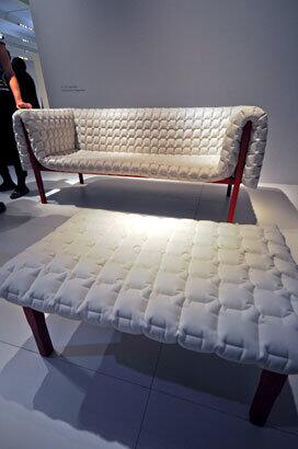
Ligne Roset showcased the new Ruché collection by Inge Sempé, who tweaked the quilted look by offering it in a billowy white leather – like sitting on a cloud. (Franco Forci / For The Times)
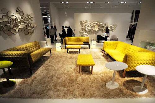
If leather isn’t your thing, Sempé’s sofa also comes in olive and a muted canary yellow. The seat can come with the cushion partially absent, leaving an exposed wood surface that serves as a built-in side table. (Franco Forci / For The Times)
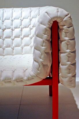
The frame of Sempe’s design looks like powder-coated metal, but it’s actually wood. The effect, when viewed up close, feels more handmade than industrial. (Franco Forci / For The Times)
Advertisement
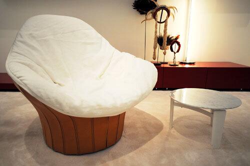
First quilts, now sheets? Another trend to emerge in Milan was loose upholstery a bit reminiscent of an unmade bed. One showroom representative used the metaphor of an untucked shirt – casual and carefree. This Lips swiveling chair by designer Carlo Colombo for manufacturer Artflex actually looked more inviting in person than in photos. The seat cover is removable and washable. (Franco Forci / For The Times)
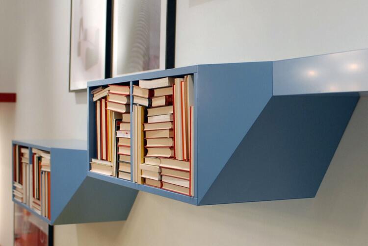
Artflex also responded to brightening palettes, offering its 2009 Hillside shelving pictured here in fresh colors, including bold yellow and red. (Franco Forci / For The Times)
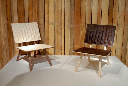
The Milan furniture fair sections off part of a convention hall for Salone Satellite, an exhibition of young designers and student work. The irreverent Austrian studio Pudelskern, which won praise last year, showcased new designs that included the curious Saddler chair. When politely asked the question most passersby were silently contemplating – what was he thinking? – designer Georg Öhler chuckled and said landscape-like curves of the seat and backrest were meant to contrast sharply with the otherwise rigid lines of the chair. The bubbles are something of a visual shock, but they softened the landing for anyone who dared to sit. (Franco Forci / For The Times)
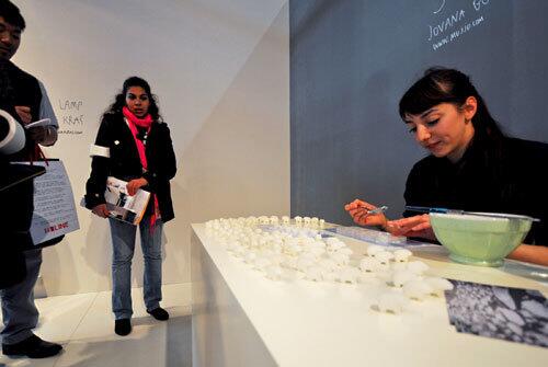
It looked so sweet: Jovana Boddanovic sat packing sugar into tiny bear-shaped molds. In front of her, dozens of polar bear-shaped “cubes” marched across her snowy white table. Then the designer offered the full explanation of the concept: “Bears are drowning in real life,” she said. As a reminder of the consequences of global warming, the sugar bears are meant to be drowned in your coffee, each little bear slowly dissolving away. (Franco Forci / For The Times)
Advertisement
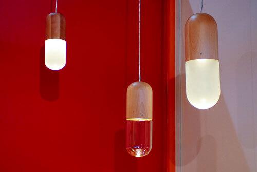
Get happy: New Zealander Tim Wigmore’s Pil lamps are carved beech and hand-blown glass shaped in the form of super-sized pharmaceuticals. (Franco Forci / For The Times)
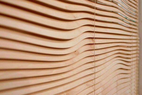
Leave it to a student to reinvent something as basic as mini-blinds. Helena Karelson, an Estonian exhibiting with Kingston University of London, turned heads with Kontour. Precision-cut wood slats create a rolling landscape inside your window. The design appeared to function just as well as traditional blinds, and because the curves flow continuously, theres no wood waste in production.
Look for more photos and reports from Milan by clicking to coverage on our blog. (Franco Forci / For The Times)
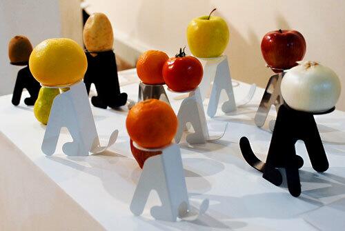
You can’t stop looking, can you? Ireland-based designer Masakazu Hori’s oddly mesmerizing Waiting is a stainless steel piece shaped like a dog at attention. And the head? The background sheet on the design stated that you can finish the stand with an apple, a lemon, a pear, even an onion or potato so “you can enjoy various expressions.” (Franco Forci / For The Times)


