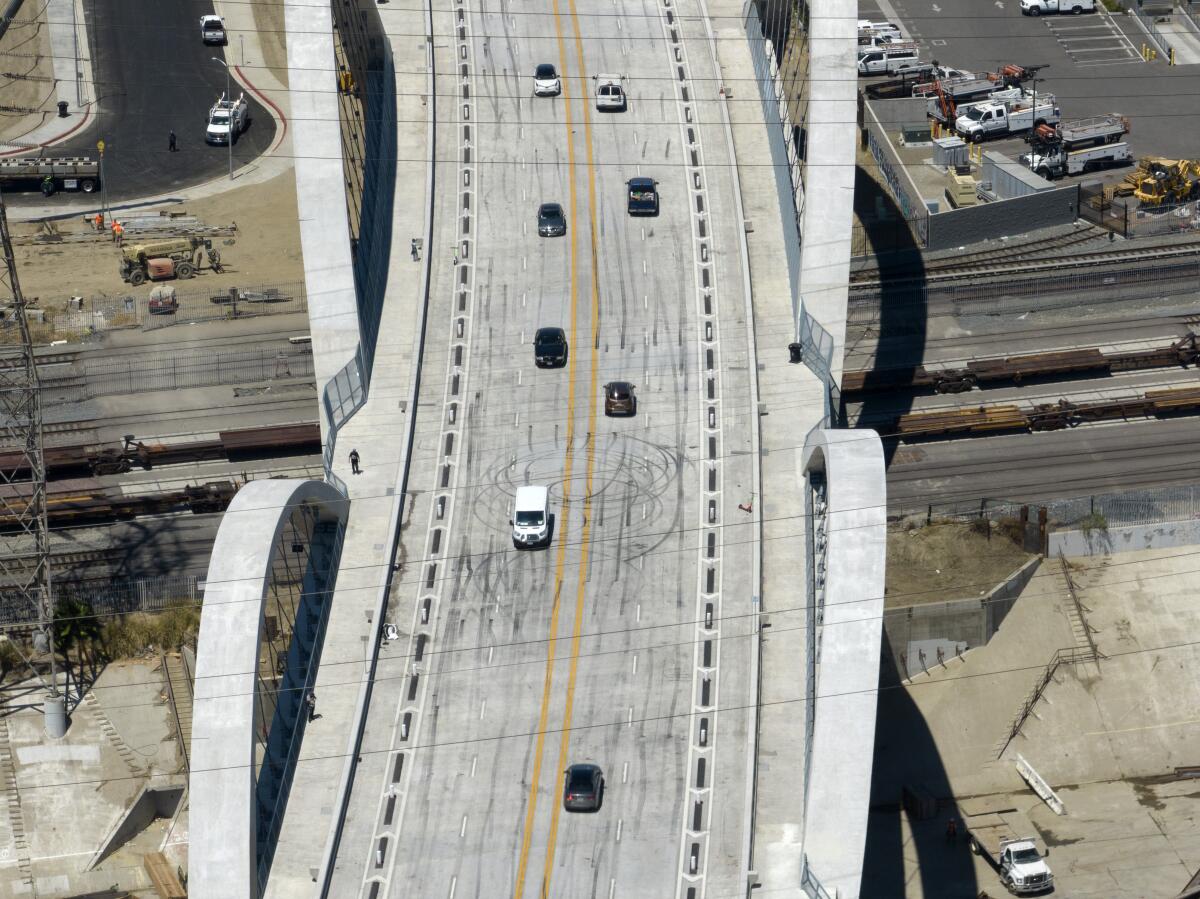
Letters to the Editor: Engineering principle shows how the 6th Street bridge invites reckless drivers

- Share via
To the editor: The 6th Street Viaduct is a troubled bridge over no water. The planners, like too many designers, forgot to include human beings. (“More crashes, climbers and chaos on new 6th Street Bridge,” July 22)
Let’s have several open lanes! Let’s have high semicircular arcs! Oh, goody!
The resulting design was full of what engineers call “affordances” — design aspects that vividly suggest how an object or space should be used. They invite (afford) an almost inevitable human response: An elevator button affords you to push it, a chair’s design affords you to sit on it (or avoid it), and wide-open lanes afford teenage boys the irresistible impulse to drag-race.
Who among us has not touched a “don’t touch, wet paint” sign, to make sure?
It is incomprehensible that the viaduct’s architects did not know about affordances, but if they didn’t, that’s professional malpractice. Post-hoc solutions — install lane dividers, add cameras, somehow block access to the arches — may be helpful and necessary in the short run, but I would hope the designers go back to the drawing board and make the substantive corrections that will allow the bridge to be used safely and enjoyably by all.
Carol Tavris, Los Angeles


