A Competition to Design L. A. Landmark Project
Scheduled to be announced within the next few weeks are the results of a privately sponsored competition here between three world-acclaimed architects to design a major downtown development.
It is the stuff that stirs the hope of a more architecturally exciting city.
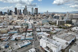
Proposed to be built in stages on a site of nearly five acres west of the Harbor Freeway, bounded by 8th, 9th and Francisco streets, is an ambitious mix of 2 million square feet of office space, a shopping and entertainment center, a hotel and an apartment complex.
Given its size, location and exposure, there is in the estimated $500-million development the potential of a landmark structure to lend the burgeoning skyline some needed identity and verve, and the streetscape some interest to link downtown with South Park and an expanded Convention Center.
If ever there was the site and development begging for a landmark design to express downtown Los Angeles entering the 21st Century it is this assemblage by the City Centre Development Corp., and its subsidiary, Parkhill Partners.
It was with this in mind that Parkhill, headed by Ronald Lushing and James Miller, boldly scrapped the already completed plans for a modest office tower on a portion of the site, designed by the local firm of The Nadel Partnership, and wisely sponsored a limited competition. The site, and the city, deserved no less.
Invited to compete were Michael Graves of Princeton, N.J. and Post Modernism fame; high-tech advocate Helmut Jahn of the very commercial, Chicago-based firm of Murphy/Jahn, and futurist, user-oriented John Andrews of Australia.
Invited to act as advisers to the jury were Deans Robert Harris of USC and Richard Weinstein of UCLA. I was invited to witness the presentations, with the understanding that I would reserve my comments to this column.
The presentations that lasted over two days were fascinating, revealing a refreshing concern by all for urban design considerations, a sensitivity to the site and city, and a common desire to make an architectural statement. Yet each had a very different architectural response, and in subtle ways, challenged one another’s style.
In summary, the Graves proposal calls for two pairs of twin towers of about 28 stories, flanking a central rotunda of about 14 stories, and styled in a multicolored, stone-clad, cookie-cutter collage of classical elements that has become the architect’s trademark.
Jahn submitted two, typically slick schemes. Both are a variation of a prominent, 43-story central office tower and two smaller towers styled in a lyrical high-tech and sitting on a sprawling base cut by a galleria oriented to Francisco Street and the nearby 7th Street Marketplace.
The scheme by Andrews calls for a dominant office tower in the form of a 28-story high-rise cluster of pods, providing maximum exposure of work areas and expressing a novel mechanical and structural system.
While the other elements in the design are somewhat fragmented and unassuming, the tower is, in a word, different; a glass and metal launching pad for the 21st Century.
At a future date I hope to be able to comment more on the presentations, for I feel they brought out some important themes in architecture today. However, for now, because of limited time and space, I must rush to judgment.
My emotional choice is Andrews, for I feel in his office tower, however difficult it may be to market, he has, in the best tradition of architecture, molded the latest advances in construction technology to serve the needs of users while creating a signature building for Los Angeles.
Not as inspired, unfortunately, is the proposed designs by Andrews of the shopping center, hotel and housing.
My logical choice is Jahn. He, too, has created a signature building of landmark potential in a machine aesthetic appropriate to an emerging Los Angeles.
Particularly dramatic is his more articulated scheme “B,” in which a cylindrical glass wall is encased in a rectangular structural grid, emphasizing the building’s verticality.
Though not as striking as the Andrews design, the office tower by Jahn works better as part of an urban design, relating well to the other buildings on the site, and to the street and surrounding structures.
It was apparent in the discussions that Jahn better understood the constraints, and therefore the challenges, of the site.
As for the submission by Graves, I feel it is more an expression of the architect’s limited design vocabulary than of Los Angeles. Indeed, its style, palette and materials are quite similar to his award-winning Humana Building in Louisville, Ky., and other recent projects.
Graves does make some excellent suggestions concerning the physical relationship of the project to the Convention Center and downtown, but, unfortunately, the design appears to me to be a cartoon, missing the spirit of the place and time. This, I feel, was captured much better by Andrews and Jahn.
More to Read
The biggest entertainment stories
Get our big stories about Hollywood, film, television, music, arts, culture and more right in your inbox as soon as they publish.
You may occasionally receive promotional content from the Los Angeles Times.


