CRITIQUE : Reaganomics on Spring Street : Will Benefits of New State Building Trickle Down to Former ‘Wall Street of West’?
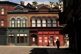
Spring Street, known in grander days as the Wall Street of the West, has had a hard struggle over the past decade to regain some vestige of its former respectability.
Bordered by Skid Row, divided from the new, largely Anglo, Bunker Hill commercial center by Latino Broadway, Spring Street still limps along, despite an infusion of $50 million in public money by the Community Redevelopment Agency.
The latest weapon in the battle to revive Spring Street is the new $100-million Ronald Reagan State Office Building at Spring and 3rd streets.
The result of years of intense lobbying initiated by former CRA Administrator Edward Helfeld in the early 1980s, the State Office Building will eventually bring 2,500 workers to the beleaguered street.
The CRA hopes the massive pink granite building and the employees therein will, in CRA Chairman James Wood’s phrase, “generate new life . . . (with) an economic shot in the arm for merchants and property owners who have made a long-term investment in the historic core.”
“We all hope the building will demonstrate the viability of Reagan’s famous trickle-down theory of economics,” said Ari Sikora, a former CRA project manager who is supervising the renovation of the Washington Building across the way from the State Office Building.
“It didn’t work five years ago with the heavily subsidized Los Angeles Theatre Center down the street, but maybe the time is now ripe?”
But the gap between official Spring Street aspirations and the harsh realities of its social environment is revealed in the building’s architecture.
Already dubbed Fort Ronnie by some of its prospective occupants, the building looks defensive in its dubious surroundings.
Its massing resembles a series of granite cliffs slit by windows divided into narrow strips by horizontal metal louvers. These “cliffs” loom above Mexican restaurants on 3rd Street and the empty parking lots and urban desolation on Main Street.
The building’s defensive look reflects its political background. For security reasons, many agencies were reportedly reluctant to accept a Spring Street location when the project was first developed, despite a $20-million low-interest loan offered by the CRA to subsidize the state’s acquisition and preparation of the three-acre site.
Within this awkward social and political context, the architects, Santa Monica-based Ellerbe Becket Inc., have done what they could to humanize the scale and character of the building.
The architects persuaded their clients to break down the mass of the structure to fit the scale of the street. Originally proposed as a 31-story tower rising way above the district’s historic roof line, the bulk of the building has been split into two smaller towers, 17 and 14 stories tall, linked by a wide atrium.
The towers run from Spring to Main, parallel with 3rd. The Spring Street elevation is slab-sided to continue the traditional rhythm of the existing buildings, while on Main Street, the facade profile steps back and down to match the lower and less regular roof line.
On both frontages, free-standing screen walls at ground level carry the building’s perimeter up to the edge of the sidewalk.
“The pink-flamed granite facing was chosen to match the traditional terra-cotta that clads most of the older Spring Street facades,” said former Ellerbe Becket director Robert Nasraway, who oversaw development of the project and who is now a consultant to the firm. “We wanted to fit in with the historic architecture without falsely imitating its details.”
However, his attempt to match the style of the street’s historic architecture without imitating its style does not succeed. The sleekness of granite compared to terra-cotta undermines the architects’ intentions.
The uncompromising modernism of the new building distances it from its historic neighbors. By deliberately ignoring tradition, the Reagan building draws no inspiration from the original Italianate or beaux-arts architecture of Spring Street, which once gave a sense of dignity and coherence to the district.
Compared to the beaux-arts style of its neighbor to the south, the Hillman Building, built in 1905, which reflects an essential confidence in the energy of Spring Street, the Reagan building’s architecture has the air of being where it is by duty rather than by choice.
The building’s open and friendly interior is a sharp contrast to its rather stiff and defensive exterior.
Its most attractive feature is its spacious four-story double atrium. Within this airy, cheerful space, lit by wide skylights, the design relaxes its rigid outward stance.
Bridges cross overhead, their Art Deco-inspired stainless-steel railings conjuring up the air of a luxury liner. A lifelike bronze grizzly created by Mary Chomenko paddles in a shallow pool that also hosts a 20-foot steel construction titled “Redwood Moonrise” by sculptor Betty Gold.
Jaunty metal grilles and gates by John Okulick and etched glass panels by Laddie John Dill complement a vivid red-and-blue three-dimensional mural by artist Billy Al Bengston that lines the back wall of the stairwell leading down to the subgrade parking.
The atrium is flanked by a colorful day-care center for employees’ children, plus a number of small shops. A large second-floor cafeteria overlooks the central space, above an auditorium intended for public hearings.
In the center of the atrium is the block housing the State Supreme Court, flanked by judges’ chambers and offices for support staff. The courtroom’s somber green marble and dark paneling makes a contrast with the light-gray, cream and beige paint work in the rest of the building’s interior.
The function of the horizontal louvers that add to the fortress-like aspect of the exterior is explained once you enter the offices that occupy the twin towers.
A double layer of metal fins shielding the windows creates reflective light shelves that bounce natural sunshine deep into the interior. These shelves, which also act as sunscreens, reflect light onto the high, white office ceilings. This reduces the need for artificial illumination, and enhances the energy conservation qualities of the building.
Apart from energy conservation, security is a prime concern. Employees who arrive by car will enter the building from underground garages, ensuring their safety and their isolation from the street. Visitors may use the parking garage in the Broadway-Spring Center across the street.
Whether the building will fulfill the CRA’s hopes to generate new life in the street remains in doubt. Will staffers actually leave the security of the Reagan building to venture out among its shabby and desperate environs? Will it, as its boosters believe, encourage a revival of the surrounding commercial area?
It appears that even the CRA is beginning to doubt whether Spring Street will ever really take off as a commercial center.
Recently, the agency announced plans to convert some of the old office buildings on the street into housing for the elderly and for artists. However, funding for such strategies remains doubtful while the CRA’s spending cap is still restricted by political opposition to lifting limits fixed 15 years ago.
One new building cannot change the fact that the hub of the downtown business community has moved irrevocably west to Bunker Hill. Even a street-friendly architectural masterpiece would not overcome the drawbacks of a location on the edge of urban desolation, and the Ronald Reagan State Office Building is far from friendly.
Fort Ronnie may effectively defend itself from its surroundings, but it fails to send out a clear message of official optimism in Spring Street’s revival.
More to Read
Sign up for Essential California
The most important California stories and recommendations in your inbox every morning.
You may occasionally receive promotional content from the Los Angeles Times.


