The art of the museum
CINCINNATI — There are a lot of reasons to care about the new Lois and Richard Rosenthal Center for Contemporary Art. It is the first major American art museum designed by a woman. It is also the first major American commission completed by the London-based Zaha Hadid, one of the profession’s most precocious talents.
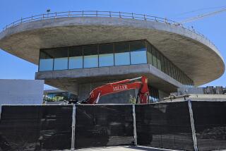
But the best reason to fall in love with the building is its seductive pull. A vibrant composition of concrete forms stacked on top of a delicate glass base, its design is calculated to lure people into a titillating architectural experience. That it does so while showing art to its best advantage is what makes it a significant achievement in museum design.
The building, which will be unveiled to the public Saturday, packs 87,500 square feet of galleries and administrative offices into a narrow lot at the corner of Sixth and Walnut streets in downtown Cincinnati. It will have no permanent collection, only temporary shows. Its $20.2-million price tag -- which averages out to roughly $230 per square foot -- is modest by museum standards. By comparison, Tadao Ando’s celebrated Fort Worth Modern Art Museum, completed late last year, cost more than $340 per square foot to build.
Nonetheless, Hadid’s structure carried a high level of expectation. For the art center -- an institution that has spent the last 33 years buried on the second floor of a nondescript downtown office and shopping complex -- the new building was an opportunity to rethink its public identity. City officials, in turn, saw the building as the final element in a plan to transform a once-seedy downtown neighborhood into a vibrant cultural hub. The Aronoff Center for the Arts stands across Walnut Street. A gritty parking structure faces it across Sixth. The rest of the neighborhood is a typical urban mix of traditional brick office buildings and modern shopping malls.
Hadid’s design does not ignore this context, it imbues it with unexpected meaning. The entire ground floor is given over to a large, two-story public lobby, which is entirely encased in glass. Above it, the rest of the museum’s exterior appears as a series of interlocking rectangular volumes. The black, aluminum-paneled form of one gallery space extends along one side of the building. Below it, a thin horizontal band of windows is set back into the facade. Other concrete volumes interlock around these forms at various scales, creating a three-dimensional composition of remarkable visual depth.
The images that come to mind are of the Suprematist paintings of Kasimir Malevich, a pivotal figure in the early years of the Soviet avant-garde. Malevich’s goal was to create a new aesthetic language for a society in a perpetual state of revolution. Colliding in empty space, his colorful geometric forms seemed to float across the canvas.
In a similar sense, Hadid’s design suggests a world that has broken free of conventional restraints, both physical and psychological. The horizontal volumes evoke a collection of lost urban fragments, as if parts of the city had been dislodged and then carefully reconfigured. Packed with urban energy, they look as if they could break loose at any moment and fly off into space.
That sense of freedom is felt most keenly in what Hadid calls her “urban carpet,” in which the sidewalk, lobby and vertical circulation are all conceived as a single unbroken experience. Bars of fluorescent lights are embedded in the lobby floor, drawing visitors inside. The ticket counter and bookstore are pushed to the back of the room, further emphasizing that this is shared public space. Opposite the entry, the lobby floor curves upward to become the back wall of a slot-like atrium. A narrow, sloping staircase zigzags upward inside this slot, connecting to the various gallery levels.
This is one of the museum’s most exquisite spaces. Light spills down from a skylight above; views open up at one end of the staircase to the city outside. Moving up through this space, visitors feel a sudden sense of compression, as if the life of the city had been folded up into the building. It is a remarkably physical experience -- a vertical public plaza.
In contrast, the galleries are intentionally more static. Big open spaces, their simple industrial aesthetic reflects a contemplative, inner world. They are designed at various scales for maximum flexibility. The detailing is left raw, so as not to distract from the art inside. It is the kind of restraint that only a mature artist can muster. The result is an ideal environment in which to view art.
Hadid’s accomplishment is significant. For more than a century, museum designers have struggled to define the relationship between art and a mass public. The imposing grand stairs of New York’s Metropolitan Museum of Art, for example, were once conceived as the emblem for a people’s palace; they also placed art on a pedestal. The revolving doors of the Museum of Modern Art symbolized a more direct connection between art and the common man.
More recently, architects as diverse as Renzo Piano, Rem Koolhaas, Frank Gehry and the team of Jacques Herzog and Pierre de Meuron have created museum buildings that seek to break that boundary down even further, anchoring art firmly within the public realm. In Gehry’s celebrated Guggenheim Museum in Bilbao, Spain, for example, a reverse grand staircase drives down into the lobby like a wedge; Koolhaas’ Rotterdam kunsthalle is cut in two by a massive ramp.
Hadid’s “urban carpet” fits neatly within that growing tradition. Its roots are set within the populist notion that art serves an important public role, that it is an expression of our collective values.
Such ideas are a testament to the depth of Hadid’s work. Since bursting onto the architectural scene in 1982 with her winning design for the Peak -- a posh country club in Hong Kong that was never built -- Hadid has developed an architecture that seeks to capture the flow of contemporary urban life.
This is particularly true of her paintings, dynamic colorful compositions that create a sense of infinite space, a sensual world that seems intent on breaking down social and aesthetic boundaries.
But until recently, Hadid has struggled to land major commissions. In part, this is due to the fact that she is an Iraqi-born woman working in what remains predominantly a white man’s profession. In part, it is because clients have found it difficult to envision how her drawings would look in built form. How do you make buildings fly?
The Contemporary Art Center proves once and for all that such a vision is not only possible, it is the kind of cultural sustenance our world craves.
More to Read
The biggest entertainment stories
Get our big stories about Hollywood, film, television, music, arts, culture and more right in your inbox as soon as they publish.
You may occasionally receive promotional content from the Los Angeles Times.


