Beefed-up by design
COLUMBUS, Ohio — For better and for worse -- mostly worse -- McDonald’s has had a profound effect on the American landscape. Its golden (actually yellow) arches, it’s said, are a brand icon more recognized than the Christian cross. Its cookie-cutter buildings have turned vast stretches of suburbia into seas of asphalt. Its very name has become synonymous with garish design, which is why we call those bloated houses that cram far too much square footage onto tiny suburban lots “McMansions.”
So the new, Starbucks-like look that McDonald’s has rolled out in this classic Middle American test market may tickle more design palettes than a knock-your-eyes-out architectural whammy by Frank Gehry or Santiago Calatrava ever will.
We visit museums by those architectural stars, but we practically live in McDonald’s. The company estimates that more than 25 million people a day eat at its U.S. outlets.
And now McDonald’s is playing a controversial, high-stakes game of architectural catch-up, transforming its harsh, plastic-heavy interiors into soft, earth-toned places where you might linger with your laptop in an upholstered chair beneath a stylish pendant light. On the outside, McDonald’s wants to ditch those screeching ketchup-red and mustard-yellow mansard roofs for a more muted look. By year’s end, assorted aspects of the makeover -- mostly changes to interiors -- will be in place in about 6,000 of McDonald’s 13,700 U.S. outlets. They are part of a global “re-imaging” program that includes other new designs the fast-food giant has built for its 31,000 outlets worldwide.
While Oak Brook, Ill.-based McDonald’s is touting the changes as the inevitable path to the 21st century, a visit to four of its showcase restaurants in Columbus and its suburbs reveals a decidedly mixed outcome, which can be summarized this way: McDonald’s new look serves up less aesthetic heartburn, but it needs a strong shot of architectural spice.
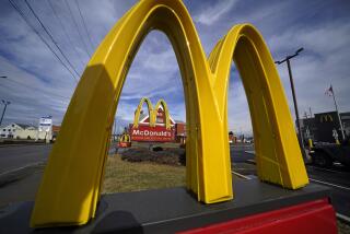
On the upside, the chain’s model for a new building, a light-and-airy arched structure based on the famous golden arches, is (stop the presses!) pretty appealing. The refurbished interiors, at least in the Columbus area, are far more visually sophisticated and comfortable than their predecessors from the age of disco, leisure suits and glitter balls.
On the downside, the design quality of rank-and-file interiors that tweak the company’s model is spotty, based on visits to several remodeled McDonald’s in downtown Chicago. And there’s more than a grain of truth to the argument espoused by dissident franchise operators that the planned remodeling of McDonald’s exteriors, which hides the mansard roof behind a tacked-on front with an eyebrow-shaped yellow arch, differs little from the bland, brick-and-awnings facades of an Applebee’s or a Panera Bread. It’s as if McDonald’s has gone too far toward the competition in doing penance for its decades of architectural sins.
The remodeling, quips franchise consultant Richard Adams of San Diego, a former franchise operator himself, “is too generic to hate.” In one sense, to be sure, the changes are mere window dressing. They will do nothing to roll back the energy-wasting sprawl of the car culture that McDonald’s helped bring to the rest of America from a drive-in hamburger stand in San Bernardino that the McDonald brothers (Richard and Maurice) opened more than 50 years ago. On the other hand, the changes will alter, in small ways at least, the everyday experience of millions of Americans. Indeed, the very fact that McDonald’s is pushing for the changes shows how much design expectations have risen across America over the last decade.
At Target, you can pick up Michael Graves’ tea kettles along with clothes by fashion maven Isaac Mizrahi. Kmart counters with bedding and other housewares by Martha Stewart. It’s the age of the down-market designer label, where the highbrow and the lowbrow mix and mingle in ways previously unimaginable. And then, of course, there’s Starbucks, which brings hip to the masses with its much-admired, multisensory mix of cool furniture, piped-in jazz and aroma-heavy java. Eateries such as Cosi have added their own design flair to the “fast casual” marketplace.
Four years ago, when its stock price had hit a new low, McDonald’s was way behind this curve, trailing the expectations of a society that had shifted to quality-driven shopping along with health-conscious eating. The molded plastic seats that had symbolized cleanliness in the 1970s now represented sterility. And company leaders had grown uncomfortable with the overhanging double-hip parapet roof -- the so-called “double mansard” -- that McDonald’s introduced in 1969 as part of a dull-brown look meant to combat objections that the original golden arches were eyesores.
“Get rid of that damn roof,” the company’s then-chief executive, the late Jim Cantalupo, told Peter Dixon, a senior partner and creative director at Lippincott Mercer, a New York City-based branding consultant, Dixon said in an interview.
The changes Lippincott Mercer developed with McDonald’s staff of in-house architects are part of a broader push for relevance, now in its third year, that also includes a more diverse menu with items such as Asian salad, Wi-Fi access (now available at about 7,000 U.S. outlets) and service-friendly measures such as letting customers pay for their meals with credit cards. Yet it’s unclear how far the architectural changes will go. Only about 60 U.S. outlets sport the new or refurbished look -- mainly here and in Tulsa, Okla., but also in New Orleans and Miami -- and some franchise operators have voiced opposition to the shift.
“They’ve been telling us for 30 years, 40 years, that the mansard roof is our brand and now it’s going away,” says Adams, the consultant to the franchise operators. “We don’t understand it.” Besides, he adds, the financial burden on the operators will be enormous: $1 million for tearing down an old restaurant and building a new one; $300,000 to $400,000 for renovating an existing outlet. The bottom line: He doesn’t think the redesign will raise profit enough to justify costs.
McDonald’s declines to discuss financial specifics, but spokeswoman Danya Proud defends the changes, saying: “It’s an investment we have to make to do business over the next 50 years.” John Miologos, vice president of worldwide architecture, design and construction, says McDonald’s isn’t changing its brand, but updating it, thus staying true to its slogan “forever young.”
The rift illustrates the tension built into the symbiotic relationship between the company and its franchise operators. The company provides the brand and the time-tested know-how. The franchise operators are the ground troops who spread the McDonald’s empire. But McDonald’s controls the land and the buildings, though it lets the operators tweak menus and interiors to meet local needs. Of the 13,700 U.S. outlets, about 2,100 are owned and operated by McDonald’s, company officials say. Franchisees operate the rest.
Around the country, there are signs that McDonald’s is winning over some franchise operators who initially opposed the new exteriors. Kenneth Rust, chair of the operator association in Raleigh, N.C., explained that he was converted because the contemporary outside expresses the interior upgrades franchisees have made. A from-scratch McDonald’s he plans to build is “gonna cause a buzz,” he says.
Adams, the franchise consultant, attributes the conversions to corporate pressure, saying that McDonald’s can refuse to renew the contracts of franchisees who refuse to build its new look. “Obviously everyone involved got an atomic wedgy from Oak Brook for speaking their minds,” he writes in an e-mail.
Those who have read Eric Schlosser’s bestseller, “Fast Food Nation: The Dark Side of the All-American Meal,” may regard such matters as superficial and of little consequence. After all, they don’t speak to issues the book raises, such as its contention that McDonald’s targets children in its advertising. So powerful is the company’s effect on American culture, Schlosser writes, that the golden arches “are now more widely recognized than the Christian cross.” But design matters because it’s the inescapable art and McDonald’s ubiquitous outlets seem truly inescapable.
While the changes in the company’s makeover vary widely in quality, they nonetheless speak volumes about a broader cultural shift: It is no longer acceptable, at least in many places, to dumb down design. Even if it’s a latecomer to the trend, McDonald’s deserves credit for turning its gaze forward. There is substance in style and if you want to sell a hamburger and fries, you had better take note.
Blair Kamin is architecture critic at the Chicago Tribune, a Tribune company.


