Animation shifting away from the clean lines of CG in favor of messier, retro styles
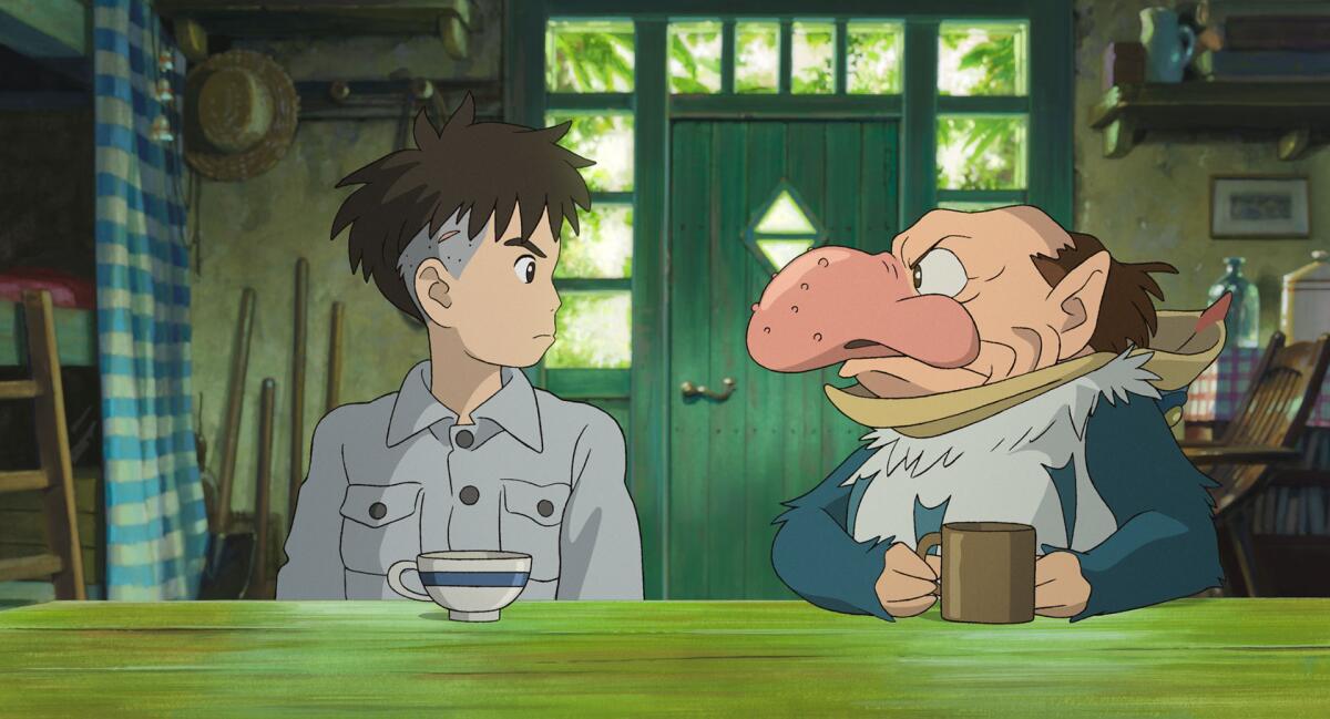
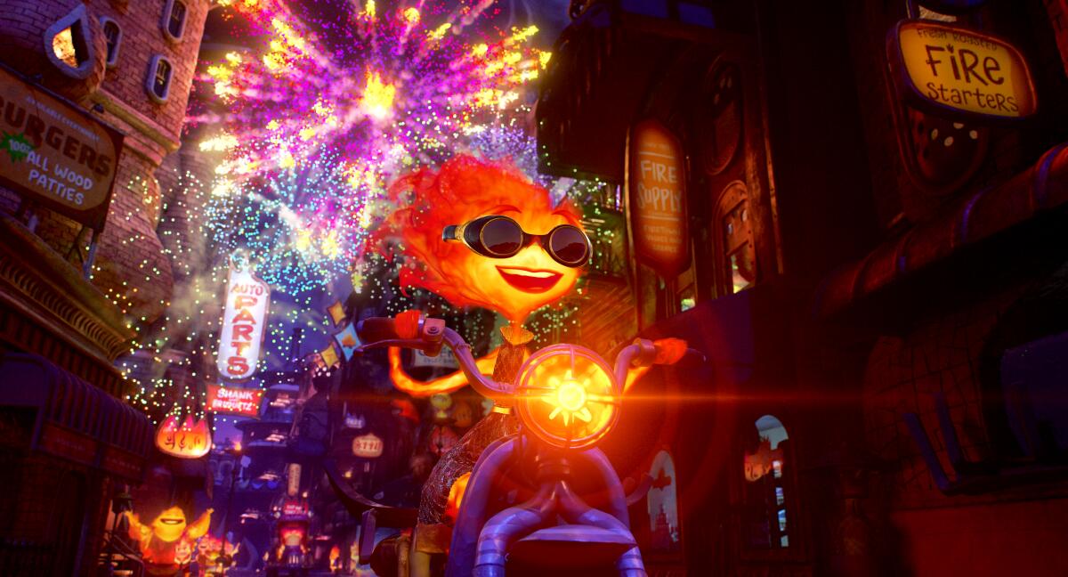
While deciding how to animate “Elemental” (Pixar), director Peter Sohn was having a crisis. How do you animate fire? Or water? He could take cues from Hayao Miyazaki’s Calcifer in “Howl’s Moving Castle” or riff on the fiery title character of “Ghost Rider,” and he did. But when it came down to it, he had one basic issue: How realistic should fire, or water, appear?
“Early tests were me putting eyes on photographs of fire and water, and there was a disconnect there that was disturbing,” he admits. “If the fire was realistic, it demanded that the eyes become realistic. Our main water character became a monster when we tried to make it realistic. It wasn’t for lack of trying [that we didn’t go with hyper-realism].”
The field of animation has evolved in recent decades. Hand-drawn, two-dimensional images are largely a thing of the past, with computer graphics and software stepping in — Pixar’s Oscar-winning RenderMan software being just one example — to transform the industry. Still, no animated film has won best picture, and only three have ever been nominated in the category.
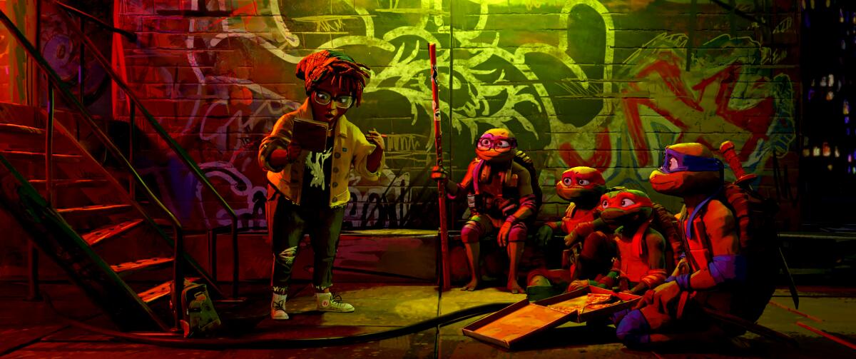
Where is animation looking to evolve next? Well, it turns out that many studios aren’t leaning so hard on the clean lines and perfectly rendered images conjured up by CG. These days, the buzziest animated feature Oscar contenders include “Teenage Mutant Ninja Turtles: Mutant Mayhem” (Paramount), “The Boy and the Heron” (Toho/Studio Ghibli), “Spider-Man: Across the Spider-Verse” (Sony), “Suzume” (Toho/Crunchyroll) and “Wish” (Disney) — all films that embrace their messier, retro sides to varying degrees.
“Computers are really good at being symmetrical, with straight lines and things that are clean,” says Jeff Rowe, writer-director of “TMNT,” which has the look of rough sketches animated with three-dimensional depth. “They have a harder time rendering and computing asymmetrical misshapen things. For the first decades of American computer graphic animation, [creators] had to find a way to be appealing within those technical limitations.”
To Sohn, computer graphic rendering has become a creative cul-de-sac. “There is a pipeline [at Pixar] that has gotten more codified, tighter to break [over the years],” he says. “Anything you put on the screen will ultimately render through the RenderMan program, so sometimes you’re fighting that machine. It’s been optimized that way.”
Perfection can be limiting to character creation, says Junichi Nishioka, an executive at Studio Ghibli, which released Miyazaki’s latest, “The Boy and the Heron.” “If the images become so real that they are indistinguishable from photographs, people perceive them as being close to reality,” he says via translator. “The expression of the movement of characters in realistic animation naturally becomes limited to the range of physical abilities of human beings.”
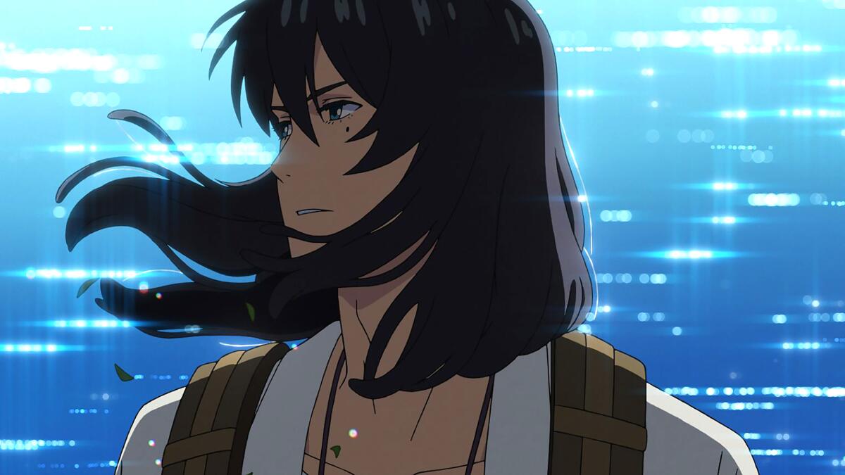
Agrees “Suzume” producer Genki Kawamura, also through a translator, “What may ‘look’ real doesn’t necessarily portray ‘reality’…. Giving your audience a sense of reality with a single line, single sound or a single word is the goal of expression, and that’s what I strive to achieve with films.”
In “Suzume,” the luminous backgrounds are all hand-drawn — and a look at a selection of other recent animated features proves there’s a wide range of artistic styles beyond clean CG lines. Rowe brought on Woodrow White as the lead character designer on “TMNT,” liking what he saw in White’s “expressive, sketchy, energetic, kinetic line” look.
Notes White, “For 30 years or so, CGI was a spectacle unto itself. Now, CG is at the age where we’re no longer thrilled by a cube turning in three dimensions. The thrill has worn off, and we can start making things look different in ways we never thought of before.”
“Spider-Man,” meanwhile, incorporates multiple comic book-inspired looks throughout its multiverse story, using throwback and international styles to reflect the worlds its various “Spider” characters live in. But as co-director Justin K. Thompson (with Kemp Powers and Joaquim Dos Santos) notes, style shouldn’t dictate story.
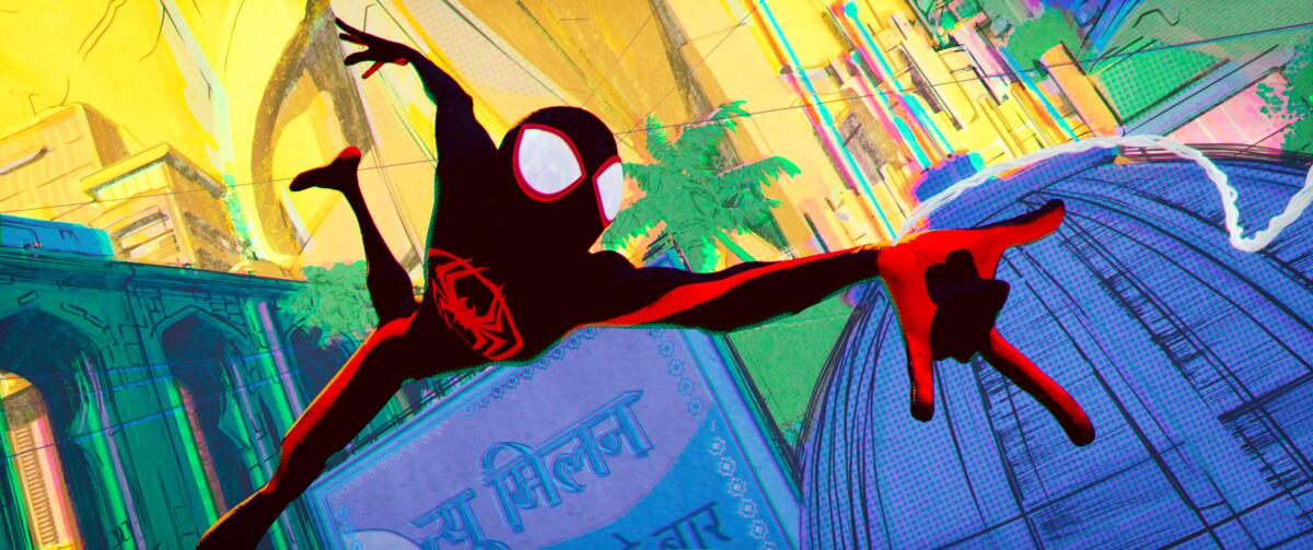
“The comic book styles we were able to tap into helped us tell our story better and gave us visual cues and devices that allowed us to tell the story,” he says. “As a filmmaker, I’m always thinking about what would be cool to see — and what would tell the story in the best way.”
Walt Disney Animation also wanted to shake things up with “Wish,” the film that marks the company’s 100th anniversary. Directors Chris Buck and Fawn Veerasunthorn nod back at the watercolor look of the company’s first feature, 1937’s “Snow White and the Seven Dwarfs.” To help achieve this look in “Wish,” a new addition to the company’s Hyperion rendering system, Screen Space Texturing, has been put into use.
“It helps achieve the visual nuance of a watercolor look,” Buck says. “We have a bit of a graphic opening [in the film], but then we go into this beautiful, illustrative look so it’s like going into a picture book fairy tale.”
“We’re taking great care in watercolor as a medium,” Veerasunthorn adds. “We’re able to reduce the detail and be very purposeful about the line work, so we can narrow down the focus onto certain characters without applying motion blurs or effects that are prominent in CGI.”
Part of the hope in shaking up what’s expected from the clean, modern lines of today’s CG-rendered animation is that it will inspire the next generation to start early and feel free to use its own style. “No one else had that computing power level at the start of the first Pixar films,” Sohn says. “Now everyone does, and it can open things up. It can get into more hands, and you’ll get more diverse looks, that seems very exciting to me.”
“Spider-Verse’s” Dos Santos says he’s already seeing it: At a recent conference in Italy, he was blown away by the level of sophistication in the work of students he met. “They have access essentially to all the tools we have, and they’re doing some wild stuff out of the gate. They’re showing me stuff where I think, ‘Oh, man, we might need to hire you.’”
Indeed, keeping things out of that creative cul-de-sac is where “TMNT’s” White hopes things continue to evolve. “Sometimes amazing, crazy visions can go horribly wrong,” he says. “But you appreciate them because someone took the leap — and you don’t see too many crazy leaps anymore.”
More to Read
From the Oscars to the Emmys.
Get the Envelope newsletter for exclusive awards season coverage, behind-the-scenes stories from the Envelope podcast and columnist Glenn Whipp’s must-read analysis.
You may occasionally receive promotional content from the Los Angeles Times.


