Review: R.H. Quaytman makes paintings as sculptures, mysterious and seductive at their best
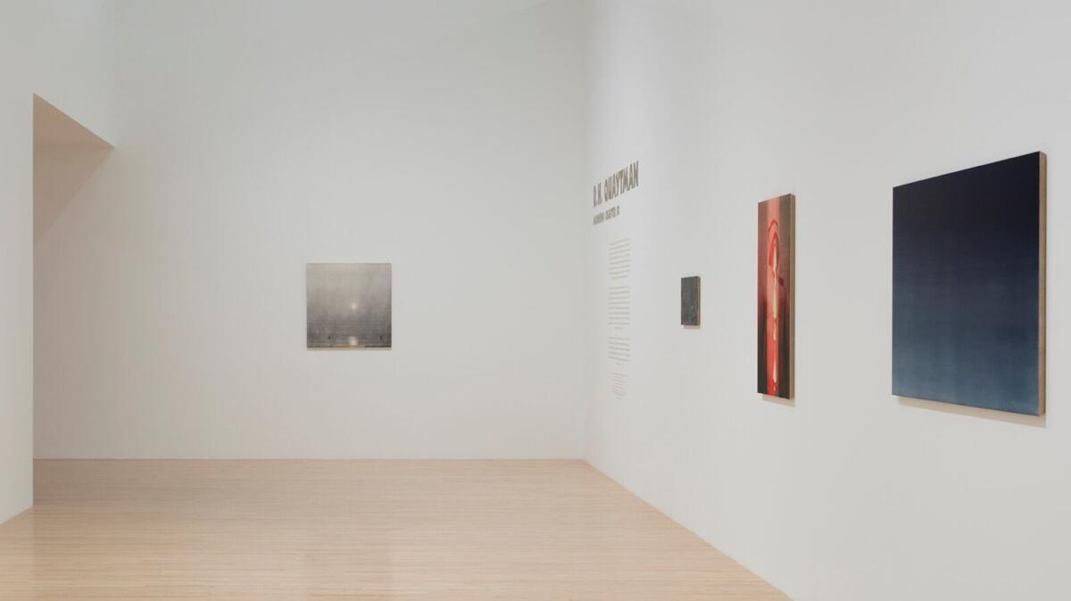
Indigo, saturated eggplant, black, gray — the colors that dominate the show of R.H. Quaytman’s paintings at the Museum of Contemporary Art constitute what can only be called a twilight palette. Landscape is at the center of the New York artist’s exhibition of new and recent work, and dusk is falling.
It begins with a contrary burst of white.
The first of the show’s 84 paintings, 22 of them forming a continuous mural, is a roughly 2-foot-square wood panel silkscreened with a foggy gray picture. The photographic image is focused on a bright, white sun over gently rippling water, with the glowing disk slightly off-center and its watery reflection breaking up in shallow waves at the bottom.
The image loosely recalls assorted 19th century paintings. One is Claude Monet’s “Impression, Sunrise,” the little 1874 depiction of the French port of Le Havre that lent its name to Impressionism. Others are by the audacious British painter J.M.W. Turner, whose blazing pictures turned stale history painting into riveting visual narratives of light exploding across water.
Quaytman’s image is, by contrast, murky and even somewhat difficult to make out. Monet and Turner are like half-remembered ancestors on a tattered genealogical chart. The silkscreen process fuzzes the scene, while a mechanically produced grid interrupts any easy perceptions of naturalism.
Just below the watery light-reflection at the bottom, something quite strange also hovers: a short, wide wedge of colored striations. The oddity remains a mystery until you look at the painting’s side.

Quaytman paints on thick, beveled planes of plywood, so the flat surface of her picture stands an inch or so away from the wall. Plywood is made from layers of compressed sheets, which the beveling reveals at the sides. The skinny wedge of strange, colored striations at the bottom of Quaytman’s silkscreened image represents a painting laid flat and seen from the edge, whatever image it might carry now rendered invisible.
The construction of a Quaytman painting virtually always emphasizes that it is a material object in real space, just like you, rather than being only a metaphorical window on the world or a mirror of it. Her silkscreened panel showing a sun over water is both an ephemeral image and a material thing, spectral illusion and blunt reality, hypothetical concept and inescapable fact.
It’s like a thought you can stub your toe on.
Nearby, a second, even smaller painting on beveled plywood asserts the literary aspect of her unfolding image-narrative.
The smaller picture shows a twisted length of blue ribbon hovering before a black background. Golden letters of the alphabet, A to Z, are superimposed, threading ribbon through openings in the letters’ font here while casting illusions of letter-shadows on the ribbon there.
The ribbon’s twists and turns even suggest the shapes of numbers and characters in non-Roman languages. Image and text promiscuously mingle in objectified form.
For the artist, these imaginative designs make some biographical sense. Her late father was painter Harvey Quaytman, her mother is poet Susan Howe; and her two biological parents’ three subsequent spouses are a painter, a writer and a sculptor.
Quaytman’s work is all in the family of 1960s Minimal and Conceptual art, as well. (She was born in 1961.) She draws on precedents as diverse as the text and image work of John Baldessari, screened paintings by Sigmar Polke and Robert Rauschenberg and
And, more specifically in this show, there’s Michael Heizer’s monumental 1969 desert landscape sculpture, “Double Negative.”
Located in the Moapa Valley near Overton, Nev., “Double Negative” consists of two long, straight trenches, each 30 feet wide and 50 feet deep, cut into the “tabletop” of Mormon Mesa. The trenches mechanically displaced tons of desert sandstone across a natural indentation in the mesa.
As the name “Double Negative” implies, the two negative elements — a natural void at the mesa’s edge and a man-made void cut across it — together produce the positive force of the sculpture. It’s there and not there — or “not not-there,” so to speak.
And it’s right up Quaytman’s alley, subject-wise.

“Double Negative” is part of the museum’s permanent collection, even though physically it lies 350 miles away in the proverbial middle of nowhere. A widely published landmark, it’s an Earthwork that few have seen except in photographs and many have written about. As art, “Double Negative” exists at the intersection of sculpture, photography and writing.
That’s where Quaytman’s art traffics. MOCA curator Bennett Simpson, who organized the show, calls the Heizer a “leaping-off point” in the catalog. (A Heizer show, incidentally, is at Gagosian Gallery in Beverly Hills through Dec. 21.)
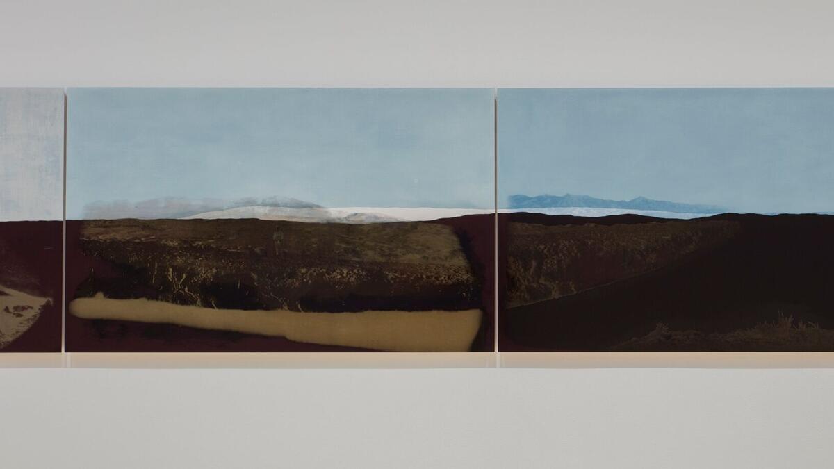
For all its relevance, however, the sculpture hasn’t provided much inspiration. Quaytman made a “Double Negative” landscape mural expressly for the show, but unfortunately it’s not very engaging.
The 22-panel mural, 110 feet wide, fits exactly the width of one gallery wall. Moving from right to left, in the manner of the journey through an unfurling landscape in a Chinese scroll, a shiny plane of black lacquer beneath a flat blue field seems to recede to a vanishing point. Then a desert landscape opens up. The lacquer is light reflective while the desert horizon progressively blurs.
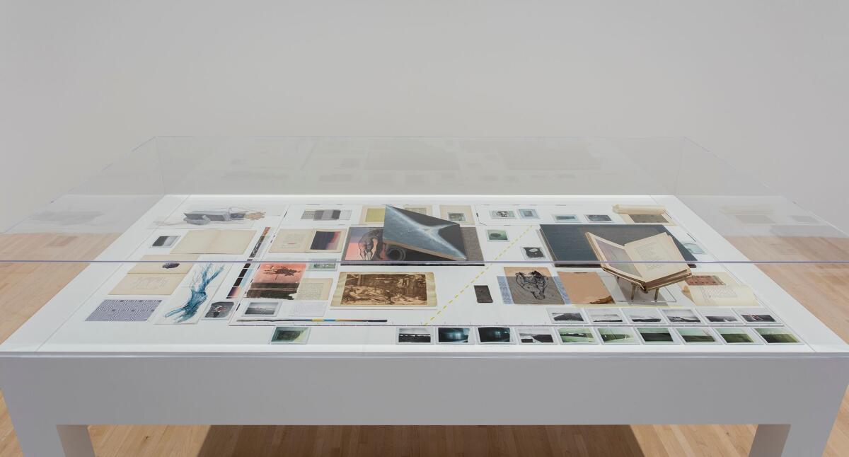
The final six panels are silkscreened with obscured, high-contrast photographic images of Heizer’s sculpture. (A display of source material is in a vitrine nearby.) Now the earth is brown, the sky has gone gray.

Despite all the acreage it occupies, the mural is visually dull. Its ancestry lies less in “Double Negative” than in Andy Warhol’s failed 1978 “Shadows” mural — 102 silkscreened panels showing illegible shadows on a wall, its collective size also determined by the dimensions of its exhibition space. “Shadows” was shown in the same MOCA room two years ago.
In the context of Quaytman’s exhibition, her individual easel paintings are like quirky but shrewd bits of considered information that come together as a conceptual footing for the mural. But those bits are more beguiling, more ruminative, more visually and intellectually seductive than the big picture. Whatever pull the mural might have dissipates, while the mysterious easel pictures almost always shine.
Museum of Contemporary Art, 250 S Grand Ave., L.A. Through Feb. 6; closed Tuesdays. (213) 626-6222, www.moca.org
christopher.knight@latimes.com
Twitter: @KnightLAT
ALSO
New dean for art and architecture at UCLA
Huge Arts District development along L.A. River: an early look
The biggest entertainment stories
Get our big stories about Hollywood, film, television, music, arts, culture and more right in your inbox as soon as they publish.
You may occasionally receive promotional content from the Los Angeles Times.


