‘The Favourite’ gets a distinctive look by mixing the historically accurate and the not-so accurate
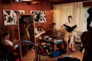
Reporting from London — In creating the visual world of “The Favourite,” production designer Fiona Crombie wanted to emphasize spaces that felt like real people lived in them day to day. Queen Anne’s palace, meant to be the historic St. James Palace, is less of a showpiece and more of a genuine home, one that reflects the quirks and emotional states of its inhabitants. In each room, especially the queen’s bedroom, the furniture was allowed to shift based on what was happening — which was an early note from director Yorgos Lanthimos.
“We liked the idea that these rooms were lived in,” says Crombie, sitting down to discuss the film in London. “They’re not presentational. They change a lot depending on what’s happening or the choreography or even how well someone is. You want to have a sense of character and life in those spaces. There’s something really good about an unkempt room, and it can reflect where that person is and what’s happening with her. We charted a little graph of the queen’s mental health and well-being and how it’s reflected in the state of her bed or what’s on the floor. Even the floral arrangements go through a mood shift.”
Most of the palace was created in Hatfield House, a Jacobean house outside London in Hertfordshire. The property has been used frequently for filming, including on “Wonder Woman,” “The Crown” and “Shakespeare in Love,” and presented the best location for several reasons, but particularly because Hatfield would allow the use of candles, an important element in Lanthimos and cinematographer Robbie Ryan’s vision. The team could also build in walls and structures as needed for a particular scene (the palace entrance in the film, for example, is entirely a construct).
RELATED: ‘The Favourite’ is one of the year’s most original screenplays, here’s how it came about »
“That building is so beautiful and so inspiring, but it’s also a good use of economy, because I was adding to what we already had instead of redoing everything and pretending it’s not there,” says Crombie, who earned a BAFTA nomination for her work this week. “The cost of building [sets] is well beyond the budget of an indie film, so we have to work with what we had. We did clever things like build the passageway and build doors and add tapestries.”
Knowing that costume designer Sandy Powell was working with a monochromatic color palette, Crombie had to determine how her own colors would work against that. She ended up going for gold fabrics and wood, creating a warm set of colors against the cool blacks and whites of Powell’s costumes.
“That was a particular challenge we had in the art department,” Crombie says. “I wanted a real clarity in the film so it made sense and you weren’t overwhelmed. It’s wood and gold, and that’s it. But then you have elements like blue and white chinas and the tapestries and flowers. The palette is very tight, and there’s not too much happening.”
One of the key visual elements within the palace are its black and white tile floors found in Hatfield along with wooden floors hidden underneath the carpets and polished to a gleaming shine. Using the actual historic floors proved to be a challenge, though, when it came to lighting scenes using only candles — Crombie estimates that 80,000 candles were using during production.

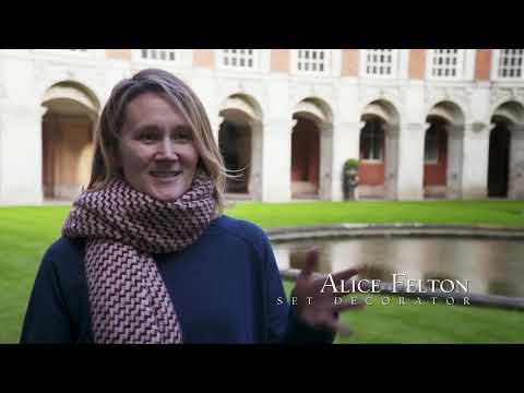
A behind-the-scenes look at the production design of “The Favouirte”
Another challenge was the use of wide, fisheye lens throughout the film. Many of the scenes are shot with an expansive viewpoint that encompasses a large portion of a room. That meant that Crombie and her team had to consider the ceilings and corners in a way a traditional production might not.
“We did camera tests at Hatfield,” Crombie says, “understanding what we needed to light a scene with candles, looking at the costumes. We also tested the lens so we knew what we would be getting. Very early on with Yorgos, we were talking about people in space and emptiness and not over-filling rooms, having a sense that although everything is exquisite, it’s not over-stuffed. You don’t have millions of things everywhere. There’s a degree of isolation in these ornate spaces, and I think the lens is the thing that really pushes that.”
The queen’s bedroom is a prime example of this. Crombie’s team had a massive canopy bed, which is stacked with four mattresses, built for the room in Hatfield. The tapestries that cover the walls were already there, although more were added to fully coat the space. The bed itself is historically accurate (including the multiple mattresses) and the pile of rabbit cages in one corner evoke a dollhouse. The cages have black and white floors that mirror Hatfield’s own, and the idea is that the queen can rearrange them as she pleases. In the other areas of the room, the furnishings shift — and sometimes vanish completely.
“What we tried to do is empty the spaces a lot,” Lanthimos says. “Architecture played an important part in the film, and one of the striking things is to see those huge spaces the characters inhabit — and that the real people back then actually inhabited. The contradiction between these lone figures and the empty spaces was quite important — to have one bed on one end of a huge room and a space in front of the bed, which would sometimes have furniture and would sometimes be full of people visiting. It was important for the spaces to feel fluid so we could change them according to the scene without having to justify that. Sometimes there would be a little lounge sitting area in the queen’s bedroom, and then other times when that wasn’t needed it would go away.”
The production also shot in Hampton Court Palace, including the kitchen and a long gallery, as well as Danson House, which stood in for the servants’ quarters and was transformed into a spa. Although these historic locations were an essential part of the visual storytelling and Crombie did lots of historical research, the sets and props for “The Favourite” don’t necessarily adhere to period accuracy. There were not, for instance, birthday cakes with blue icing available in the 1700s.
She adds, “That’s the thing about this film: There are things that are absolutely accurate, like the glassware and the queen’s bed, which was hand-carved. And then you have the wheelchair, which didn’t exist. It’s a mix, and then they all fit together in a way.”
FULL COVERAGE: Get the latest on awards season from The Envelope »
More to Read
From the Oscars to the Emmys.
Get the Envelope newsletter for exclusive awards season coverage, behind-the-scenes stories from the Envelope podcast and columnist Glenn Whipp’s must-read analysis.
You may occasionally receive promotional content from the Los Angeles Times.


