Designer behind Solange Knowles’ ‘A Seat at the Table’ book reveals the singer’s inspiration
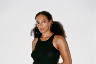
Solange Knowles released her latest album at midnight Friday. The musical body of work marks Knowles’ first since 2012’s “True” EP. Last week, Knowles sent a select group of 86 fans copies of a mysterious book titled “A Seat at the Table,” which is also the name of her new album. The book includes lyrics, poems and photos shot by Carlota Guerrero.
WWD caught up with Frédérique Gagnon, the Montreal-based designer credited with conceiving of the book’s design, to learn how it came to be.
WWD: Tell me about your role in designing the book.
Frédérique Gagnon: I’ve been working with Anteism Publishing for a couple of years. They do artists’ books and photographers’ books. We do the design whenever those artists or photographers don’t have a specific design that they already give us. Either they send the whole document if they already had someone doing the design for them and we do the production or if they want us to do the design, then that’s my part of the work. … Anteism had already helped [Solange’s team] with another publication before. They came again and asked if we could help with this one that would be released at the same time as [Solange’s] new album to a couple of the people who bought the album before. She actually hadn’t finished all the lyrics when we started working together.
WWD: When did you and Solange start working together?
F.G.: Not that long ago. Maybe a month and a half? It was a really quick project.
WWD: Did you communicate with her mainly online or in person?
F.G.: It was all through e-mail because I was still in Montreal. The owner of Anteism Publishing, he works a lot in Europe. He was there pretty much all summer, and that’s how he was in contact with Sony and Solange in person. But I stayed here and we communicated through e-mail, sending inspiration.
WWD: What were some of the things she sent you as inspiration?
F.G.: She was still finalizing the lyrics, so at first we started working with just placement holders. She sent me some inspiration images and things she’d been looking at while writing this album and also what she had in mind because at the same time, she was shooting the videos to go with the album. I think she’s doing a photo shoot, too. So she already had some imagery in mind as far as the photography, so the book had to go with that design, too. She sent me images and things that inspired her. Minimalist art. Donald Judd paintings and illustrations, she sent a few of those. Some Matisse collage, too. That’s when we started thinking that something along the lines of concrete poetry would be nice for the lyrics because we didn’t have much visuals. She wanted it to be pretty mysterious. She wouldn’t have her photos at the beginning so people would look through the book and read all those words and not necessarily understand at first what it was. That’s why all the photography comes at the end and her name, too, is only at the end.
WWD: How did the book come together?
F.G.: I sent her mock-ups of what it would look like. The lyrics were not exactly the ones they ended up using. For the last part of it, I gave all those to her and Sony I think they had someone working with them, too, and then also, the art director [Carlota Guerrero] who’s been working with her for her photo shoots and also for the videos, she’s based in Barcelona. So she put the real text and inserted her photography because at the time, the photos were not ready. I had just put placeholders for them. The last part was done by [Carlota] in Barcelona. Once that was finished, everyone reviewed it and everything was good to print. Then it got sent back to Montreal and they built it and put it all together here. And then shipped them.
WWD: What was the reasoning behind the book’s exclusivity and the number of people — 86 — that it was sent to?
F.G.: That exact number? I’m not sure about the exact number. I know she wouldn’t have sent 500 copies. She wanted it to be a small number. But no, she didn’t tell me why. I thought it would be more like 150, but I don’t know why she picked 86. [Releasing 86 books was the singer’s nod to her birth year — 1986.]
WWD: What was it like working with Solange?
F.G.: It was great. She’s super down-to-earth. I thought she’d maybe have someone writing the e-mails for her, but no, it was all her. For the inspiration images, she was, like, “Here’s what was on my desktop.”
WWD: Was she very hands-on or did she give you a lot of artistic freedom?
F.G.: She gave me complete artistic freedom for the text layout and the concept of doing it as a concrete poetry style, so playing with text and repetition and stuff. She was really excited about that idea, but that was not part of her plan at the beginning. She didn’t have any direction for that. She just said she was interested in minimalist and mid-century modern art and furniture. She sent photos of like a table and things like that. She didn’t send images of another book or something that had layouts she was inspired by. It was more about what kind of art she was into.
WWD: Were you a fan of hers?
F.G.: Yeah, definitely. I was really happy when the owner of Anteism said, “Hey, would you like to do a book for Solange Knowles?” That was pretty cool.
WWD: Have you heard the album?
F.G.: It’s great. I really like it. It was funny reading the lyrics before listening to the album. I think that’s why she wanted to send the book to people before they get the album because it’s different when you read something and you don’t know what it means. Especially if people wouldn’t have read to the end [and known] that it was hers. Maybe they didn’t know it was a song, too, when they read the lyrics. I think it was really interesting that I got to read it, too, without knowing what it would sound like and then hearing it. It’s really cool.
More to Read
Sign up for our Book Club newsletter
Get the latest news, events and more from the Los Angeles Times Book Club, and help us get L.A. reading and talking.
You may occasionally receive promotional content from the Los Angeles Times.


