Room to grow into

As 5-year-old Ever Trattner pushes her scooter back and forth across the deck of her family’s Venice home, she reminds her father of the path that landed them in this house, not far from Abbot Kinney Boulevard. It’s a familiar L.A. story: Scott Trattner’s commute from Beachwood Canyon to his advertising job at Media Arts Lab in Venice was killing him. He longed to live closer to work.
He and wife Sharonne got their wish nearly five years ago, when they found a rundown 900-square-foot beach bungalow on a 3,420-square-foot lot near Venice’s charming “walk streets.” They bought the house and immediately hired an architect, who began drawing up designs. The only problem?
“We couldn’t afford the house we planned,” says Scott, a creative director working on the iPod ads and co-creator of Apple’s Mac-versus-PC campaign. “That was a dark day.”
Undaunted, the Trattners designed and renovated what they called a Monopoly-style house themselves, working with a few contractors. Only after they suffered some mishaps -- a roof cave-in, a backyard fire -- did the Trattners, now a family of three, realize that the house was just too cramped.
“We were idealists,” Scott says. “We wanted to prove that we could live in a small space. But it was hard.”
Eventually, the couple was able to hire architect Talbot McLanahan to build an addition. McLanahan proposed a simple and modern design: a vertical minimalist box wrapped in white metal industrial siding that would purposely contrast with the original home’s architecture and dark gray cement-board exterior. Ever conscious of scale in a neighborhood filled with single-story houses and tiny bungalows -- not to mention cutting-edge architecture -- McLanahan was careful not to make the addition too tall and skinny. “There’s a point where the house gets too tall for the width of the property,” she says.
The original house is now a large, open living room and kitchen. The relatively small bedrooms along one side of the old house have been turned into a home office and dining area, the latter better connected to the rest of the public areas now that a wall has been torn down.
In back, the addition boosts the home to 1,600 square feet, with two new stacked bedrooms and bathrooms. The master suite is downstairs. Ever’s bedroom upstairs has impressive views of the mountains, treetops and an arresting bungalow by architect Barbara Bestor across the alley.
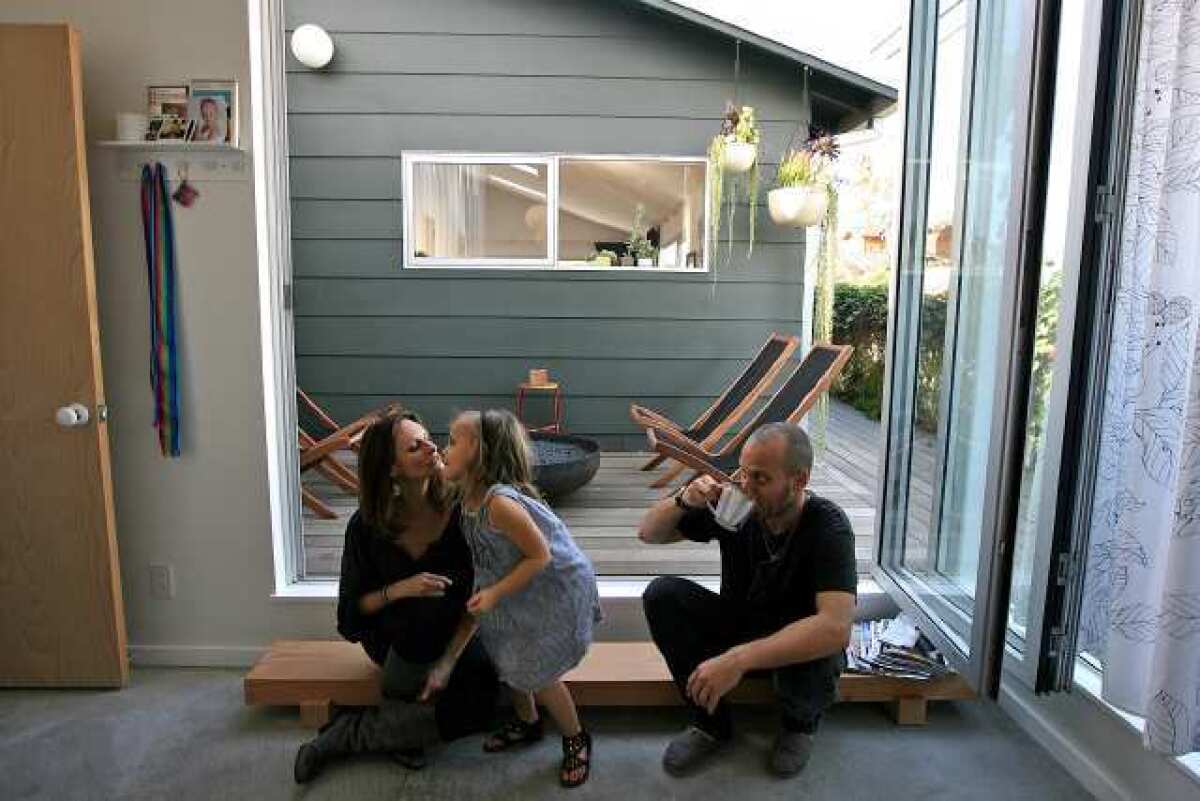
The new and old wings of the house are connected by a short, glass-walled hallway that looks out to a petite deck. By leaving the courtyard-like space between the addition and the original house, McLanahan preserved natural light that came in through an existing kitchen window. Now the window lines up with a glass door in the master bedroom, and two people can wave at each other from opposite sites of the courtyard.
Whenever possible, McLanahan and the Trattners used inexpensive materials and took a pragmatic, budget-minded approach: white laminate IKEA cabinets, unfinished birch doors, concrete floors in the addition, simple white subway tile from Dal-Tile, even $3 porcelain light fixtures. Framing posts double as a screen along the stairway. A rooftop deck was added to the existing garage. The aluminum siding and commercial grade aluminum windows should require no maintenance. The biggest splurges were custom Corian countertops in the kitchen and the NanaWall folding glass door in the master bedroom.
The Trattners benefited from hiring an architect who lived nearby and understood the area. The home’s one-car garage -- a necessity in a packed neighborhood with little parking -- blocked light and air from the west. To enhance airflow, McLanahan added three operable skylights to the original house and an oversized skylight in the stairway leading to Ever’s bedroom. McLanahan also installed hopper windows, which are operable transom windows, above the bedroom and bathroom doors to improve ventilation.
Perhaps the biggest impression, though, comes from the couple’s sense of color. Vibrant pink in the kitchen and magenta walls in the dining room create a striking silhouette, particularly at night when viewed from the street.
The home sits on a corner lot and is exposed on three sides, which creates a bit of a fishbowl effect. Sharonne initially wanted to put up a high fence for privacy (“a sad trend,” McLanahan says with a sigh), but is now glad they didn’t.
“It is such a friendly walking community,” Sharonne says. “Everyone walks and rides their bikes and says hello. Our neighbors comment on our garden. It’s just a lovely way to live.”
But ask what she likes best about the house, and the answer is simple.
“The extra space,” she says. “It is so wonderful for all of us to spread out. We all lived together in one big room before. We don’t have to be quiet while Ever is sleeping now. It has become a whole different way of living.”


