This effortless Midcentury look? It takes a lot of hard work — and attention to detail
Have you ever slipped into a well-made piece of clothing and instantly understood the difference between designer and off-the-rack?
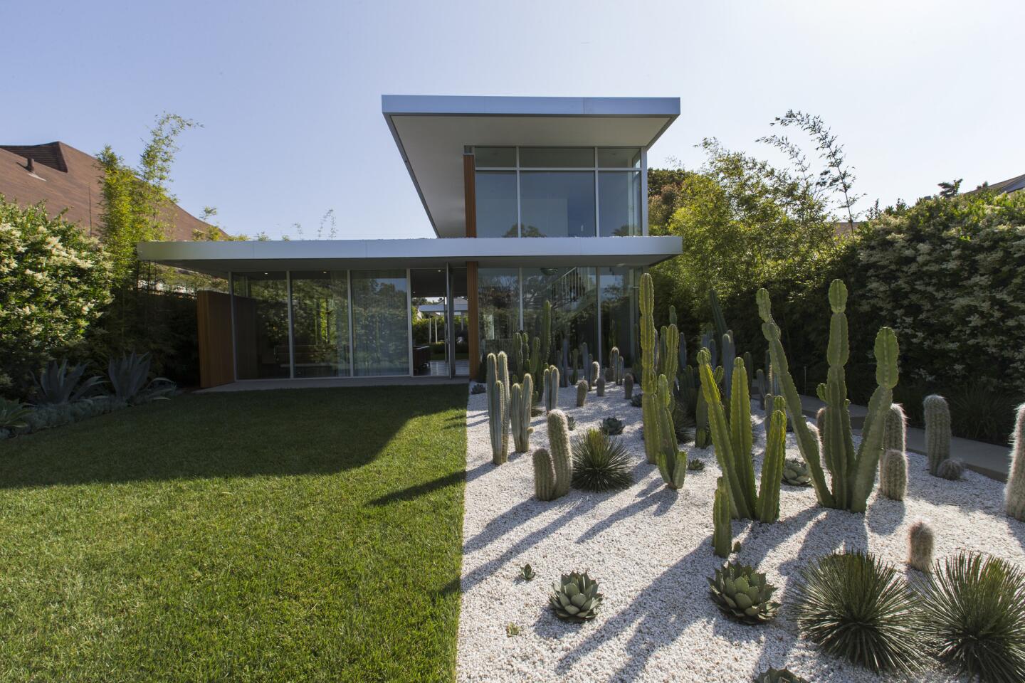
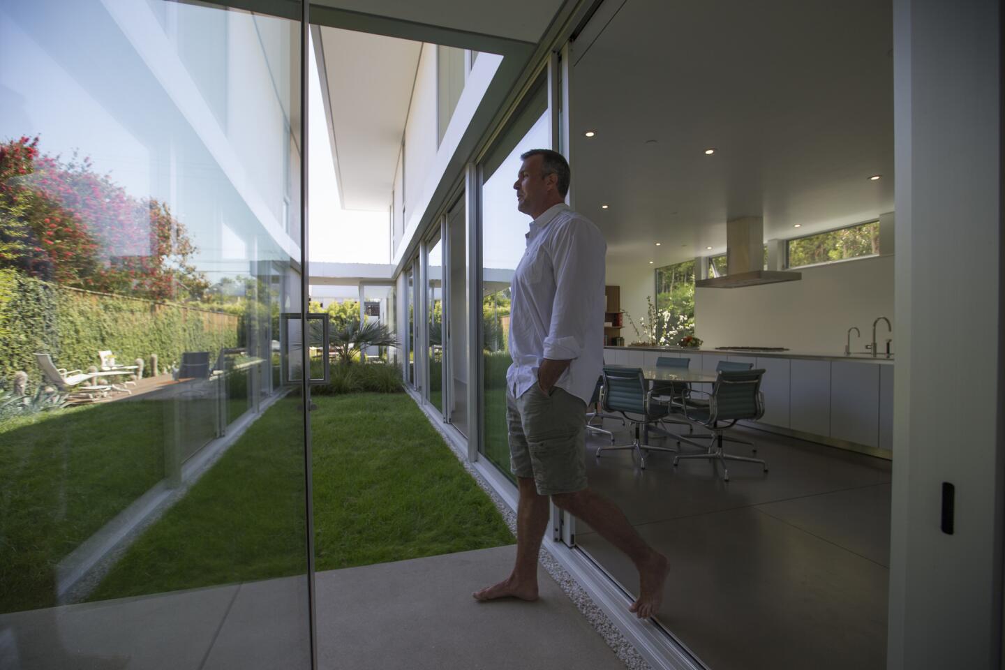
It’s the same feeling you get stepping into the Midcentury Modern-inspired home of Eline Hissink and Scott Yasharian — and for good reason.
As a former couture designer with more than two decades of experience working for the world-renowned fashion houses of John Galliano,
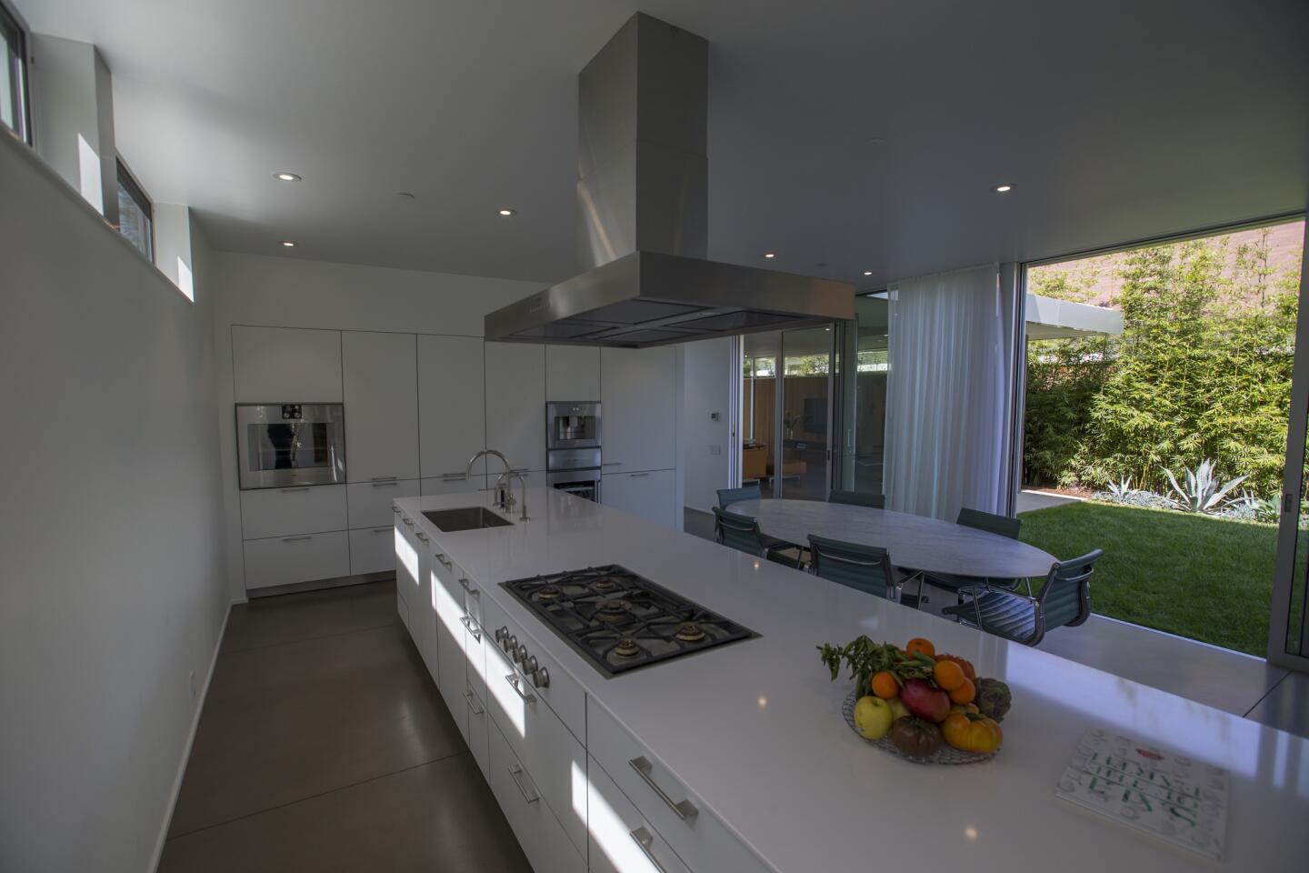
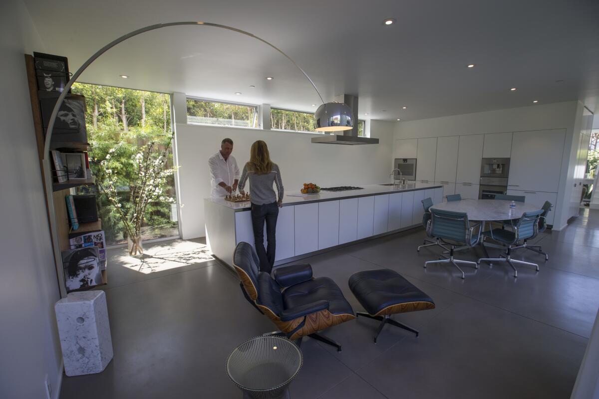
Walking in, you may not recognize that the height of the family’s customized Florence Knoll dining table was raised 1 inch to accommodate increased comfort for the tall couple, or that it took “a tremendous amount of searching” to find a tabletop slab with perfect marbling, or that the midcentury stitch-length on a new Scimitar reading chair could have only been achieved by a vintage sewing machine located in Italy. But it was. And when it’s all put together, you feel it.
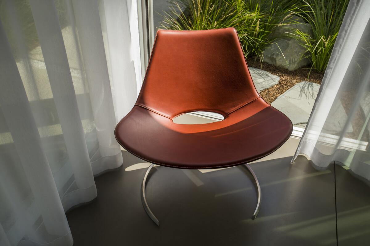
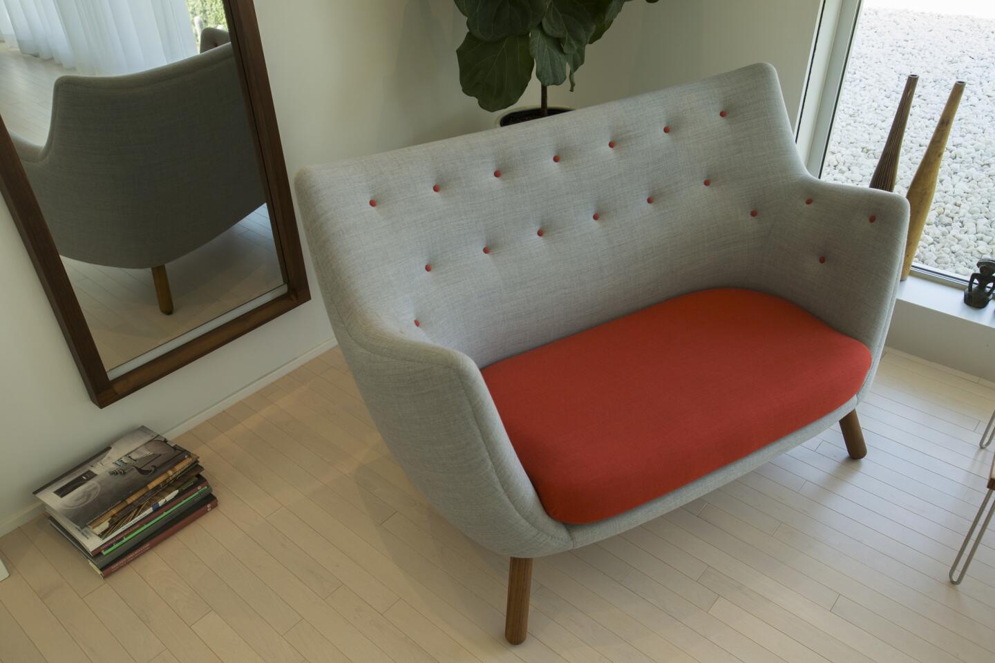
“To me, it’s like art,” Hissink said of the Scimitar chair she commissioned using technical sketches from the original Danish designers. “I had it made in Denmark, then they sent it to Italy where they still have a midcentury sewing machine to stitch the whole thing together. Then it went back to Denmark and they put it together. … While it was there the factory in Denmark was vandalized, somebody broke in and drew all over the chair with a marker, so we had to start over.”
“What we have needs to be functional, sturdy and well thought out,” Hissink said, “that’s why I like modern design. It looks super simple but there is so much thought that goes into everything.”
Life + style
The couple applies the same deliberate thoughtfulness to how they conduct their lives.
After leaving professional positions in design and finance (he is a principal at a financial services firm in Los Angeles), the couple took a year to travel to places like Palau, Yap, Borneo and Palawan in pursuit of a shared passion for scuba diving (with infant son Aiden in tow).
Then in 2010, intrigued by the idea of living in Los Angeles, they moved to a rental home in Santa Monica, where they searched for property to build a home and make the move permanent.
“We chose this location because we wanted to be able to walk to the beach, but we needed to be near restaurants,” Hissink said of their leafy neighborhood.
From the ground up
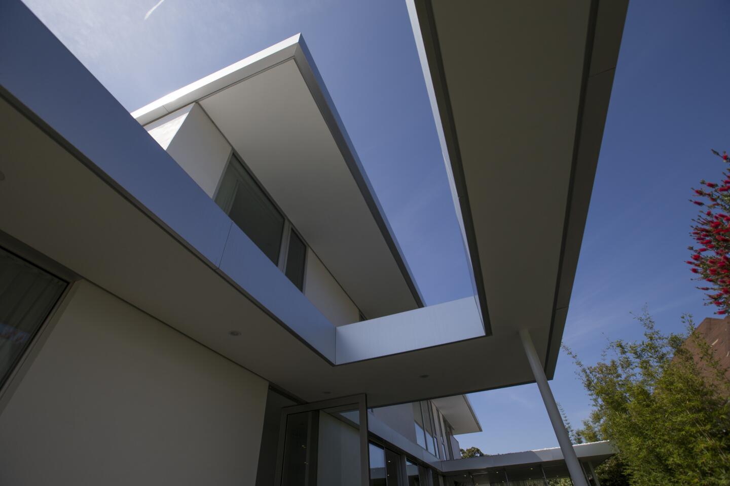
In looking for partners to help build the home Hissink envisioned, the couple clicked with Brett Woods and Joseph Dangaran, two architects who had just started their own firm, Woods + Dangaran, in Culver City.
It took a year to finalize the design and procure necessary permits. The building process took another year and a half.
Whole design
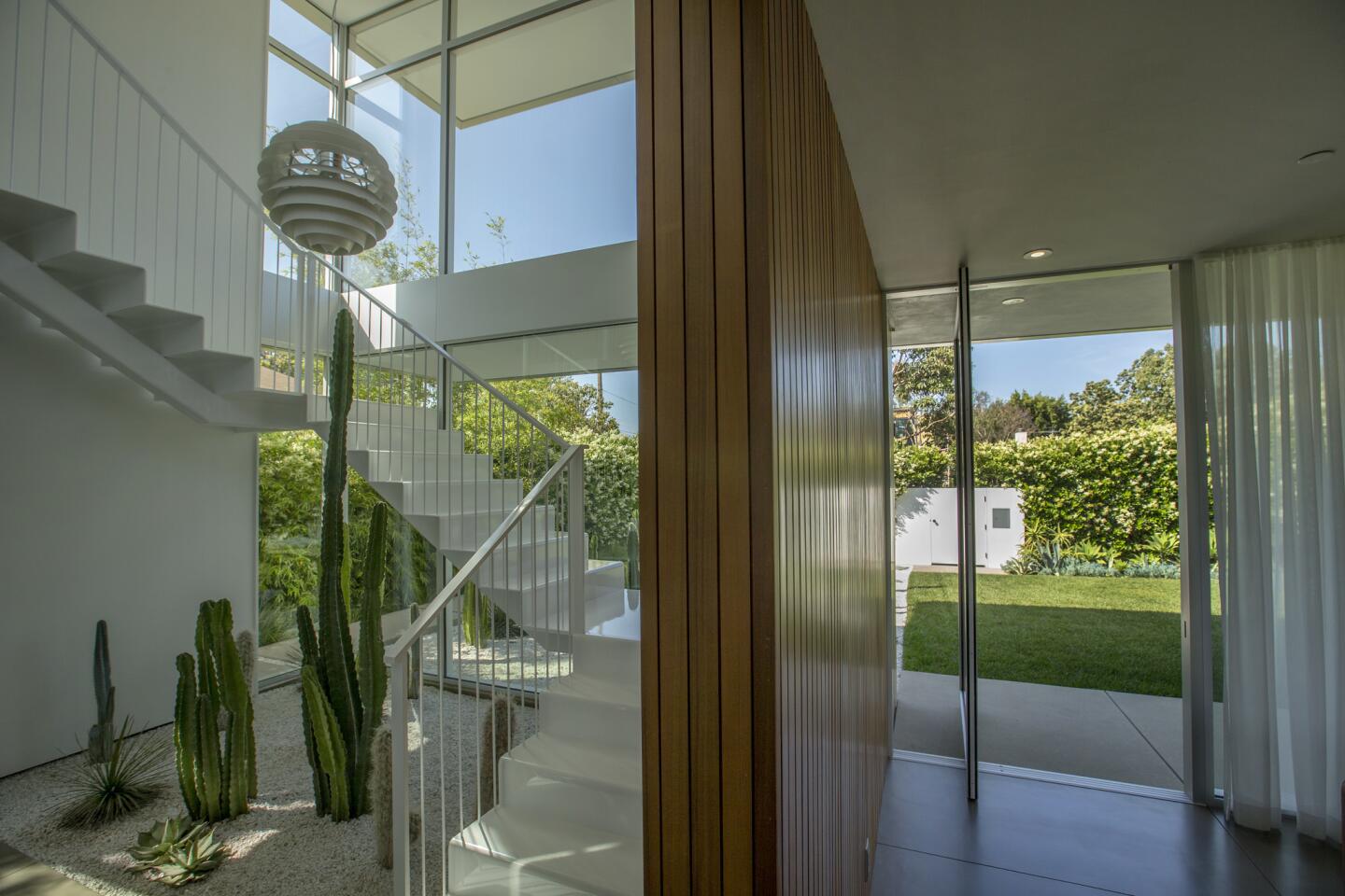
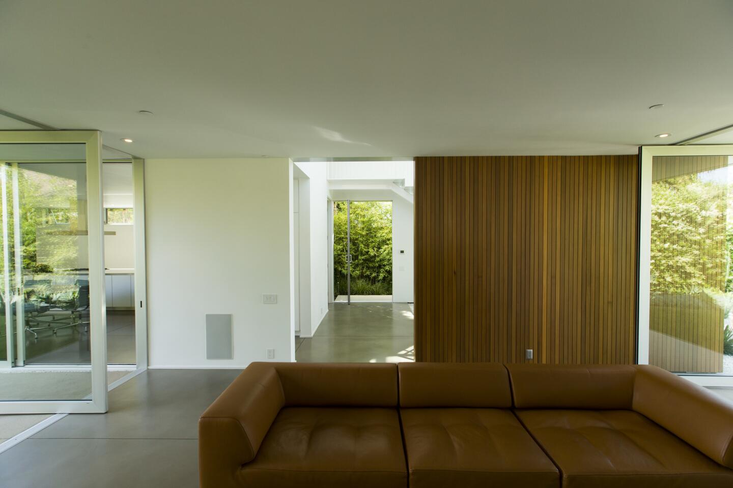
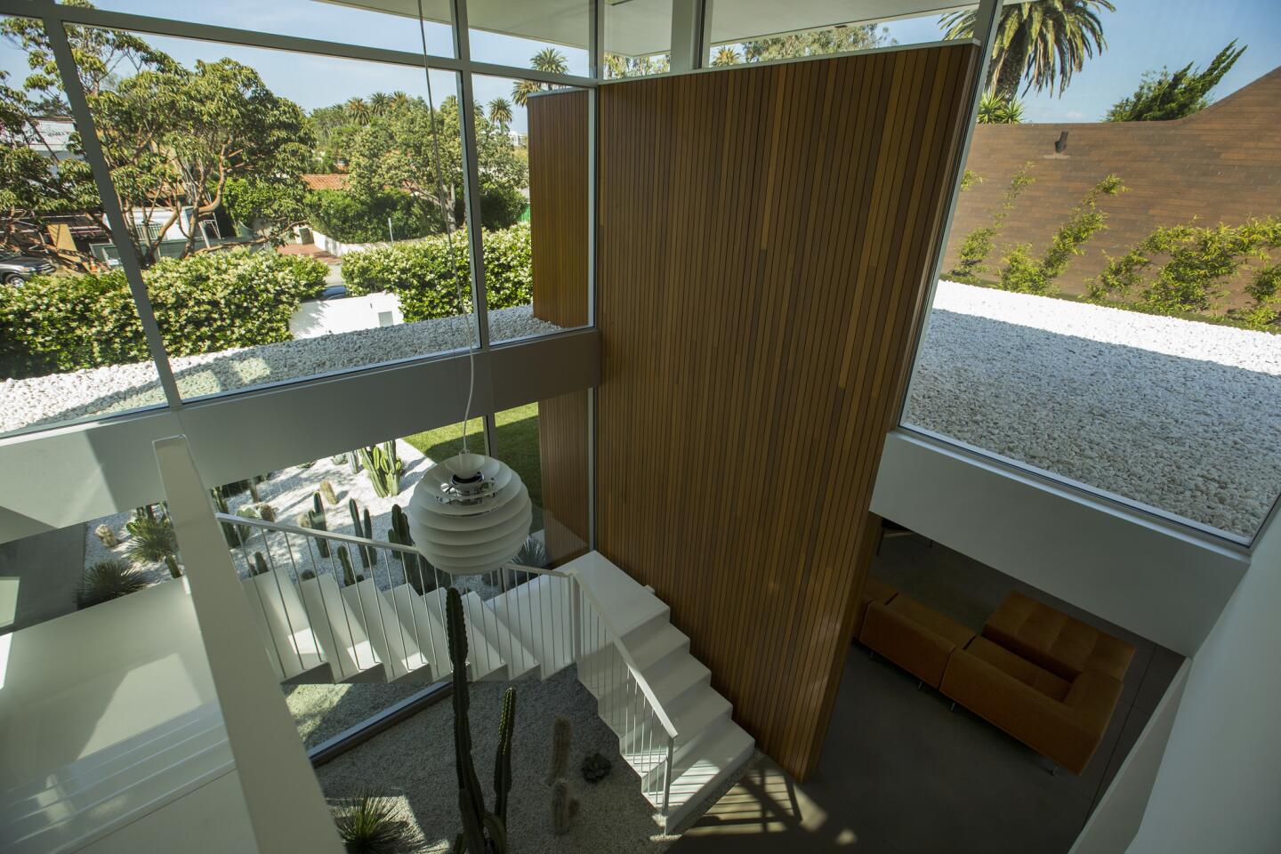
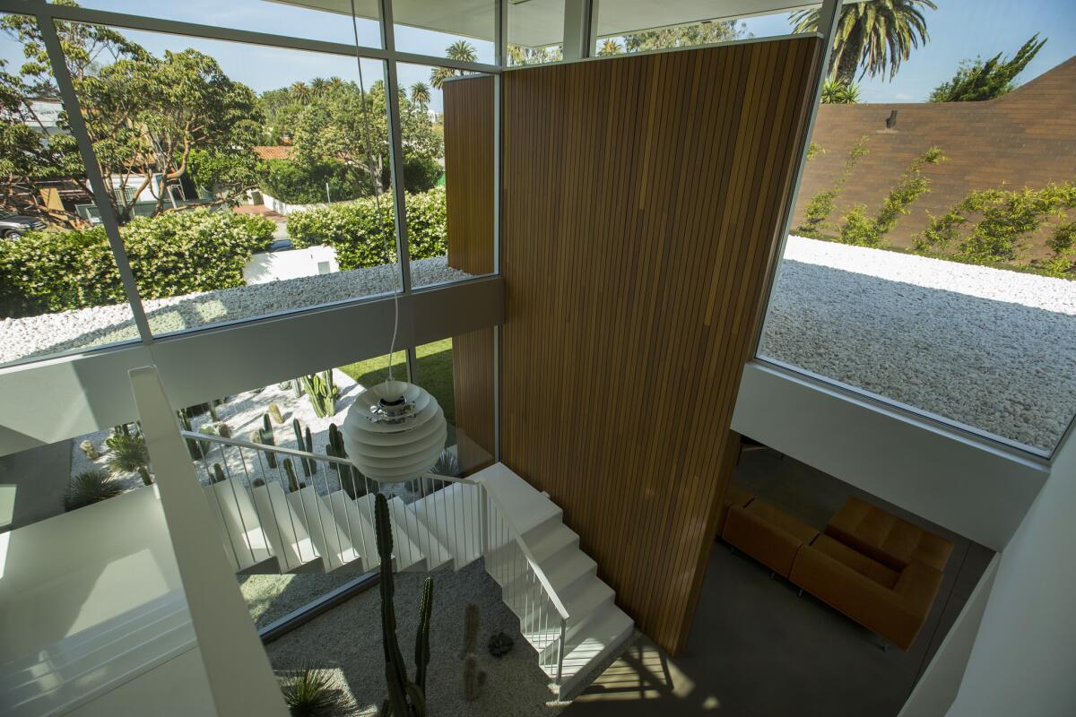
Instead of building a house then furnishing it as an afterthought, Hissink conceived the interior design simultaneously. A wall of vertical red cedar siding in the living room is a focal point. “Without it, the whole living room would have been different,” Hissink said.
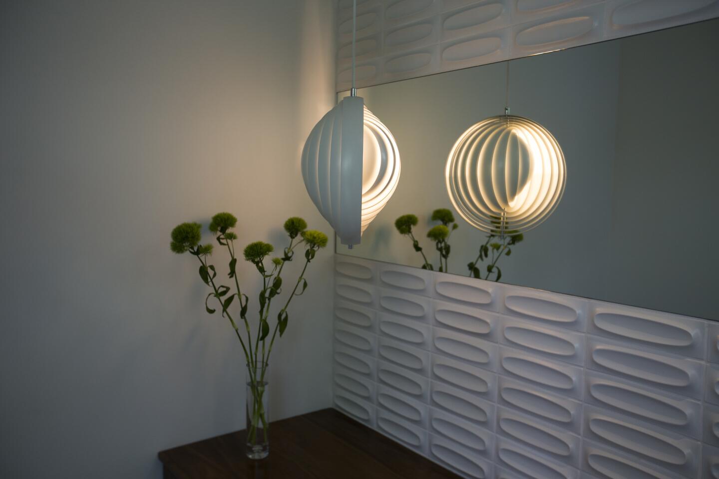
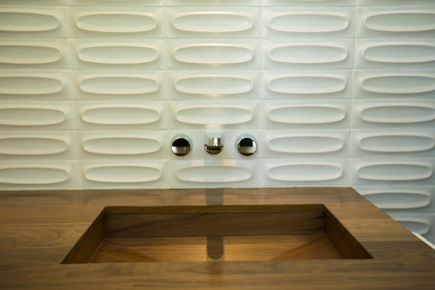
Instead of cutting oval, three-dimensional Heath tiles in the powder room to fit the wall, the wall size was determined by the measurements required for uninterrupted, whole tiles. Hissink drew the width of the grout lines on the wall as a guide.
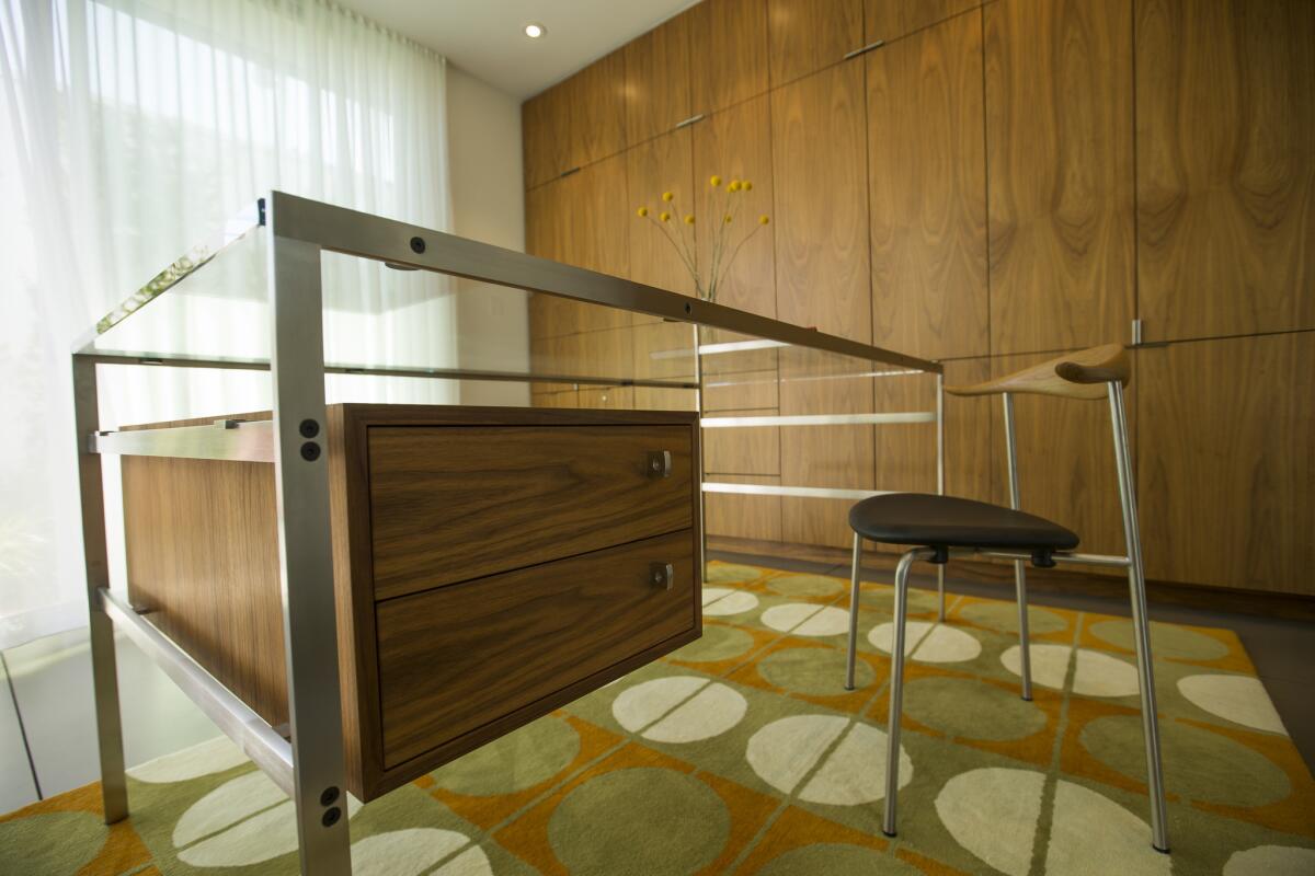
In the study, the quintessential Midcentury Modern Fabricius & Kastholm bo-555 writing desk had not been manufactured for more than two decades when Hissink tracked down the original technical drawings of the desk and commissioned a Danish craftsman to create the piece. In keeping with Hissink’s laser-focused attention to detail, the cut of the floating walnut drawers on the desk mirrors the cut walnut used in built-in cabinetry elsewhere in the room.
The steel staircase in the entryway was delivered in three separate pieces by crane and final assembly was done on-site. “The goal was not to have any [visual] support or pillars,” said Yasharian. “You have to look hard to see where it is connected to the frame.”
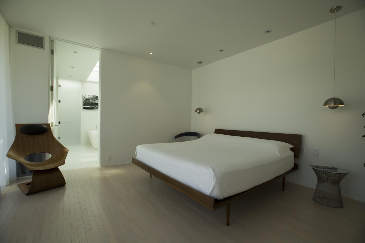
The home’s deceptively simple, minimalist style is in the details.
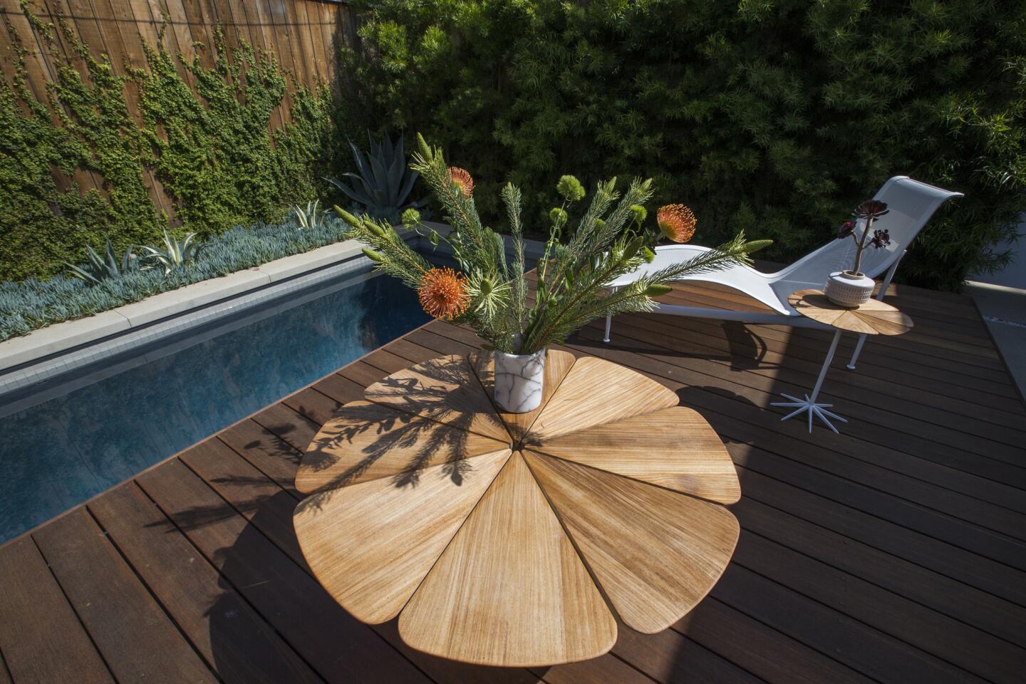
The lap pool, painted dark blue, is the only thing on the property that doesn’t conform to midcentury protocol. Midcentury blue “stood out too much,” Hissink said, “and we kind of like it looking more natural.”
Simple pleasures
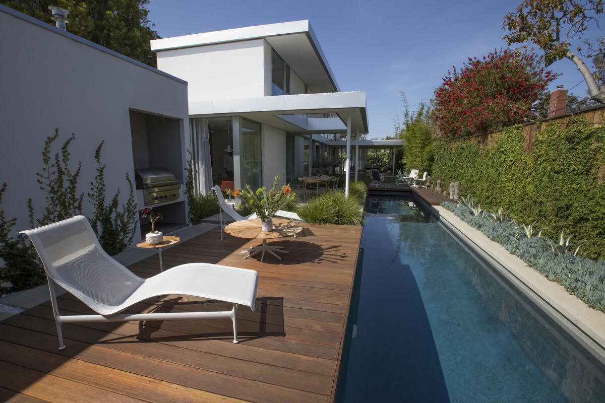
Clutter is anathema to a home like this.
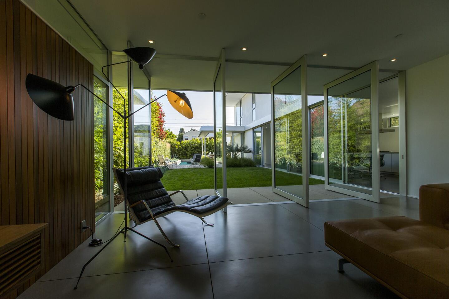
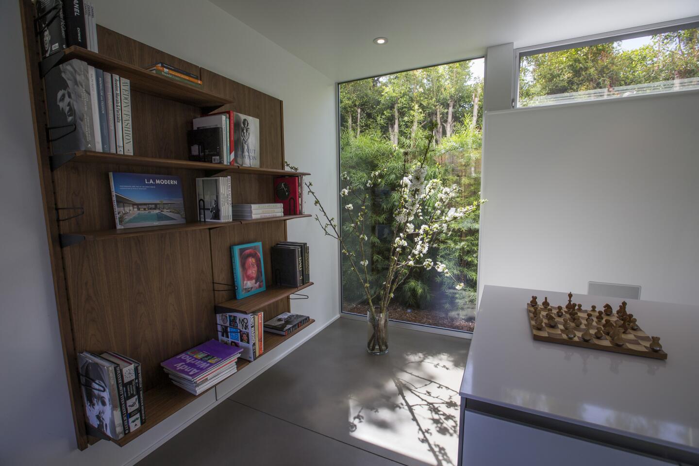
Pivoting walls of glass are framed by breezy, flowing sheaths of fabric hanging from the tall, airy ceilings to the perfectly painted concrete floors. Floating walnut shelves hold an edited selection of books; vintage lighting was carefully chosen from Danish Modern designers such as Arne Jacobsen, Verner Panton and Poul Henningsen; and knickknacks are a no-no.“We like a clean space,” Hissink said, “because we traveled so long [for work as well as pleasure], it came from everybody having only one suitcase and not needing much more.”
“I think you get bombarded with so much stimulus all day long,” Yasharian added, “that to me it’s a luxury to just turn it all off.”
Still child-friendly
According to his parents, Aiden, now 8, is onboard with the anti-clutter aesthetic as well. “He’s very good with it,” Hissink said.
In his own, orderly room, Aiden has control of the decor, which centers around a map of the world dotted with pushpins (he could claim passport stamps in more than 20 countries before he turned 3) and a large photograph of an airport, scored in Germany. “It’s a child’s room,” Hissink said, “he should be able to do whatever he likes.”
As for the rest of the house, Hissink insists the sleek, sophisticated style is more kid-friendly than you might think. “We like it to be clutter-free,” Hissink said, “but for everyday what we have needs to be functional and sturdy.”
Admittedly, kid-friendly durability, timeless style and customized designer furnishings don’t come easy — or cheap.
“You go through this process and spend the money, you want to have the right emotional response to it in the end, and to me to sit here and read a book,” said Yasharian of the glass-walled living room that opens onto a perfectly appointed pool area, “it’s really peaceful.”
Bonnie McCarthy contributes to the Los Angeles Times as a home and lifestyle design writer. She enjoys scouting for directional trends and reporting on what’s new and next. Follow her on Twitter @ThsAmericanHome
ALSO:
A dilapidated Venice bungalow is reborn as a 'crazy' family compound
Sign up for The Wild
We’ll help you find the best places to hike, bike and run, as well as the perfect silent spots for meditation and yoga.
You may occasionally receive promotional content from the Los Angeles Times.
