DIY Project: How to ‘Masters of Sex’ up your kitchen with just a little paint and paper
In its third season, Showtime’s “Masters of Sex” has taken a few critical lumps of the less-talk-more-sex-please stripe, but the show’s period production design continues to seduce home decor fans.
The series, which documents the personal and professional lives of human sexuality pioneers William Masters (Michael Sheen) and Virginia Johnson (Lizzie Caplan), has been nominated for the Emmy in outstanding art direction for a period series, miniseries or movie (single camera) for its sophomore season.
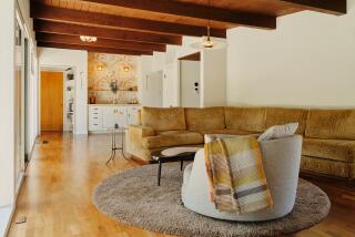
Michael Wylie, the production designer for the first two seasons, crafted distinctive homes for the leading characters. Masters has an office that overlooks Eero Saarinen’s iconic Gateway Arch and lives in a midcentury St. Louis, Mo., post-and-beam. “Clean masculine lines help us understand the Bill Masters is the master of all of his domains,” Wylie says.
By contrast, Johnson lives in a somewhat dowdy, old-fashioned early 20th century duplex.
“Her life is chaotic,” says Wylie. “She took this place because it was available and furnished. We wanted it to seem as though someone’s granny was hauled out feet first and Virginia moved right in.”
In the current season, which jumps forward a few years to 1966, production designer Elizabeth Hershberger Gray and set decorator Halina Siwolop made minimal upgrades to the Masters home, adding Ebay and Etsy finds such as a Curtis Jere-style metal wall sculpture and a pair of modernist living room yellow wing chairs from Blend Interiors in Los Angeles. For the open shelves in the kitchen, she added vintage pottery, Russel Wright Iroquois dishes and a Scandia coffee set produced by Harmony House Fine China.
To reflect Johnson’s rising financial and social status, Gray and Siwolop brightened her home, adding a Chinese Deco rug, furniture in lighter woods and tone-on-tone wallpapers in the living and dining room. The most dramatic change was in Johnson’s kitchen.
Inspired by “Interior Solutions,” a collection of photographs of interiors showcased in Armstrong flooring advertisements in popular magazines in the 1950s and 60s, Gray created a two-tone floor using Azrock vinyl composition tile in lemonade and pistachio.
Playing off the floor colors, she then painted the walls teal (Benjamin Moore Preview Collection 2050-50 Waterfall) with accents in a darker tone (2050-40 Florida Keys Blue). The cabinets got a sunny disposition with Benjamin Moore’s Historical Colors HC-4 Hawthorn Yellow. To add even more vibrancy, she found a floral paper at Astek Wallcoverings in Van Nuys and had it applied as insets on the fronts of the paneled kitchen cabinets, a look that can be replicated by DIY types.
The blue-check countertops were a bit of Hollywood magic -- wallpaper covered in several coats of clear sealer to look like Formica — which may not be practical in working kitchens. Above the sink, Siwolop says she added “cafe curtains which were the rage during that era” made from yellow gingham purchased at Michael Levine Inc. in downtown Los Angeles.
“We imagine the update is Virginia’s way of feeling in control in an otherwise frenzied home life,” Gray says. “There are also a number of stressful and heated scenes that take place in this kitchen and there’s something wonderfully uncomfortable about seeing these poignant moments juxtaposed against this lively colorful backdrop.”
Twitter: @latimeshome
ALSO:
TV shows that catch interior designers’ eyes
We’ve certainly been ‘Mad’ for modern
Interior designs for ‘The Gift’ furnish elements of tension
More to Read
The complete guide to home viewing
Get Screen Gab for everything about the TV shows and streaming movies everyone’s talking about.
You may occasionally receive promotional content from the Los Angeles Times.


