Review: Temple loses some of its eccentric personality in stylish redesign for Marciano Art Foundation
I’ve now walked three times through the 1961 Scottish Rite Masonic Temple on Wilshire Boulevard, that block-long, travertine-wrapped crypt of a building designed by architect and artist Millard Sheets.
During a first visit in fall 2014, about a year after Guess Jeans founders Paul and Maurice Marciano bought the temple for $8 million with the goal of turning it into a museum, I was struck by the deep weirdness of its architecture inside and out. It occurred to me that the building had been not just a container for various Masonic rituals but also — since those rituals were performed in private, deep within a nearly windowless temple, by an all-male group wearing elaborate costumes — a fascinatingly complex architectural symbol of the relationship between masculinity and civic culture in postwar Southern California.
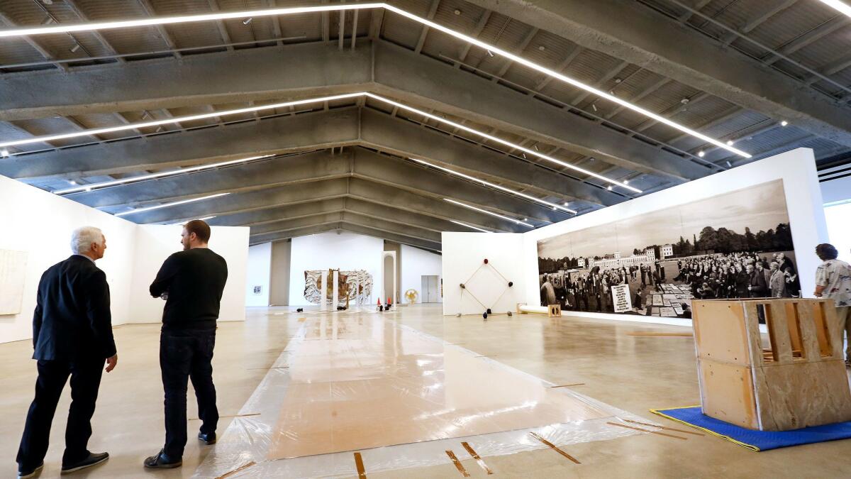
The second time — after Kulapat Yantrasast, the Marcianos’ architect, had finished redesigning the temple but before the art had been installed — I was unhappy to discover that much of that weirdness had been banished in favor of the sort of antiseptic, perfectly rational galleries you can see at any art fair on almost any continent. Yantrasast, I concluded, had sanitized the building in an effort to update it. He had White Cubed it!
My final visit — during Thursday’s media preview for the building, officially rechristened the Marciano Art Foundation — managed to temper some of those worries. Now that the temple is filled with pieces from the Marcianos’ collection, the gallery walls seem less insistent in their newness and whiteness, the original architecture less marginalized or cowed by the additions.
It seems clear that Yantrasast’s goal has been to create a series of spaces where visitors can disappear into the collection before reemerging to consider the building itself. It’s not hard to imagine why the Marcianos, who after all bought the temple so they’d have a place to introduce their art to the public, would push their architect in that direction. The brothers also deserve credit for opening an important L.A. landmark to the public for the first time.
Yet I still found myself wondering what might have been: what Yantrasast and the Marcianos might have created if they’d seen the eccentricity of Sheets’ temple — truly one of the oddest but also most emblematic buildings of 1960s Los Angeles — not as something to keep in check but instead to grapple with, spotlight or even exaggerate.
Buildings that advertise their private-ness have a long history in American architecture. The secret societies at Yale, designed by prominent architects including Bertram Goodhue and McKim, Mead and White for an all-male membership, are among the best known examples of this contradictory building type, with its conspicuous, even vain, brand of introversion.
Sheets’ take on this tradition was perfectly suited to postwar Los Angeles. The L.A. of 1961 was a city embracing its private side, discovering the independence and elbow room made possible by a growing freeway network and a sprawling collection of residential subdivisions.
Masonic lodges had already been built all over Southern California, of course, and most were similarly windowless and tomb-like. But the scale of Sheets’ temple — the way it was perfectly positioned to be seen by a car speeding by on Wilshire, the way it took on the size and self-importance of a courthouse or other public building — suggested the extent to which Los Angeles was transforming itself.
There was something about the city of that moment that made private buildings like the temple want to flaunt their inaccessibility (think of the Case Study houses, designed for hard-to-reach hillside lots but also for magazine covers) and civic or cultural buildings (think of Dodger Stadium) to shrink from public view.
The temple also mixed architecture and sculpture in way that perhaps Sheets alone could have managed. Born in 1907 in Pomona, he became the head of the art department at Scripps College while also maintaining a career as a painter, designer, mosaicist and architect. His main client in the last category was Home Savings and Loan, for which he designed more than 40 branches.
It wasn’t just in architecture that he showed a knack for communicating the civic ethos of Los Angeles. His 1931 painting “Angel’s Flight,” showing a scene looking down from the top of Bunker Hill, sums up like few other artworks the dense urban landscape of Los Angeles between the world wars. (It’s now owned by the Los Angeles County Museum of Art.)
What Sheets created for the Masons is a building, at least on its exterior, whose architecture is largely made of sculpture and vice versa. Sculptures by Albert Stewart (a colleague at Scripps) of the great builders of history, including Christopher Wren and Egyptian priest and architect Imhotep, decorate the south-facing Wilshire facade; many of the figures are shown holding or standing in front of architectural models, buildings and cityscapes. That easy marriage of art and architecture continued inside, where mosaics by Sheets were a dominant element.
In some cases, Yantrasast (and his colleagues at the firm he founded in 2004, wHY) and the Marcianos have removed these examples of the exuberant quality of the original design, including a giant fresco overlooking the lobby that featured a history of the Masons in California. In other cases, they’ve been covered, wrapped in protective glass or partially hidden behind new plaster walls.
Other design decisions — spraying exposed steel beams with fireproof material, for example — were essentially made for Yantrasast by code requirements. The result is a work of architecture whose personality has been muted, its rougher edges sanded smooth.

SIGN UP for the free Essential Arts & Culture newsletter »
Given how useful IRS rules make museums of this kind to their patrons’ bottom lines, it also seems fair to say that a temple built as a vessel for ingrown fraternal rituals has been stylishly redesigned to hold a collection of tax breaks.
The entrance along Wilshire sadly isn’t open in the building’s new configuration. Pedestrians as well as drivers who park in the two-level structure on the northern side of the temple are brought around to an attractive plaza and sculpture garden and then past a bookstore and cafe into the spacious lobby.
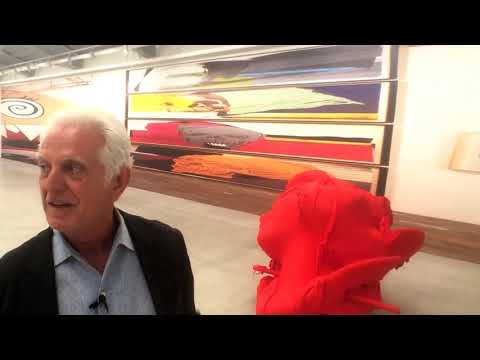
Behind a bank of elevators at ground-floor level is one of the foundation’s two show-stopping spaces. The old auditorium has been removed, opening up a massive gallery, covering 13,600 square feet, with ceilings 40 feet high. For the opening weeks, it holds a solo exhibition by L.A. artist Jim Shaw that makes ingenious use of the giant painted backdrops the Masons used for ceremonial stage productions.
This is at once the most dramatic space in the remade building and the one that strikes the most effective balance between old and new. Along its periphery, in a ghostly pattern etched in the concrete, you can see where the raked floor of the auditorium was attached to the sidewalls.
From this lower level, stairs or one of the elevators take you to a mezzanine and then a second-floor space for special exhibitions. It now features a 49-minute video piece by Lizzie Fitch and Ryan Trecartin called “Ledge.” Much of it was filmed inside the temple before it was remade; pause here and watch for a few minutes if you want to get a sense of the oddness of the original architecture.
At the top of the temple is a vast, column-free gallery covering 12,800 square feet where the ballroom used to be, along with three smaller galleries. (In total the 110,000-square-foot building has 55,000 square feet of exhibition space.) A narrow terrace overlooking the parking lot and offering remarkable views of the Hollywood Hills runs along the temple’s northern edge.
It’s on this level that the White Cube effect grows strongest: the combination of polished concrete floors and white plaster partition walls — holding paintings by Christopher Wool, Wade Guyton and Takashi Murakami, among other artists — can easily lull you into an Art Basel trance.
The result is a work of architecture whose personality has been muted, its rougher edges sanded smooth.
There are some reminders on this floor of the similarly column-free top level of the Broad museum downtown, by the New York firm Diller Scofidio + Renfro. This isn’t simply because the Marcianos’ collection overlaps with Eli and Edythe Broad’s. It’s also because the architectural priorities are the same, despite the fact that the Broad was purpose-built.
In both cases, the goal is a hermetic and visually efficient top-level space, with the distractions offered by the outside world kept to a minimum. It’s really that hermetic, well-scrubbed quality that surprised me most when I first saw what Yantrasast had done with the temple. I wouldn’t have thought it possible, given how singularly strange, how thick with history, this giant top-floor space appeared when I first visited.
On your way back down to the lobby, be sure to stop on the mezzanine to see what’s labeled the “Relic Room.” Organized by Susan L. Aberth, a Bard College professor hired by the Marcianos to help catalog and preserve the fraternal objects found in the building, it is a miniature museum in its own right, holding photographs, fringed and embroidered banners, elaborate headgear and other memorabilia.
It collects the eccentricity that once filled nearly every square inch of the temple and stacks it neatly out of the way.

christopher.hawthorne@latimes.com
Twitter: @HawthorneLAT
ALSO
The art review: Marciano’s outlandish special exhibition lends hope to an iffy museum collection
The profile: Kulapat Yantrasast, the architect behind the Marciano Art Foundation
The scene: The Marciano’s opening gala
The sneak peek: Inside the Marciano Art Foundation
More to Read
The biggest entertainment stories
Get our big stories about Hollywood, film, television, music, arts, culture and more right in your inbox as soon as they publish.
You may occasionally receive promotional content from the Los Angeles Times.


