When banks were banks
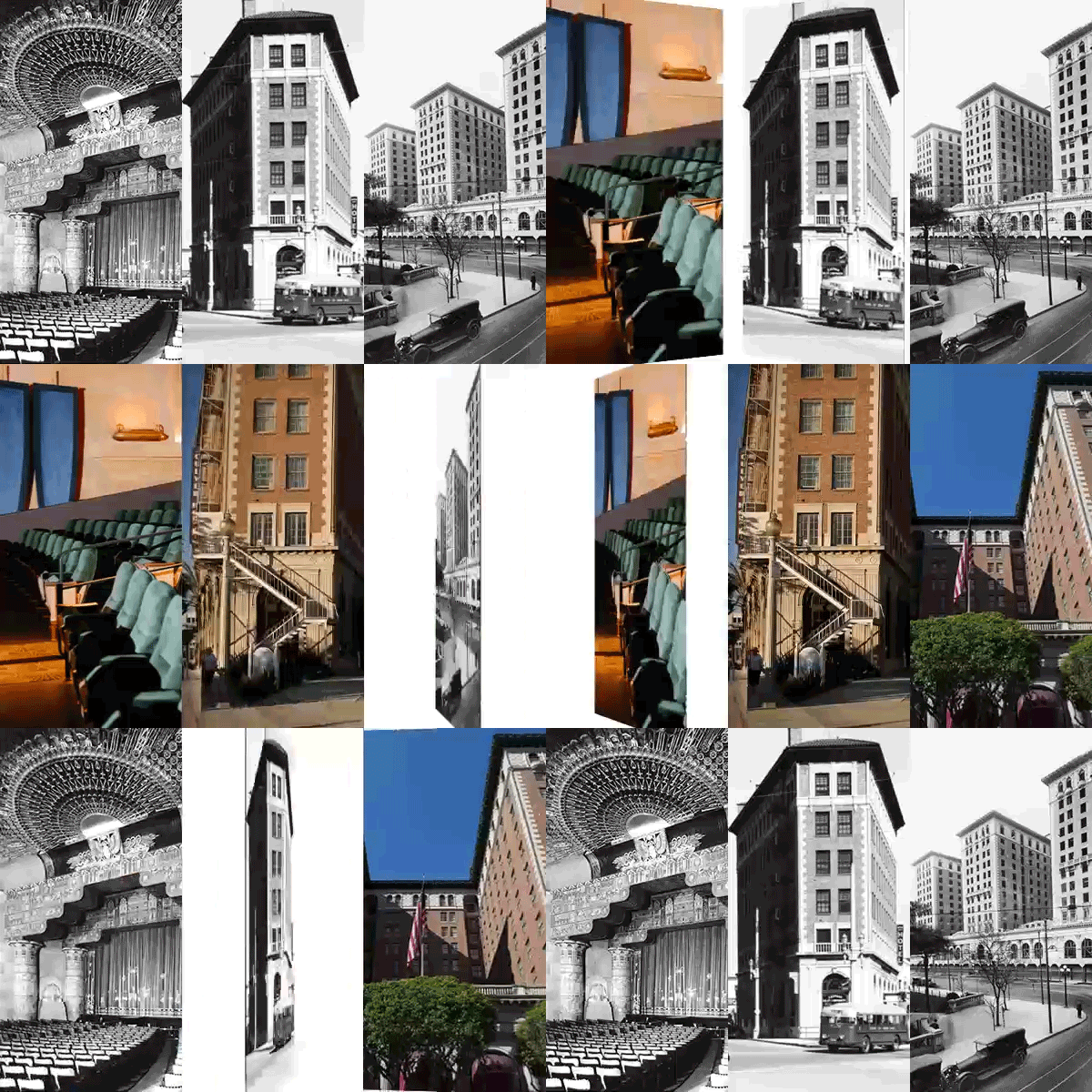
Imiss Southern California’s old, rock-solid banks. The ones sheathed in enough granite to survive a missile strike. The ones with lobbies decked out with marble and mahogany and statuary to rival an Old World palace. Their ornate trappings brought a sense of splendor to L.A.’s Pop-Tart suburbs. More important, whatever the true state of their balance sheets, their financial-fortress architecture conveyed strength and stability. They were built to last.
Contrast that with recent scenes of customers lined up in front of stucco storefronts to pull their cash from failed IndyMac Bank. As lenders and government officials seek to restore our confidence in the shaky financial system, they certainly could use more reassuring backdrops: soaring pilasters, Romanesque arches -- something to hold on to. But today’s bank architecture conveys as much permanence as those Halloween shops that fill the missing-tooth vacancies in strip malls.
Relics from the age of the gilded teller’s cage can be found from Ventura to Pomona. In downtown L.A., the columned, century-old Farmers and Merchants Bank building -- the Los Angeles Conservancy calls it one of the region’s “finest examples of the early ‘temples of finance’ ” -- now carries on as a location for filming and private parties. It’s like so many grand bank buildings these days, occupied by less-exalted enterprises -- eateries, nightclubs, a cellphone store. Not far from my house in Ontario stands a 1930s gem of a bank, once lauded in the Ontario Daily Report for its “walnut fixtures, marble trim and handsome grillwork.” And now? It’s home to a check-cashing business.
True, most of the unmistakable Home Savings of America buildings, with their trademark mosaics and monumental scale, have managed to soldier on for Washington Mutual, which swallowed up their original masters a decade ago. They are throwbacks, though. Nobody builds banks like that any more.
Banks went on a branch-opening spree starting in the ‘90s and carrying into this decade. Lenders, who once saw branches as loss leaders, had come to realize that retail-style banking “offered a tremendous opportunity to sell additional products and services to their existing clients,” the trade publication Community Banker noted. Come in for a cashier’s check, leave with a home equity line of credit.
As the housing bubble inflated, bank design became as relaxed as the lending standards. The high-ceilinged, palatial approach gave way to cheery little branches largely indistinguishable from the smoothie shops and clothing boutiques they squeezed alongside in suburban shopping centers. The goal was to be welcoming, like a come-as-you-are coffeehouse, with soft colors and cozy furniture. Coffee service and children’s play areas encouraged patrons to stick around. Plate glass replaced bunker-like exterior walls. Gone was the sharp divide between teller and customer -- employees were repositioned to work side by side with the public.
Among the big thrifts, it was Washington Mutual that led the way, going so far as to patent its “open, welcoming” branch design, “much like a Starbucks or Gap store,” according to a 2001 news release hyping one of WaMu’s first such outlets, which also promised a “khaki-clad concierge.”
So the once-grand bank became just another strip-mall storefront. Uptight bankers were supplanted by easy-going customer service representatives. Video game consoles and plasma TV screens found their way into waiting areas at some branches around the nation. Hot tubs and booze-laden mini-fridges would have surely been next, if only the financial boom times had lasted a bit longer.
Now, as Americans endure an extended easy-money hangover, it’s become obvious that we shouldn’t become too buddy-buddy with our bankers -- nor should they with us. And perhaps the buildings they conduct commerce in, the places where we put our homes and businesses on the line, shouldn’t feel like casual hangouts.
The late Millard Sheets, the enterprising artist who designed Southern California’s Home Savings buildings of the ‘50s and ‘60s, used to tell stories of how quickly his expensive banking palaces paid for themselves. Patrons loved to be associated with art and beauty, he told an interviewer for the Smithsonian Archives of American Art in 1986. And his buildings’ solidity and grandeur had to be reassuring to customers who still carried memories of Great Depression bank runs.
Today, with a mortgage-morose public, banks would be wise to again pay attention to appearances. As lending institutions slowly rebuild their balance sheets, they also should shore up their design, drawing inspiration from the grand old financial buildings. Restore the barrier between teller and patron. Make us wait at the rope lines with passbook in hand. Let our palms sweat as the loan officer sizes us up from behind the big oak desk.
And those flighty, newfangled branches? They will be easy to convert to the frozen yogurt shops and coffeehouses they should have been in the first place.
Mark Kendall is a writer and editor based in Ontario.
More to Read
Inside the business of entertainment
The Wide Shot brings you news, analysis and insights on everything from streaming wars to production — and what it all means for the future.
You may occasionally receive promotional content from the Los Angeles Times.


