- Share via
This story is part of Image issue 11, “Renovation,” where we explore the architecture of everyday life — and what it would look like to tear it all down. Read the whole issue here.
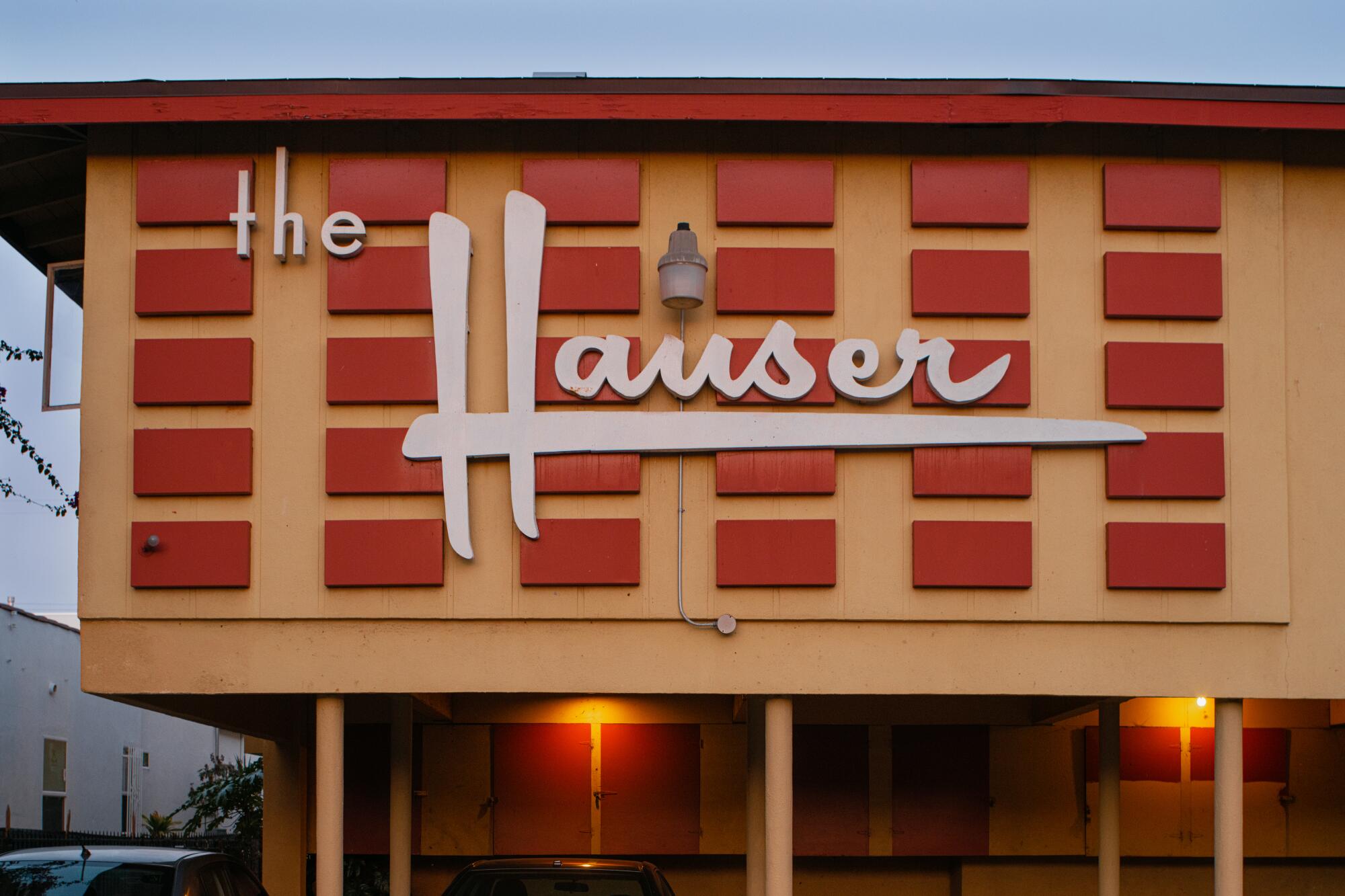
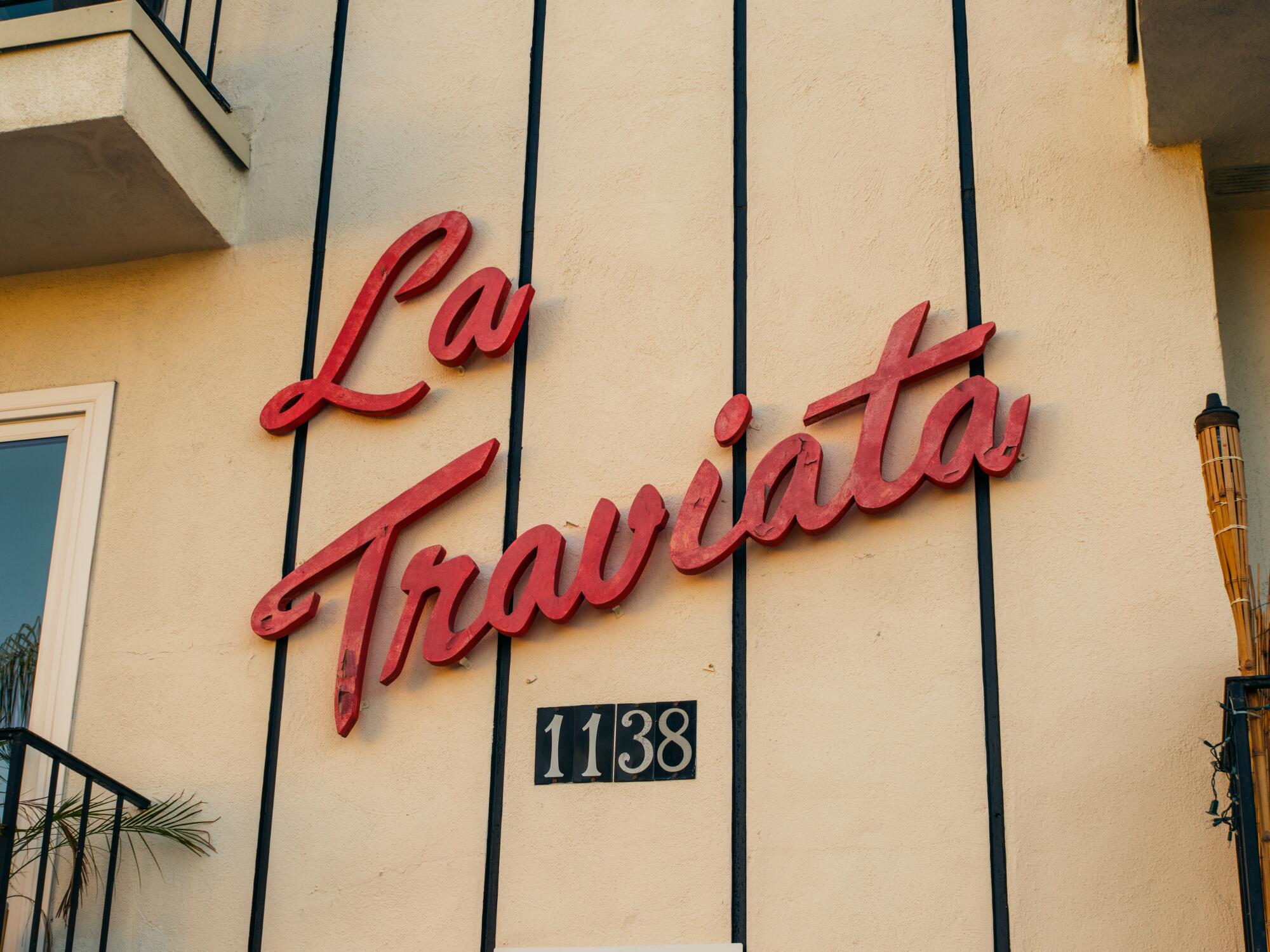
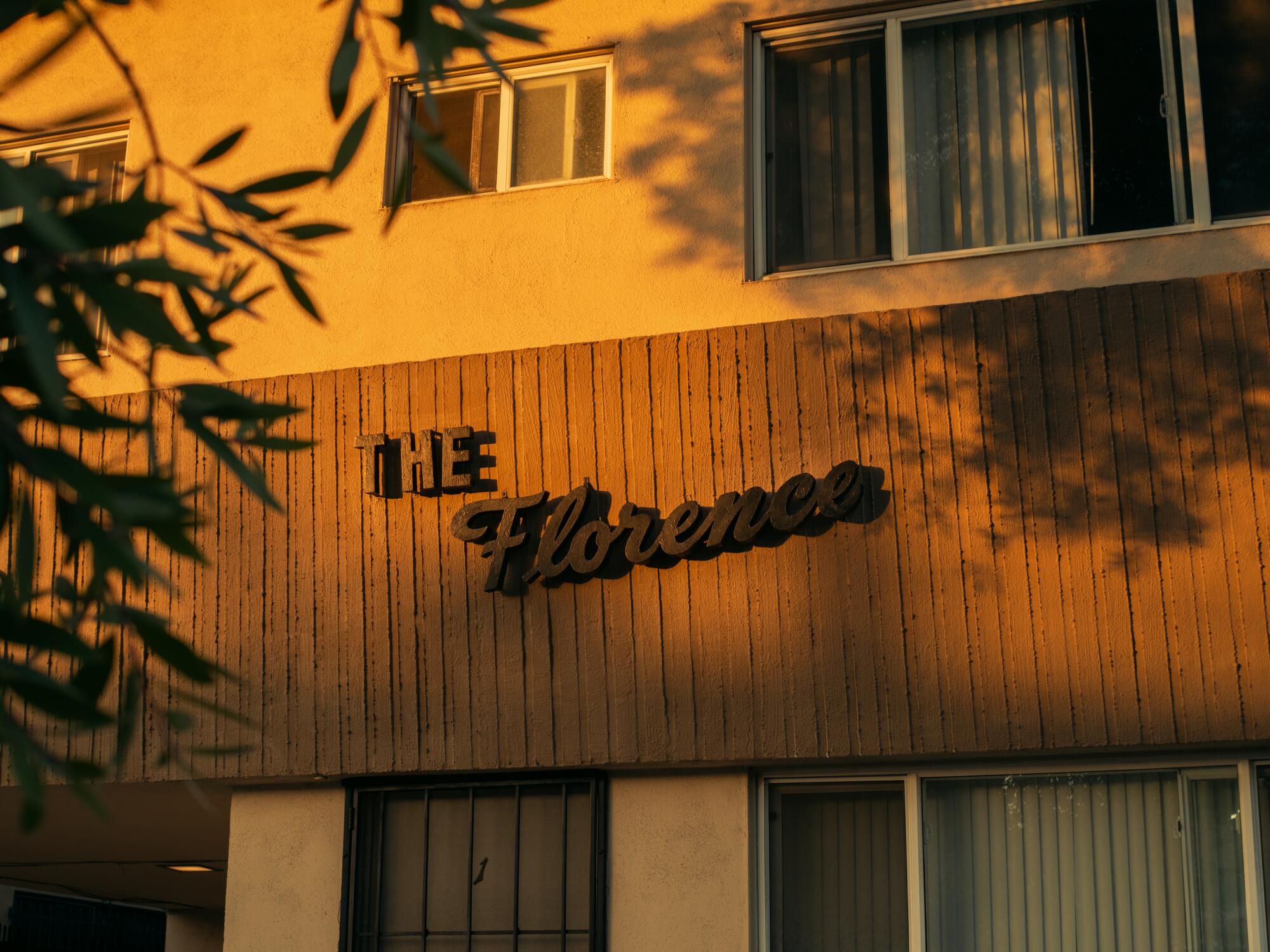
The visual language of L.A. is written on the wall — in cursive; in clunky, cartoonish script; in embossed cutout lettering; in Comic Sans; in unbearably bright uppercase; in dark thought bubbles; in pen strokes accented with imperfect punctuation; and in fonts that can elevate to the realm of calligraphy. You might not have noticed the varying degrees of emphasis that climb, descend and reach across the sides of apartment buildings in the city. But undoubtedly, they guide you, help you know where, exactly, you are. The apartment signs of L.A. announce location through flair, decadence, strangeness, absurdity, signification. When you see an otherwise unremarkable name affixed to a building in your neighborhood, you know — probably to the exact number of paces or miles, if you counted — how much further your intended destination is. That’s the thing about L.A. apartment signs — they point you toward where you need to be: home.
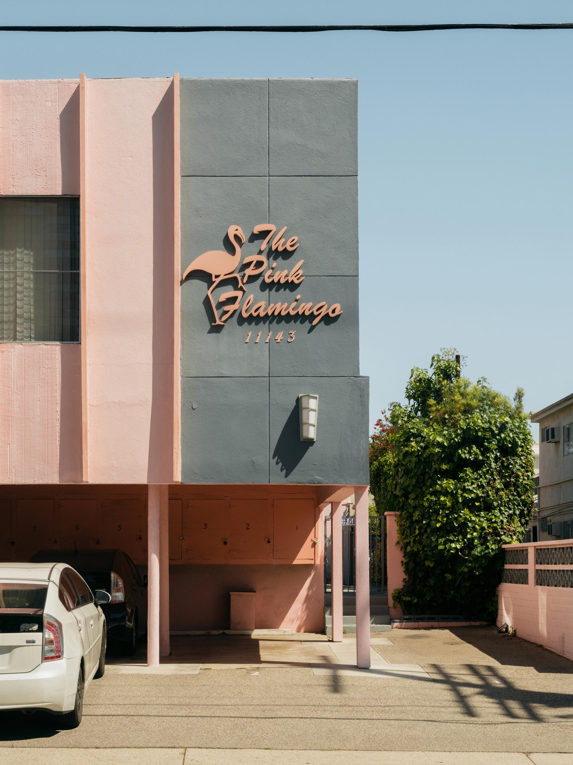
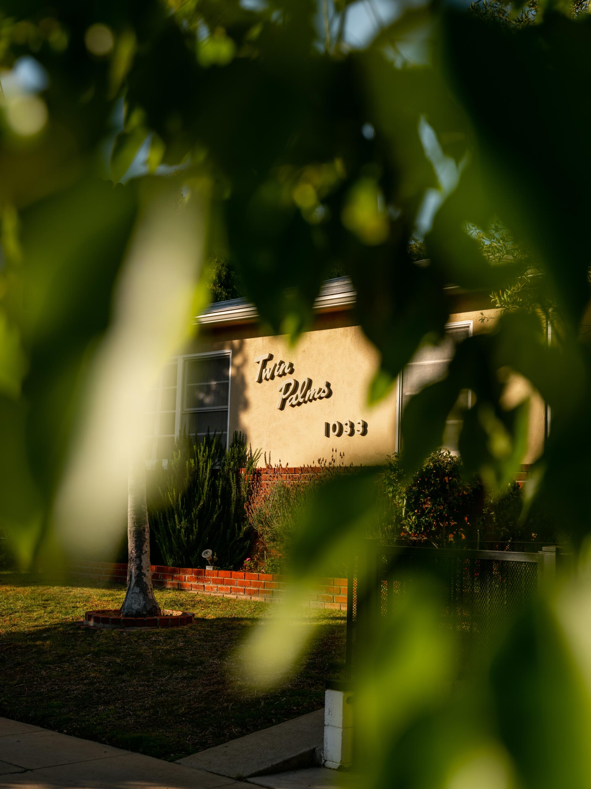
Despite their intentions, apartment signs are perhaps the least noticed letters in L.A. They are, effectively, begging you to look at them. And yet, so often Angelenos make the conscious or subconscious decision not to acknowledge their presence. It’s complicated, of course. There are so many invented forms of exoticism projected onto us from the outside — and through the dominant narratives assembled by Hollywood — that we try to tune out the noise and go about our day. We have things to do. Places to be. Traffic to get into on our way to where we’re going. But the signs offer the promise of ecstasy from within. They’re ready and inviting. Apartment signs are there for us should we pay attention. They don’t force us into any unnecessary relationship. They seem to say, “No pressure. We’re around.”

More stories from Renovation
Author Xuan Juliana Wang reconsiders the meaning of an ADU.
Activist Theo Henderson and scholar Ananya Roy show you what listening to the unhoused looks like.
Critic Dave Schilling investigates the meaning of ‘chic’ carpets.
Artist Ryan Preciado can show you a new path for furniture design.
Poet Christopher Soto envisions an L.A. without carceral architecture.
L.A. apartment signs speak to us but, most important, they speak for themselves. They are like the man on the soapbox preaching to himself on Santa Monica and Western: They want to pique your interest with the gospel, but they won’t do the work for you; you must read and study the text for yourself. Apartment signs beckon us to buy what they are selling. Sometimes that is an idea or a narrative or an image. An aspirational way of living. Other times, the signs communicate a sensibility, a way of being. Whatever the signs hope to say, they know that it takes a marriage of stylization and substance to seal the deal. They understand balance.
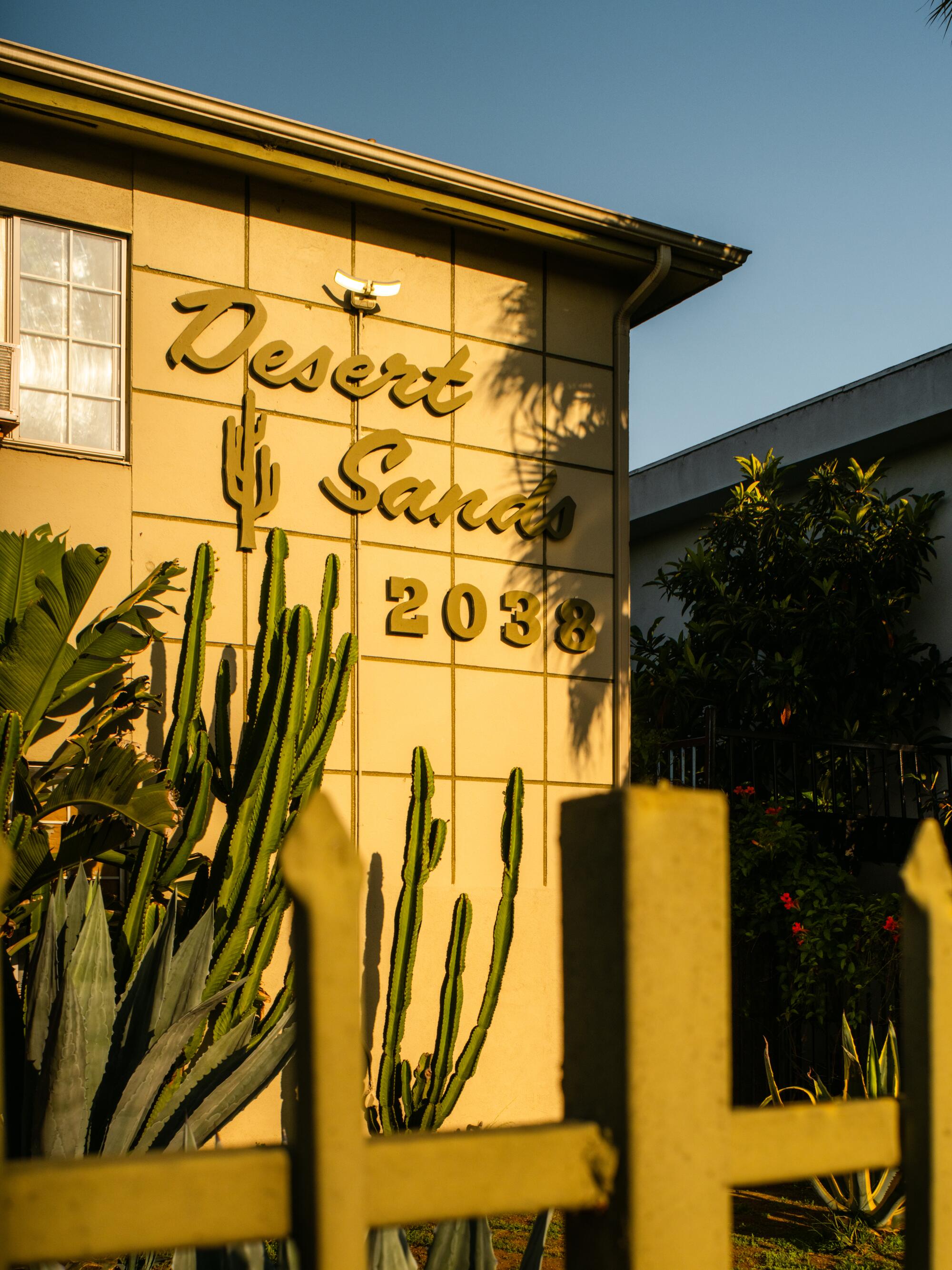
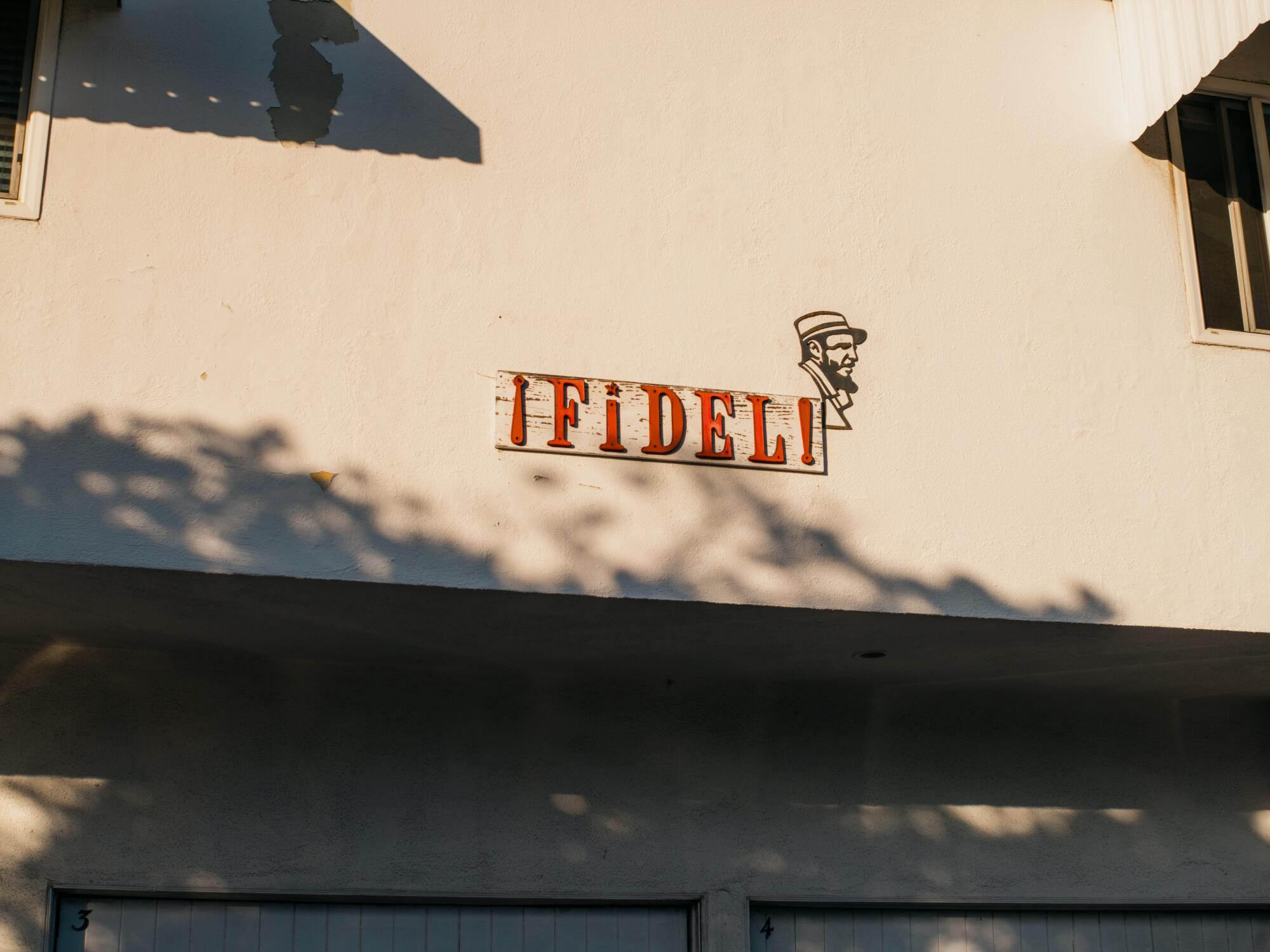
Apartment signs affect us because of the amount of effort put into the premise: Please stop, look, come inside, see if you desire to belong here. There’s innuendo baked into the concept; the main selling point is that the decadence and uniqueness on the outside might signal the apartment’s undeniable quality within. Suggestion is a powerful aphrodisiac anywhere, but especially in a company town built on selling images. The thing about façades is that they are in on the joke; they know what’s behind the veil, or what’s not. Oftentimes, that is lackluster accommodations. The Dunes promised what? Sand. And yet, on “Insecure” it did deliver something familiar to Issa and Lawrence: an architecture that could match their charming imperfections.
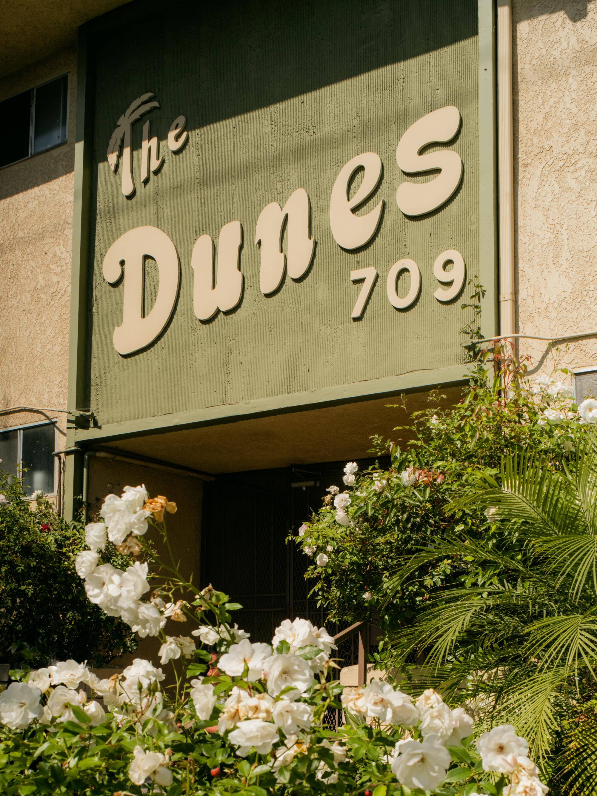
Personally, I love to look at what’s on the outside because the initial encounter offers a way in to what can’t be seen. Exteriors can deceive, they can befuddle, they can refract. They can also challenge you to work harder, to seek, to clarify, to understand. The signs, in my eyes, are about the audacity to announce that something exists, contrary to the city’s tendency toward privacy. Private hedges and gentrifences are aspirational because they are standoffish. They signal possession, accumulation. I don’t want you to see what I have. But the need for privacy doesn’t have to be conflated with private property. The boxes that the signs are written on are private residences — but the signs connect the home to the community. Even if you don’t want to live in the Vista View apartments because there is no vista and there is no view and there isn’t a vista of no views, you understand that the apartment — like the people inside — is a part of the whole. So long live the solicitation. Nothing says you are here like a solicitation to enter. L.A.’s apartment signs are the kitschy welcome mat that let you know: You should stay.
More stories from Image

