Readers weigh in with their picks for L.A.’s best business logo
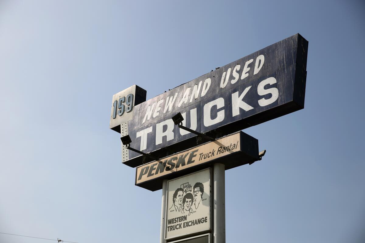
Los Angeles Times readers had lots to say about our arbitrary declaration that Western Truck Exchange had L.A.’s best business logo. And not all of them thought we were wrong.
Through latimes.com, social media and email, Angelenos gave a hat tip to the Western Truck Exchange caricature of brothers Mark, Dan and Wayne Holtzman, who since 1982 have represented the family business in advertising and on signs and thousands of truck mudflaps.
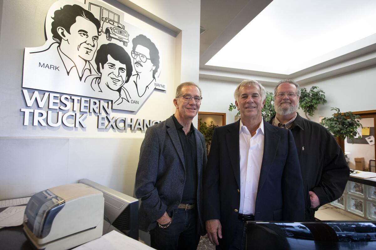
The company, founded in 1922, uses the retro design to set itself apart from the competition in new and used truck sales and vehicle repair.
For some, the smiling trio conjures nostalgia for long-ago Southern California car trips.
“That logo first welcomed me to Los Angeles when I arrived in 1988,” one reader said. “Glad to finally know the story behind the legend.”
Writer and comic Todd Munson tweeted, “Next to the Happy Foot/Sad Foot sign, Western Truck Exchange mudflaps are my favorite L.A. landmark, to the point that I *may* have written a story treatment for a 1 hour CHiPs style drama called Western Truck Exchange.”
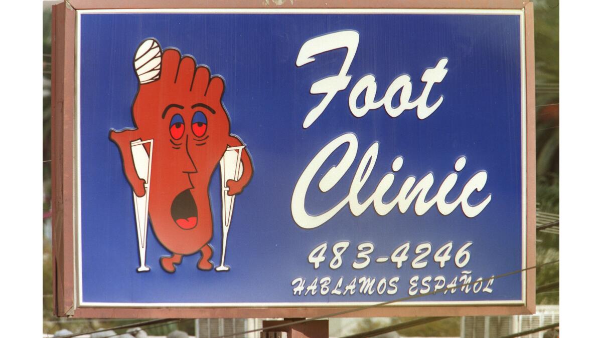
The Happy Foot Sad Foot sign had a big following, stirred up by its removal in September from its Silver Lake perch at Sunset Boulevard and Benton Way. The Sunset Foot Clinic, which owned the sign, relocated and found there was no room at the new address.
The sign currently hangs out at a Los Feliz gift store called Y-Que Trading Post, though it’s not for sale.
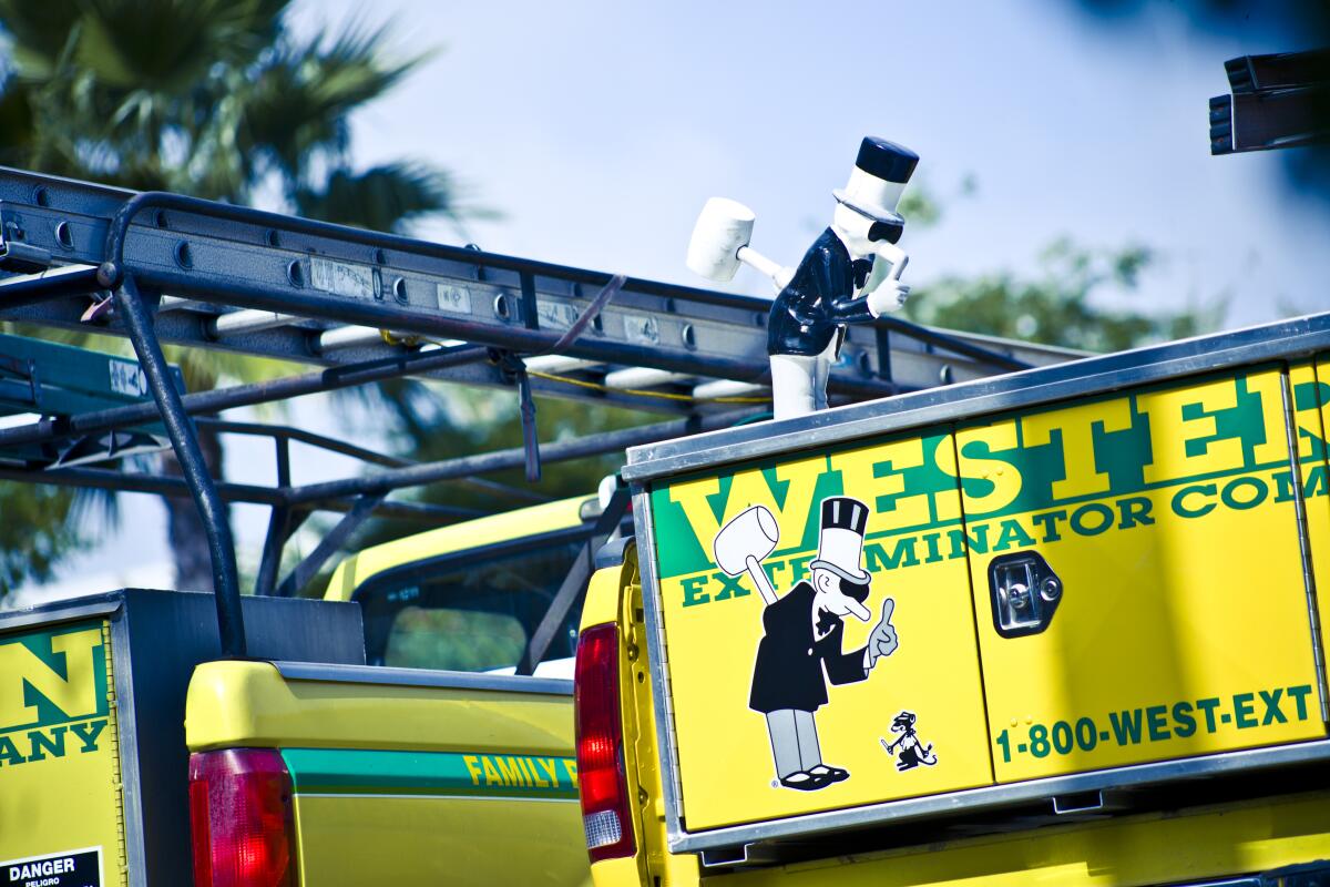
The biggest rival contender for favorite logo was the “Little Man” mascot of the Western Exterminator brand.
Little Man, as the company calls him, first appeared in 1931, 10 years after the pest extermination firm was founded in Los Angeles. Dapper in his black tux, wingtips, gloves and top hat, Little Man holds up a warning finger at his arch nemesis, Menace Mouse, with a large mallet hidden behind his back to counter the rodent’s small knife and fork.
One reader even claimed to have empirical evidence to support his choice.
“The cartoon characters of the man with a top hat holding a huge mallet behind his back, holding up one finger to a mouse on the ground is both the greatest and funniest logo in America, much less Los Angeles. I’ve done a scientific survey and it’s true,” the reader said.
Fans of the Los Angeles Dodgers were confused and annoyed that anyone would choose anything other than the logo for their beloved team, even though it has been routinely breaking hearts throughout the city since it last won the World Series in 1988, when Ronald Reagan was still in the White House.
“There’s nothing more iconic than the LA logo,” one Reddit user said.
It’s been years since the heyday of cartoon star Felix the Cat, but the cat was nonetheless the choice of many familiar with the gigantic Felix Chevrolet sign that is visible throughout parts of downtown Los Angeles.
The sign has ditched the historic and expensive neon for LED lights, to the dismay of neon enthusiasts.
Animal-related logos got several mentions, including the black mother cat carrying one of her kittens in her jaws, the logo of Yamato Transport Co. It’s one of Japan’s largest delivery services, with U.S. operations based in Los Angeles.
The cat symbolizes the company’s motto that it treats customers’ goods as well as that cat cares for her litter.
“Designed in 1919 by Yamato founder Yasuomi Ogura, our logo featuring a black cat surrounded by a yellow oval has been a good luck charm for us for almost 100 years,” the company said on its website.
Vintage eateries Pioneer Chicken (white-hatted chef rides a covered wagon while toting a whole chicken, presumably fried) and Donahoo’s Golden Chicken (big golden chicken) had devotees.
So did Original Tommy’s World Famous Hamburgers, which has inexplicably adopted a logo highlighting Original Tommy’s original stand at Beverly and Rampart boulevards, rather than the chain’s burgers smothered in greasy beef chili, an L.A. fixture since 1946.
And then there were two readers who expressed a preference for an anthropomorphic pickle escaping from a wooden barrel, the logo of an little-known Lincoln Heights pickle manufacturer called A-1 Eastern Homade Pickle Inc.
The company also has a simpler version that’s just a wooden pickle barrel stamped “Homade.” Maybe the nontraditional spelling of homemade adds to the charm.
More to Read
Inside the business of entertainment
The Wide Shot brings you news, analysis and insights on everything from streaming wars to production — and what it all means for the future.
You may occasionally receive promotional content from the Los Angeles Times.


