Review: ‘Painting in Place’ flings open conceptual abstraction doors
Before the 1980s, abstract painting typically embraced pure form — gesture or geometry as something self-contained, insulated from outside contamination.
Over the past generation, however, another practice has bumped that insular, aloof idea aside. Conceptual abstraction flings open the door to the world and everything in it.
“Painting in Place,” a scruffy yet ambitious exhibition organized by LAND (Los Angeles Nomadic Division), is the latest to survey the widespread and invigorating territory. Thirty artists show 47 works in the old Farmers & Merchants Bank downtown. The range of styles, materials and subjects couldn’t be more various.
PHOTOS: Arts and culture in pictures by The Times
What holds most of it together is the location. Given the gross prominence of the marketplace in every nook and cranny of our Gilded Age today, looking at art inside the broken-down quarters of a ruined bank has inescapable resonance.
Farmers & Merchants Bank was L.A.’s first incorporated bank, dating to 1871; its historic flagship building at 401 Main St. opened in 1905. The distinguished architectural firm headed by Octavius Morgan and John A. Walls conceived a formal Classical Revival design, once standard for any stately temple of finance. Massive Corinthian columns, sturdy pilasters and an imposing pediment over bronze front doors fairly shouted authoritative values of conservative tradition on which banking then relied.
Boy, are those days over. The site was shuttered as a financial facility a quarter-century ago — just around the time that banking metamorphosed into something more closely resembling a corporate casino operation than a trustworthy fortress.
Reagan-era deregulation, the Tax Reform Act of 1986, unsound real estate lending and other origins of the savings and loan catastrophe opened fissures in a tight system that was put in place in the wake of the Great Depression. In the exhibition, Sarah Cain’s gorgeous mural “Runaway” brings it all back, tethered to the similar, even larger banking debacle of more recent vintage.
CHEAT SHEET: Spring Arts Preview
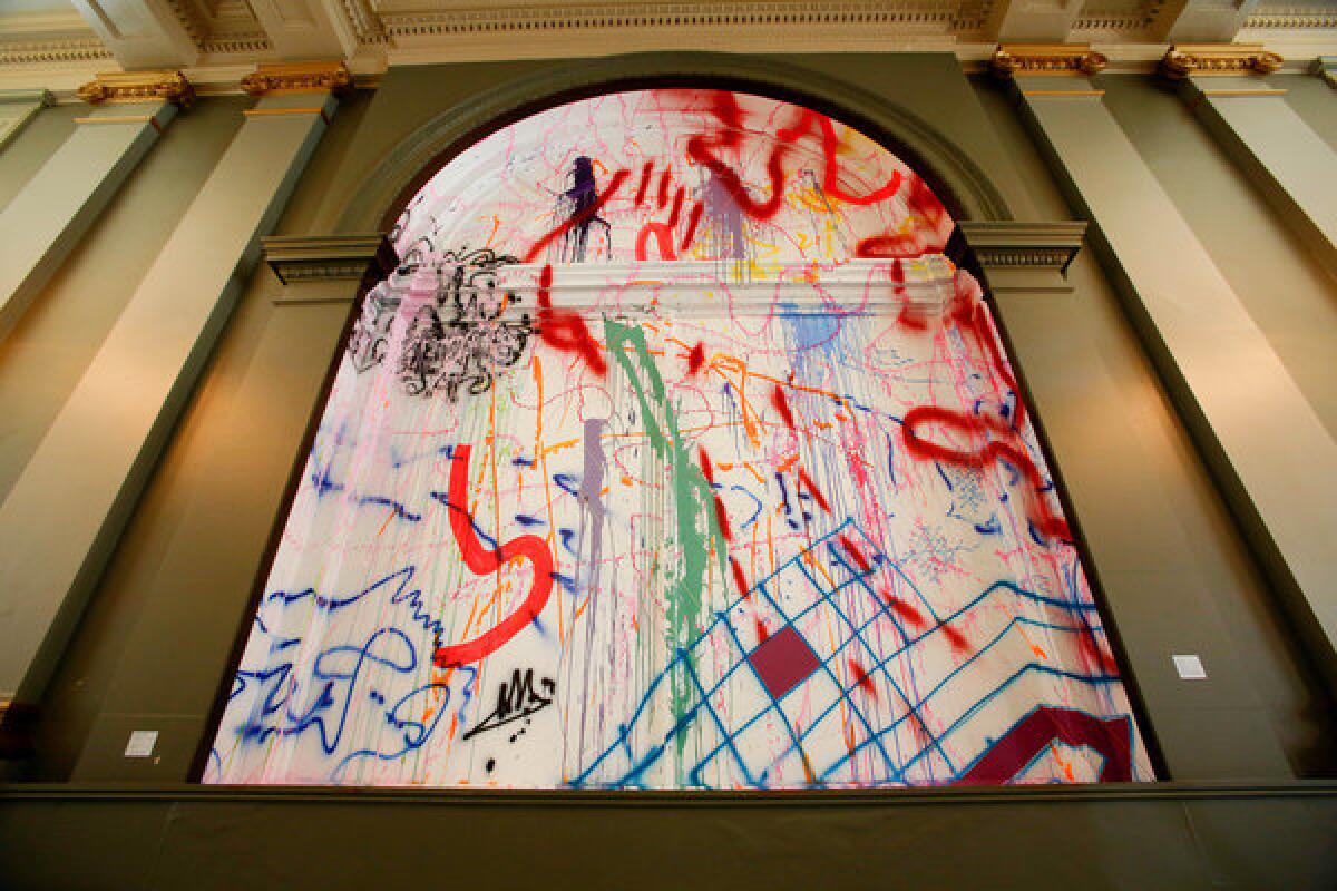
“Runaway” is painted on a 15-foot-tall window in the center of a side wall in the main banking hall. The glass and the window’s sill, casing and sashes are covered in white acrylic, its crackled surface letting shards and splinters of bright afternoon sunlight flicker through. The surface softly glows, becoming as atmospheric as a billowy cloud.
Flanked by gilded pilasters and elegant chandeliers and crowned by a semicircular top, the painted window has the imposing presence of a Mannerist altarpiece in a grand European church. Mannerism is the art that put instability and stress into play with the idealized sophistication of Renaissance art. Cain’s work does too, with 20th century Modernism assuming the old Renaissance role.
Cain splashed and sprayed multiple colors across the pristine but cracked white surface in an exuberant, worldly display of abstract graffiti. The mural’s swoops, squiggles, checkerboards and dribbles merge bits of Kandinsky, Klee and Pollock with vivid street tagging and the worn cast-offs employed by artist Jessica Stockholder. Two double-X lengths of string, one hot pink and the other lemon yellow, add dimension, landing somewhere between conventional signs for kisses and delicate cancellation marks.
Ephemeral, since the mural won’t outlast the exhibition, “Runaway” zigs and zags between being fugitive and being out of control. By itself the painting is enough reason to see the show.
But there are many others. Like all sizable group shows, individual works vary in interest. Yet “Painting in Place” conceives of painting loosely — mainly as anything that has some paint on it, plus a few things that don’t — offering lots of pleasures.
PHOTOS: Arts and culture in pictures by The Times
The surface support might be canvas, as in Barnaby Furnas’ big “Untitled (Rummy’s Flood, May 19),” a great whoosh of crimson dye bleeding over a grim black field, or Julian Hoeber’s double-sided paintings suspended from the ceiling. An elusive logic seems to have dictated the Hoeber paintings’ design, which is almost as sculpturally constructed as David Hendren’s visually clattering wall assemblage of protruding wood, glass, painted jute and fluorescent tubes, providing its own bright internal light.
Linen is stretched over small, thick, 11-by-4 inch frames to become 122 bricks that Monique van Genderen neatly stacked in two piles placed on low platforms. Decorated with gold leaf, the little paintings become Fort Knox bullion — both actual and metaphorical.
The support might be vinyl, as in a wiggly linear rainbow of multiple colors by Olga Koumoundouros that slides down a wall, across the floor, up a second wall, across a window and up to the mezzanine, where it peters out at the ceiling. (Articles of clothing are stuck in the paint along the way, like fossils in an oozing tar pit.) The bank’s floor is the support for Gary Simmons’ big rectangle of chalkboard paint, which picks up footprints in the residue of erased chalk, like memories of lost lives.
Free-standing walls constructed from wood or metal are incorporated into diverse paintings by Matt Greene, Mark Hagen, Sam Moyer and Kon Trubkovich, variously underscoring that context always frames the meaning of any work of art. Something similar happens with Jim Lee’s 14 varied paintings on canvas, wood and metal — large and small, flat or three-dimensional — which lean against a plastic laminate counter; it’s as if the old bank were an art gallery’s back room or a corner of the artist’s studio.
CHEAT SHEET: Spring Arts Preview
Jacob Kassay hung a wide, irregularly shaped, upside-down “U” of stretched linen over double doors that open onto a hallway leading to the rear gallery; the materials of a painting frame life’s mundane passage. Flanking Kassay’s installation, shiny black aluminum panels by Vincent Szarek are fitted into two doorways, their mirrored surfaces allowing only the illusion of transition.
Art historian and curator Pepe Karmel, writing recently in Art News magazine, persuasively argued that the marvelous proliferation of Conceptual abstract painting in recent decades can be understood primarily by its thematic content, rather than by any formal evolution. He identified six basic artistic themes, all plural.
They include cosmologies, landscapes, anatomies, fabrics, architectures and signs — all of which can be discerned in “Painting in Place.” Not everything in the show makes specific reference to the bank building’s decrepit site or its grand history. But none of the works are remotely utopian — or, for that matter, dystopian.
Those two poles, perfection and squalor, once dominated abstract painting. Like Cain’s resplendent window painting “Runaway,” which simultaneously invokes conflicting states of rampant excess and lost bohemianism, a runaway society and a yearning to run away from it, neither now holds sway. Conceptual abstraction is instead a vehicle for how we think about where we are.
And, as Karmel observed, about where we might want to go.
christopher.knight@latimes.com
“Painting in Place,” Farmers & Merchants Bank, 401 Main St., (646) 620-8289, through July 31. Closed Sun. through Tue. https://www.nomadicdivision.org
More to Read
The biggest entertainment stories
Get our big stories about Hollywood, film, television, music, arts, culture and more right in your inbox as soon as they publish.
You may occasionally receive promotional content from the Los Angeles Times.
