
This story is part of “Clearance,” a design issue that peels back the layers of aspirational architecture in L.A., and envisions a more beautiful future that lives a little less on the nose. Read the whole issue here.
The year was 2011. I was fresh out of college and in New York for the first time as an adult. I was a little worried about myself, as I wasn’t sure if I was going to be smart enough or cool enough for actual adulthood. I was young, so I didn’t know anything, but I was young, so I knew everything. I used HopStop, I went into an energy-efficient office, and I had lunch from Mooncake Foods. CBGB was already John Varvatos, and Max’s Kansas City was but a memory. The third-world Manhattan I had romanticized in my youth was long gone, but it didn’t matter — I was there.
I found myself at the Strand, which was once mecca for a young person with glasses. Almost immediately, I was drawn to a modern trade paperback copy of Lorrie Moore’s “Self-Help.” There was a medicine cabinet on the cover containing ointments, a bottle of antacids and a few other toiletries. It was fairly unspectacular, but it evoked my own projections of medicine cabinets, so I took it home.
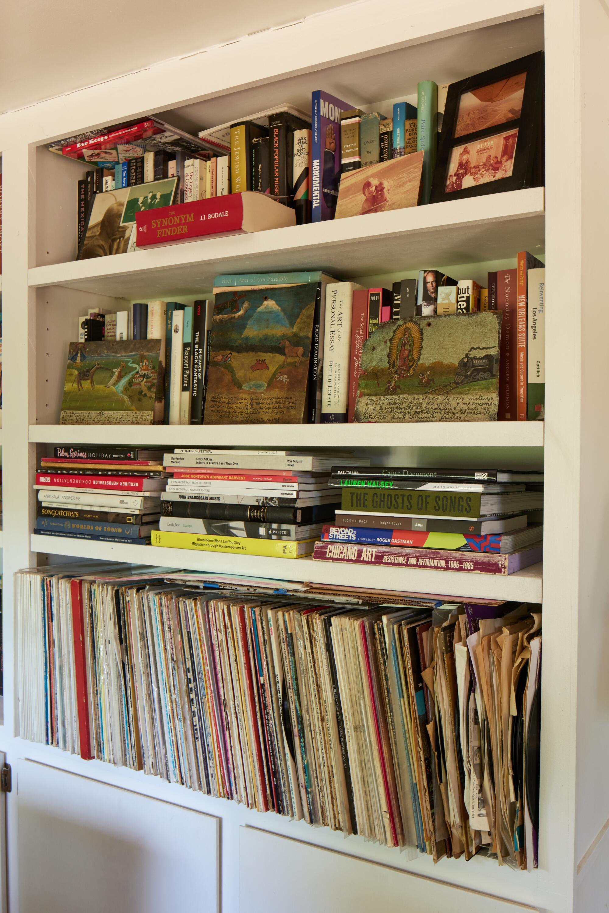
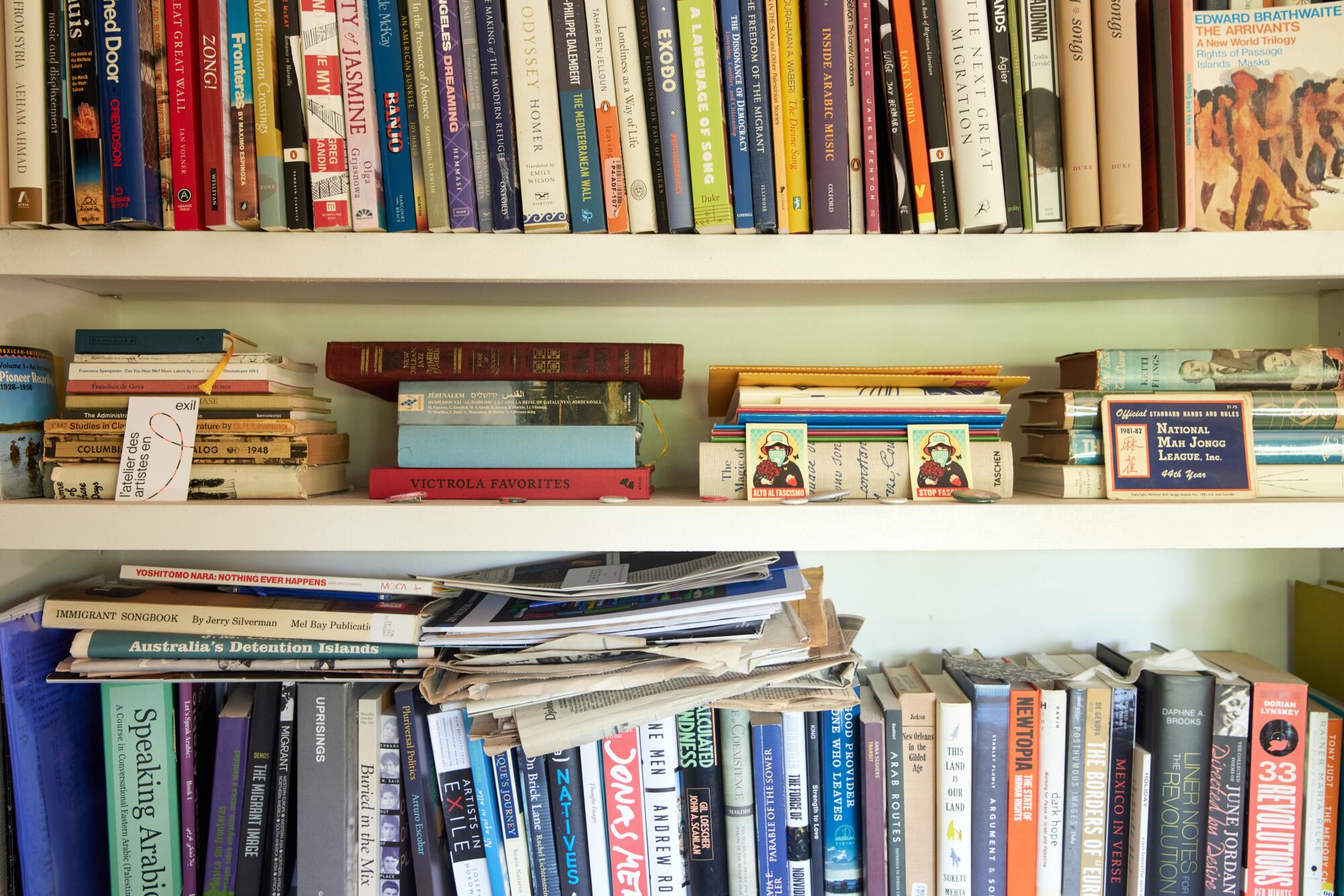


It’s intrusive and unsavory, but we’ve all poked around someone else’s medicine cabinet before. It is intimate to know what shampoo or brand of floss someone uses, and often that’s all you get. Still, the sordid potential of fun pills or finding out someone is secretly rich makes you look every now and again. These vaults know what parts of your face get more of your budget, what ailments you keep at bay, and essentially, they are the keepers of the secret recipes that transform the damp, undignified mess that leaks out of your bed each morning into the version you present to the world. They hold everything inside that results in the outside, and for “Self-Help,” this is perfect.
This was maybe the purest and possibly last example in my life where I judged a book by its cover, at least in person. Most of my window-shopping nowadays is conducted online, where book covers are reduced to flat, rectangular images that are merely elements on a page. Designers have adapted to these modern shopping habits, and their main consideration now is whether a cover can be visually processed before a thumb scrolls it into the past. But why value the consumer over the book itself? A book cover should be designed not to speak to an audience, but to speak for a book.
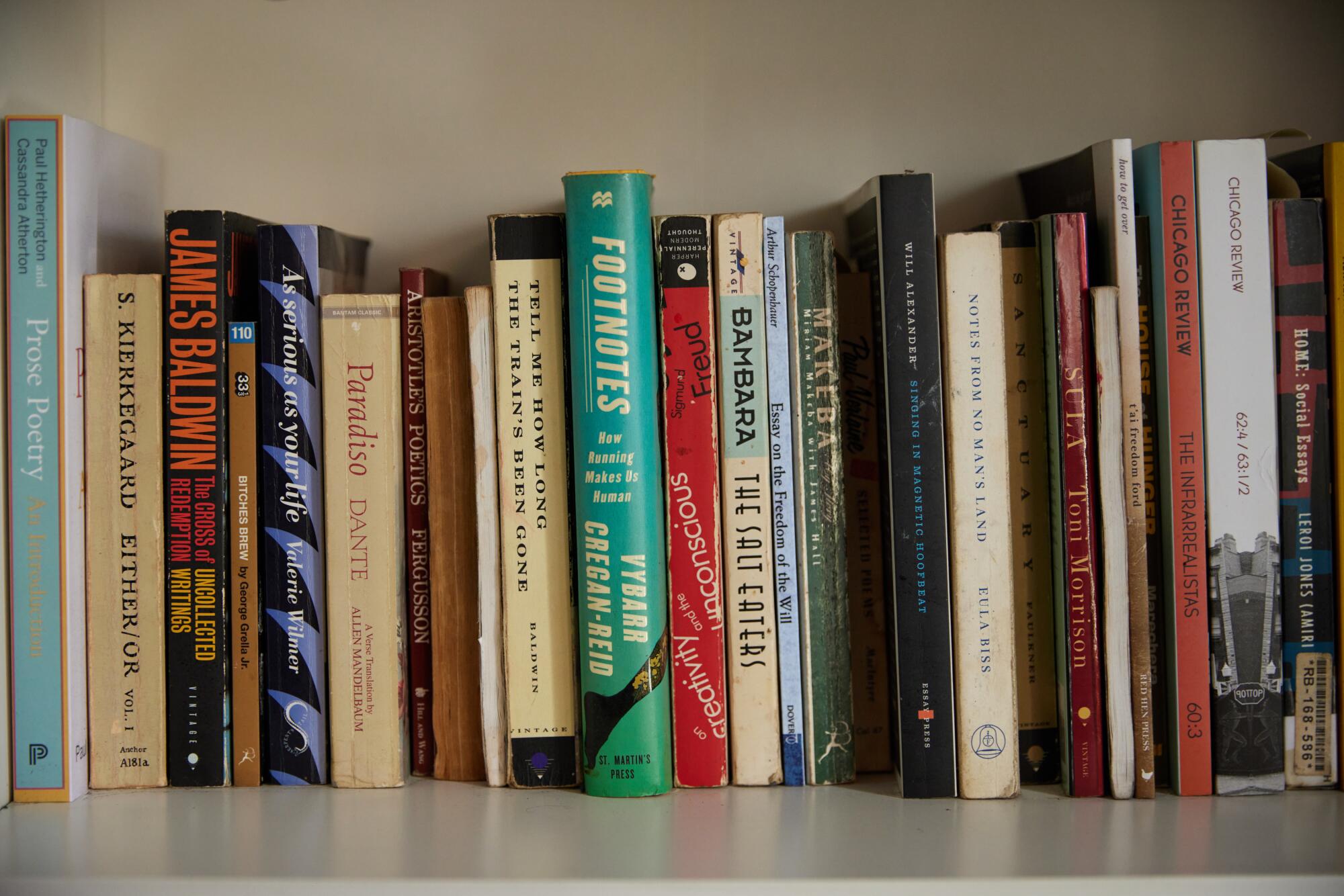
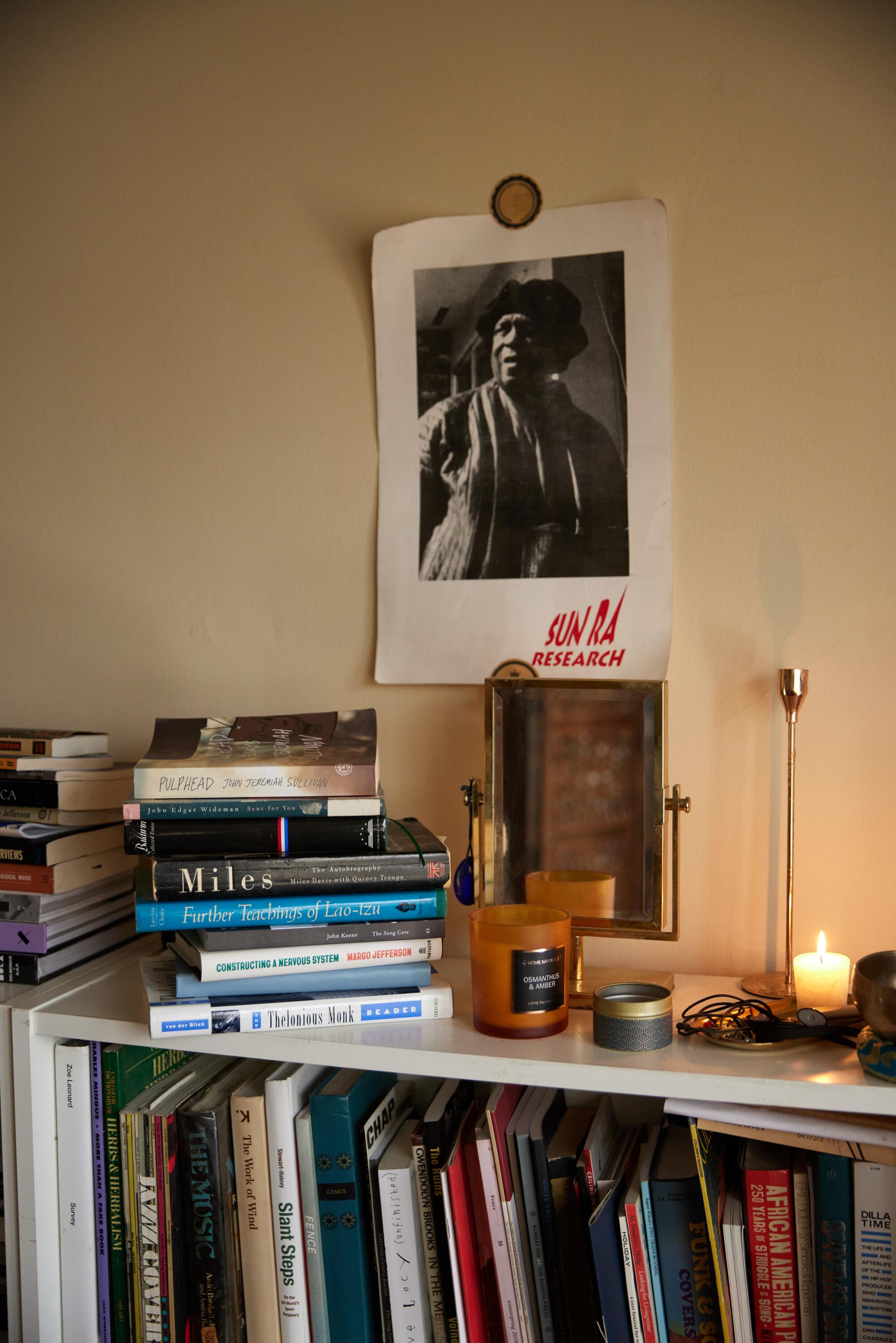
A lot of these new covers follow a template of sans-serif type against a colorful, patterned backdrop, and they all kind of look the same. They value efficiency and aesthetics above all other considerations, and they end up a graveyard of lost opportunities: How will the jacket or the obi interact with the buckram? What does the typeface of the title convey? What emotions do these colors induce? They feel akin to Squarespace websites — inoffensive and nice enough for an Instagram feed. All of the sensual elements that were once a big part of the sell don’t matter anymore, either. On a screen, you can’t smell a book, nor can you gauge the heft and texture of the page. There is no crack of dormant glue as you first break the spine, nor is there the running of fingers over the raise of emboss. These are special aspects unique to buying a book in person, but not special enough to trump the convenience of buying one from bed.
I don’t even think these modern covers look half bad. To be honest, they’re fine. They look good enough, but a good-looking cover is not necessarily a good cover. A good cover should compel you to find out what’s inside and aim to ultimately shrink the disparity between what an audience thinks a book is and what a book actually is.
If you can do both, great, but too many of them preserve a trendy aesthetic at the cost of speaking for the book. There are plenty of covers I find unattractive that are great covers for their books. A prime example is Colson Whitehead’s “The Colossus of New York.” The 2003 book is a love letter to the city, told through a series of 13 deconstructed portraits, each highlighting a specific aspect of Whitehead’s New York. The cover dons a stylized, jagged skyline reminiscent of individual elements that make a whole, but a whole that is not exactly a sum of these parts. It illustrates all the dissonance and unity of both the city and the stories inside, and it is the best book ever written about New York — but I don’t like the cover. I don’t like the black sky paired with the brassy copper of the buildings, and I find the sizing and layout of the text to be haphazard and unbalanced. However, the cover speaks for the book, and it does not consider me. It does not know who I am, nor does it care what I think. What it does do, is it communicates to me how I should prepare mentally and emotionally for what I’m about to get into.
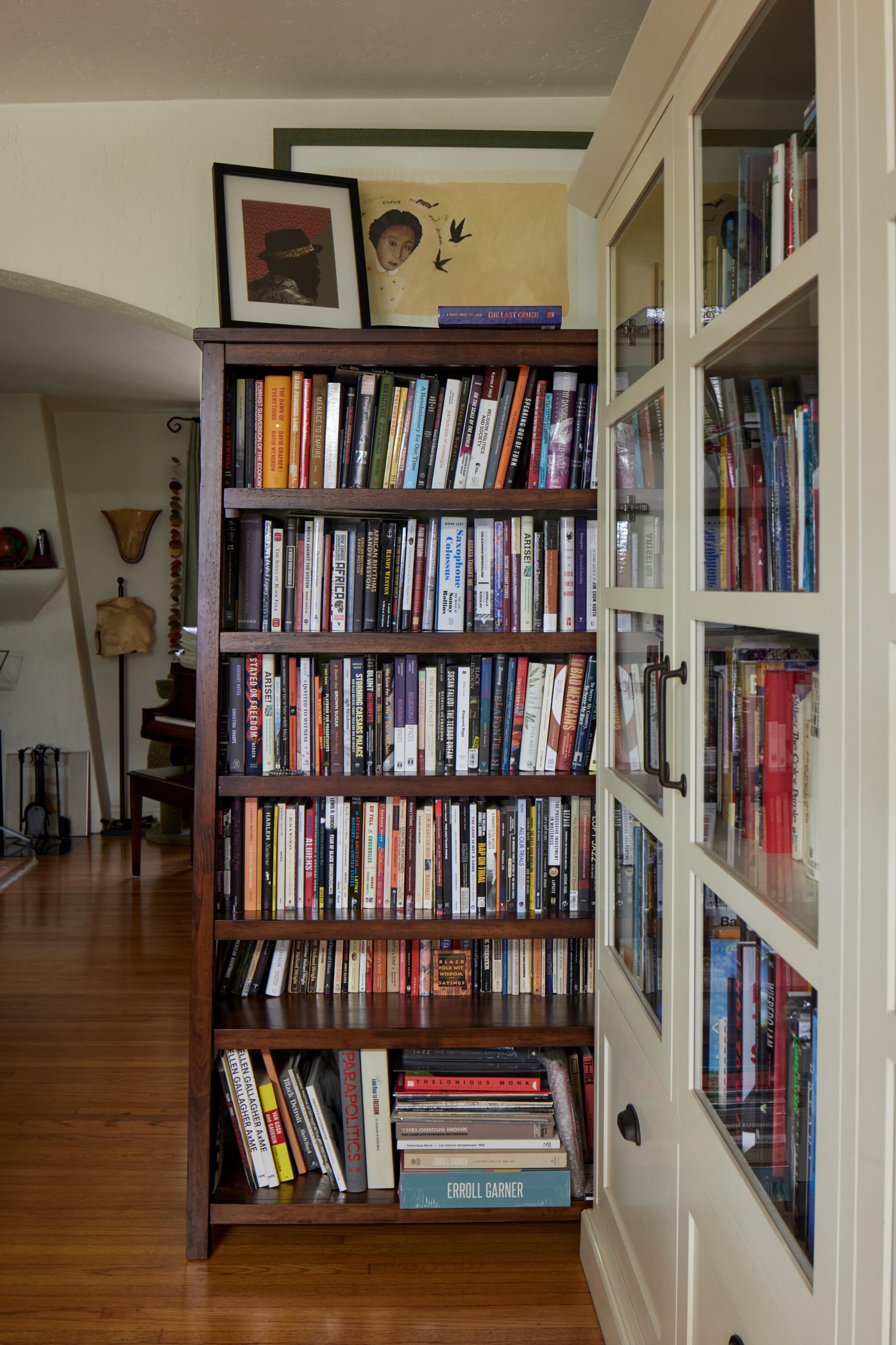

Once a cover has successfully convinced you to read a book, in addition to speaking for the book, it now takes on the added responsibility of speaking for you. It comes to represent the time in your life when you first read the book, and while the book itself does not change, you do, so the cover starts holding different weight in your life as you emotionally mature and approach the book differently each read. The cover comes to symbolize who you were when you first met, and becomes a record of all the tweaks and edits that have been made to your worldview since. The very sight of it on your bookshelf acts as a time capsule to remind you of an older version of yourself, and how this book is a foundational part of the you that exists today. When others see it displayed prominently on your shelves, it is a way for them to learn something about you, or at least a way for you to present yourself to others. A book cover becomes a way for you to understand and be understood.
As a teenager, the equivalent of books on shelves was bands on shirts. It was the early aughts in suburban Diamond Bar, and if you were “alt” at all, you were punk, or emo, or into hardcore. The main tell of your divergence was what band was named on your shirt. We wore these as a way to find each other, while at the same time separating ourselves from the general populace. We all wanted to be part of something, but we didn’t want everyone in on it. It was the first time in my life where I sort of scared my mother and displeased her a bit, so it was a very special time for me. Eventually, this practice evolved into a display of pure fandom for these bands we had lost years of our lives listening to, and so we continued wearing the shirts. I never really grew out of this, and at some point a few years back, it gave me the idea to proudly display other media that I had formed my whole identity around, so I started making literary merch.
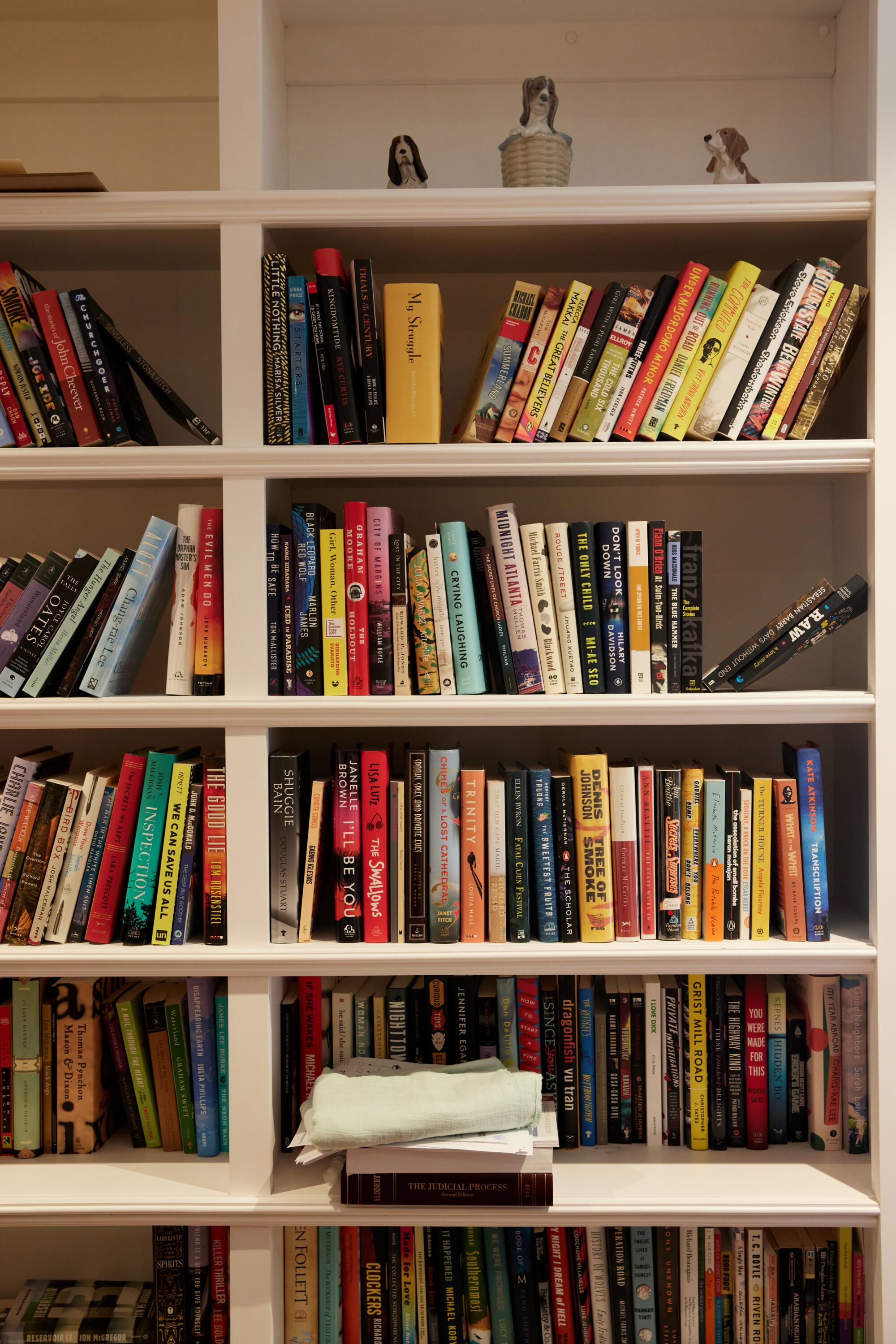

Naturally, the first had to be “Self-Help,” so I could find my Lorrie Moore contingent. Don’t get me wrong, I am well aware that it is an immensely popular book, but still, Lorrie Moore is not the Beatles. Lorrie Moore is ours, and that’s part of why we like her. Visually, the merch is quite underwhelming. They’re just black sweaters with the text from the title page, but if you know what you’re looking at, it floods your system with joy, because to you, it’s the world. A very well-known musician even messaged me about getting one, as “Self-Help” is their favorite book, and they told me they kept a copy atop a piano for a live televised performance. We have never met, but because we share the same deep affinity for “Self-Help,” I feel like this complete stranger understands parts of me on a quite intimate level. You can skip a lot of the steps in getting to know someone when there is a shared interest suggesting that you meet certain prerequisites.
If we said when you woke up tomorrow that the 10, the 91, the 118 freeways and the East L.A. Interchange had vanished, would you dare to look directly at the brave new world?
When I made the Molly Giles “Rough Translations” sweaters, at the suggestion of a friend, I cold emailed Molly Giles herself and sent her a few. She was so tickled, and after a few email exchanges, she sent me her personal copy of Lucia Berlin’s “Where I Live Now” with a nice note inside. Molly Giles and I will never meet — we don’t go to the same bars. However, I have read enough of her to feel fairly confident that I know what she was doing. I thoroughly believe that she was not giving me a book, but that she was giving me the story so I could think fondly back on it whenever I saw it on my shelves.
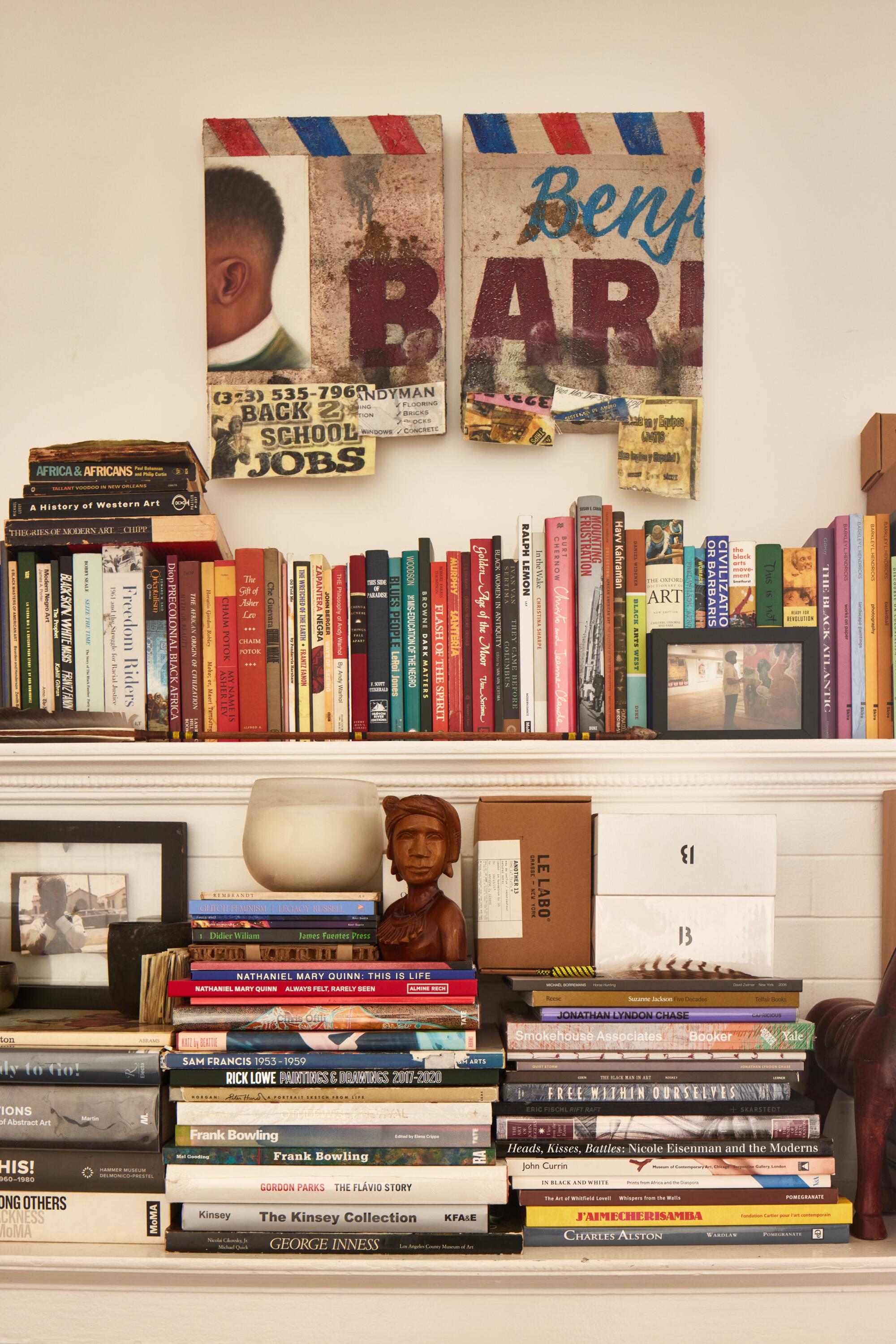
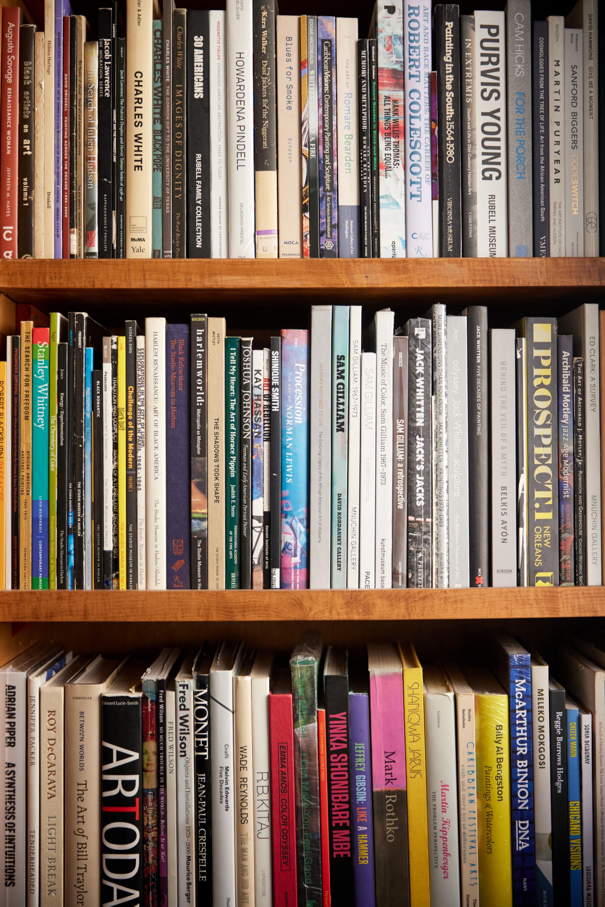

“Self-Help” has now been with me for over a decade, and it has seen all my follies and victories. I still revisit it once a year when I need to remember how it’s done. I unfortunately no longer have that shabby trade paperback copy with the medicine cabinet on its cover, but it has been replaced by a first edition hardcover. When I got this copy, I was already deeply familiar with the contents, so the cover wasn’t a metric on which I could judge. Frankly, it’s a little all over the place and very late ‘80s. I don’t know that I would have picked it up in 2011, and so I’m eternally grateful for the edition with the medicine cabinet on the cover. It changed my life, and I’m so relieved that the bright-eyed, bushy-tailed kid was compelled enough to pick it up and judge it by its cover. Soon, he will crack it open and find out a lot about himself. By the 10th or so reading, he will have seen a little more of the world, he will have met a few more people, and he will have discovered he is not so alone on this planet of billions. While he is worried about himself in 2011, he ends up being fine, so I am nothing but excited for him. I love that kid.
Christopher Chang lives in Los Angeles.


