This story is part of “Clearance,” a design issue that peels back the layers of aspirational architecture in L.A., and envisions a more beautiful future that lives a little less on the nose. Read the whole issue here.
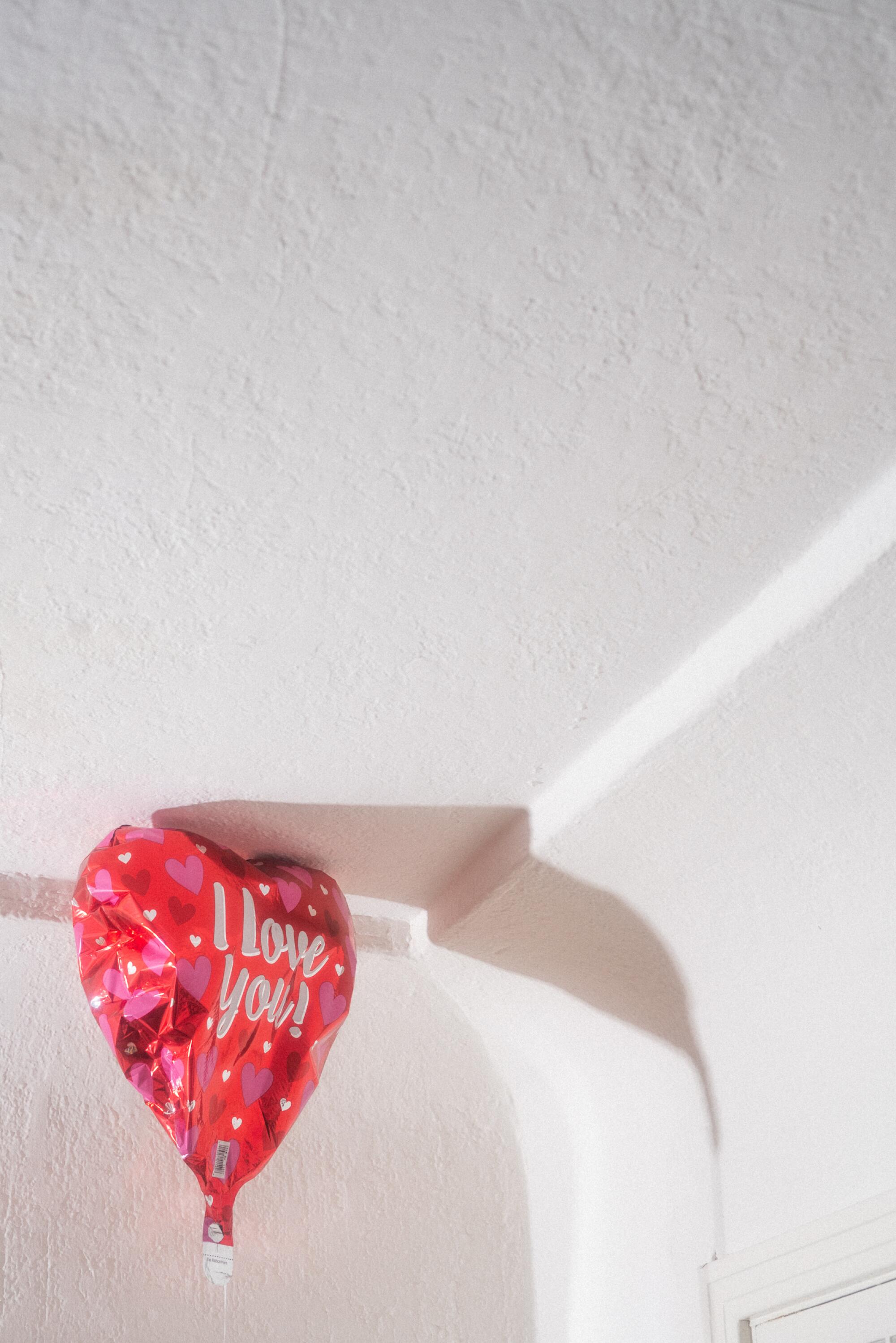
The Sistine Chapel, where “The Creation of Adam” hovers above, is probably the world’s most iconic ceiling, but the one I know best is the ceiling I grew up under in the suburbs of the San Fernando Valley. The popcorn ceiling — the ceiling of the people! — was a product of the post-war building boom, designed to make imperfections easy to hide and to act as an acoustic barrier. Yes, it was also a dust trap and possibly made of asbestos; but that ceiling still has a hold on my subconscious. I can see those tiny crags with their tiny shadows. I remember the scratchy feel when grazing my hand on the surface, the fear of it flaking off on me. I can picture the glow-in-the-dark stars and planets we brought back from a field trip to the Natural History Museum and the slanted cylinder-shaped crystal prism hanging from a hook, which never got enough sun from the north-facing window to throw a rainbow but gleamed in iridescent colors.
We are told to be forever mindful of having the roof over our heads, but we collectively forgot about what happens on the flip side. We adorn walls with what we want our lives to look like, we keep totems on our desks, we scuffle and sweep our floors underfoot. The ceiling is the last thing people tend to think about. And yet the ceiling has been there all along, calling you to give it another look.
The spaces of your childhood loom large, like the music you listened to growing up. In my seventh-grade English class with Ms. Novak, the ceiling was the first thing you noticed when you walked through the door. Hand-drawn book cover posters consumed the walls and then worked their way overhead, completely covering the ceiling. I still remember the wicked grin and pair of eyeballs on the “Clockwork Orange” poster, the melancholy rabbit of “Watership Down,” the pyramid of “Dune.” Being in class felt like living in a pile of books.
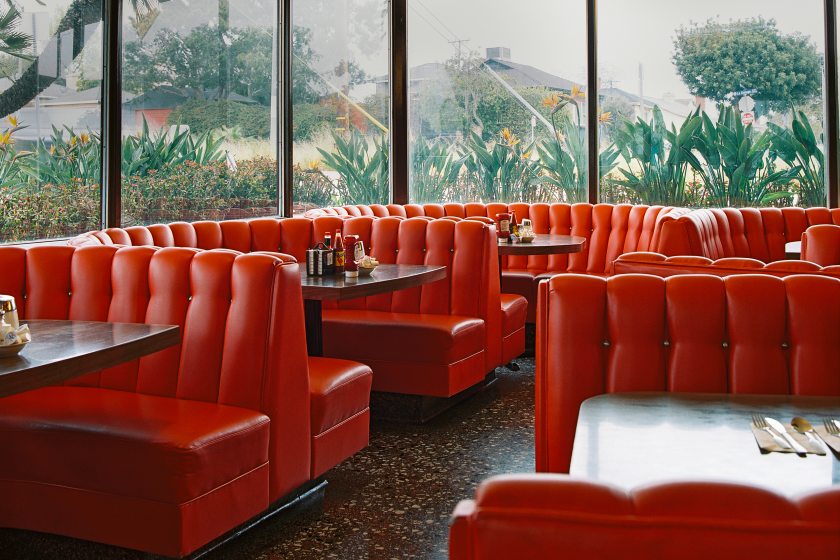
They are where regulars are born, where out-of-towners can find a taste of home, where romantics dream up first dates launching lifelong partnerships — however noisy or filled with distractions the atmosphere becomes, a booth in L.A. remains a sanctuary.
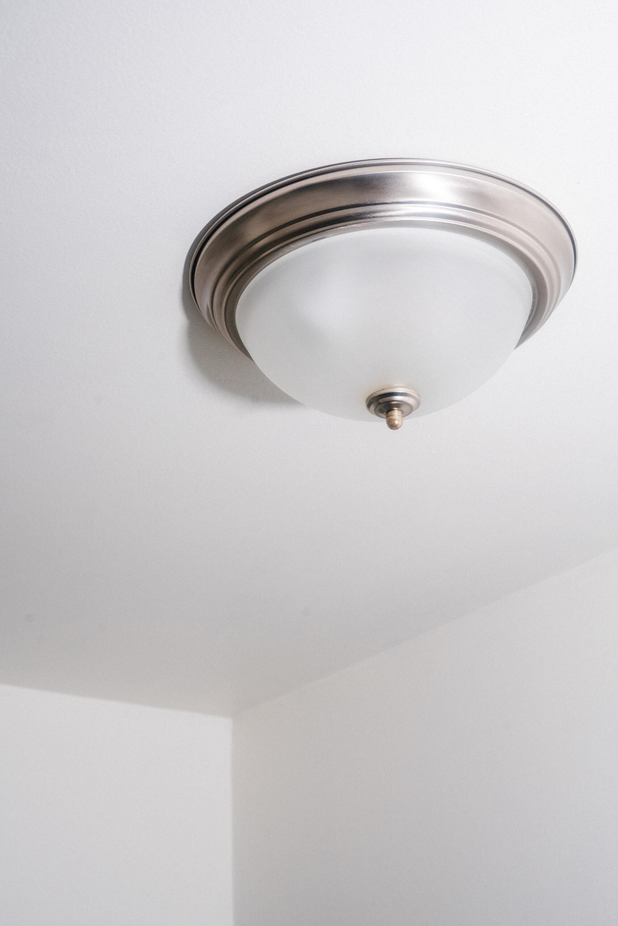
Many ceilings are empty, their pristine surfaces only interrupted by humdrum necessities — recessed lights, vents, smoke detectors. The virtue, so to speak, lies in blank space. You won’t find more than a light cover around the edge or a statement chandelier. The aesthetic of minimalism treats the ornamental as crime, regardless of the style of the space — farmhouse modern, bohemian chic, traditional Spanish. It’s the design equivalent of “quiet luxury” — where height is an absolute good, with no thought of the cavernous echoing spaces that result. Vents become lines, moldings become negative spaces. The ceiling itself is a disappearing act.
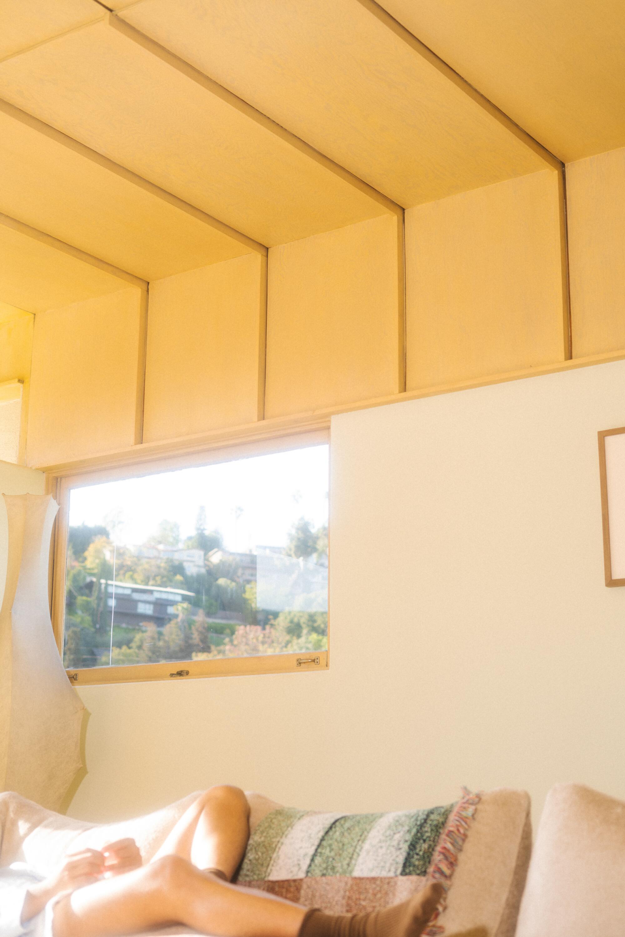
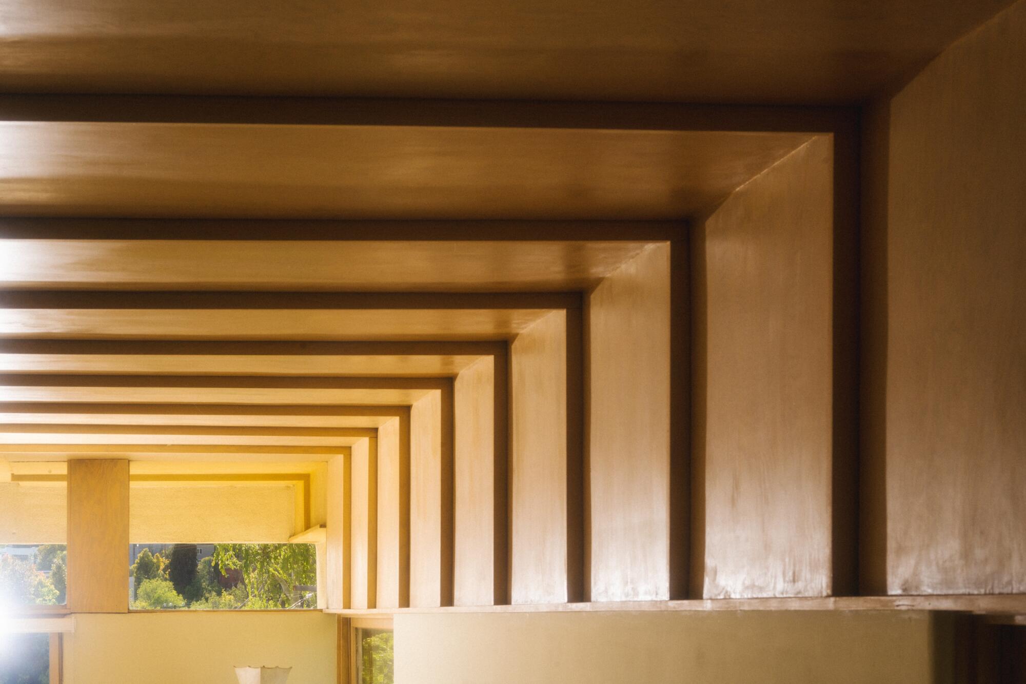
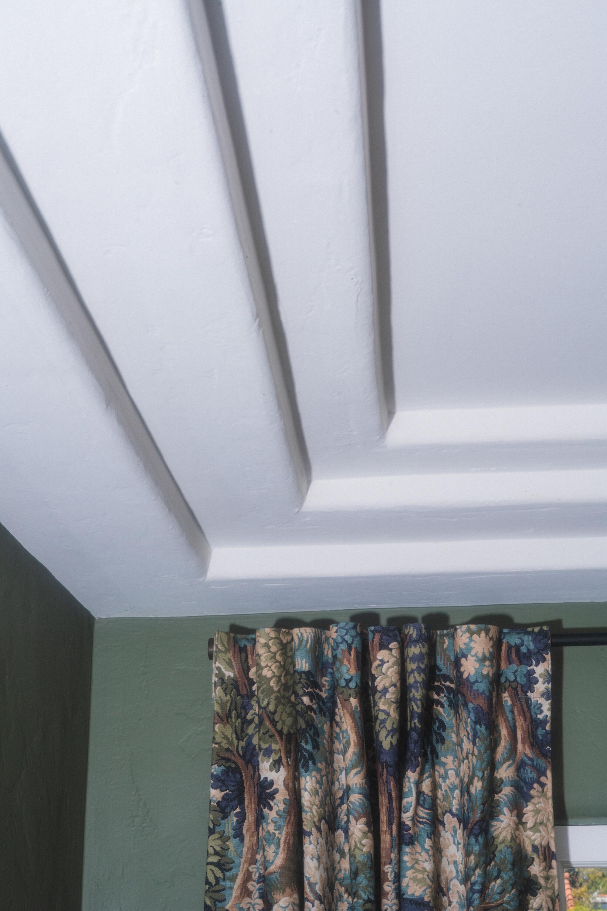
The exposed guts and building materials of an industrial warehouse turned artist’s loft give the opposite effect; the wood subfloors, the uncovered brick, the tangle of metal conduit, create lived texture by accident. When the ceiling becomes part of the design, it opens up another dimension. Each detail conveys a philosophy. Heavy crown moldings, originally a decorative way to disguise the transition from wall to ceiling, denote history and status. The stepped curves of Southwestern styling recalls the original adobe material. Painted ceilings can make a space higher or lower, warmer or cooler. The exposed wood beams of a house visually give a room rhythm; they signal strength and integrity of structure. (All the more reason that fake beams are the ultimate insult.)
Even if you don’t consciously think about these things, your body knows them well. You register how a space feels — low, high, light, dark, confined, airy, cold, hot. At the Hollyhock House, Frank Lloyd Wright’s first commission in Los Angeles, the long, low entrance path leads up to the dramatic living room, where both the floor and ceiling step away from you. The ceilings are as well-considered as the walls, with richly colored panels, intricate wood moldings, integrated lights and above the hearth, a skylight that’s an artwork in itself, with soft light filtering through a geometric pattern of wood tracery like stained glass. Being in such a considered space prompts a visceral reaction.
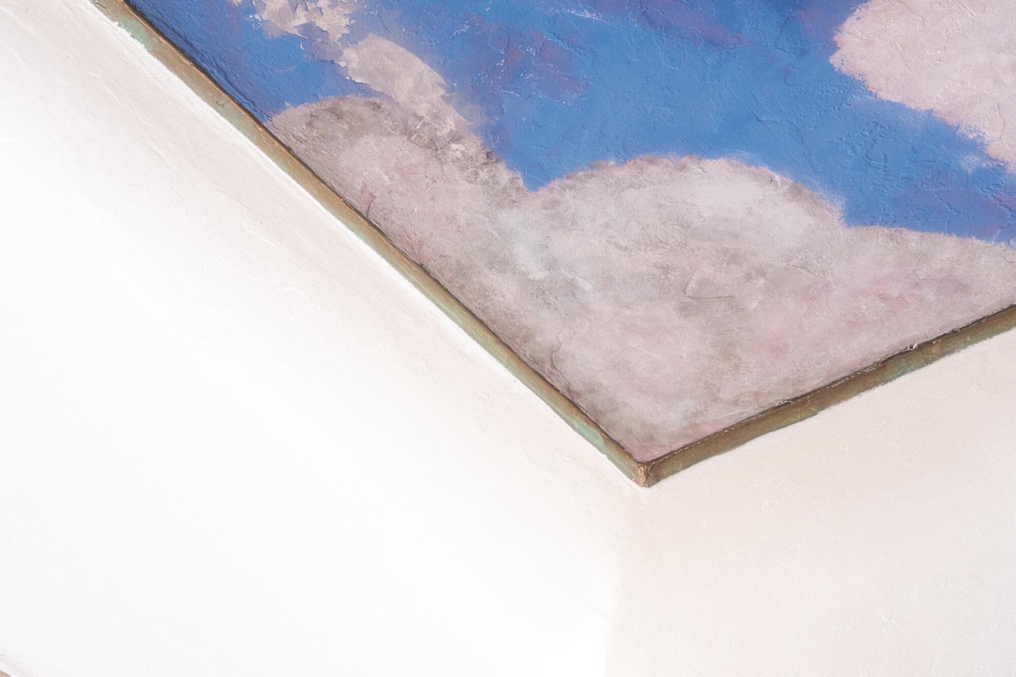
The Case Study Houses and those striking but ultimately restrictive lines of Midcentury Modern might be de rigueur. But to my eye, it’s John Lautner’s houses that define Los Angeles. Each of Lautner’s works are a singular melding of nature and fantasy through an expression of structural elegance — the cantilevered mushroom of the Chemosphere, the parabolic arch of the Garcia House, the origami-like triangular concrete grid of the Sheats-Goldstein House. There are no façades, no singular flat planes for front, back, sides, top. Walls and ceilings curve and fold, dissolve into the outdoors. The architect that inspired the Space Age cartoon buildings of “The Jetsons” got his start helping his parents build a cabin in the Upper Peninsula of Michigan. Raising their own roof beams and using the horizon to sight a level, he called this his true architectural education, more so than apprenticing for Frank Lloyd Wright. Dubbed “Midgaard,” after the mythic Norse bridge between Earth and heaven, the cabin’s ceilings were blue with fluffy white clouds, painted by his mother.
All ceilings got their start from the two archetypes of shelter: the cave, where wall and roof are one, a structure of compression; and the tent, a frame and a suspended woven textile enveloping space in tension. Wood beams evoke lying under a tree, looking up at the branches. Glow-in-the-dark stars or a painted sky signify the overarching heavens above. Ceilings are always a callback to what came before. But they are also new beginnings. As Jun’ichirō Tanizaki writes in “In Praise of Shadows”: “We first spread a parasol to throw shadow on the earth, and in the shadow we put together a house.”
We make our homes underneath them, and they watch over us. They both reflect and shape the life lived beneath them.
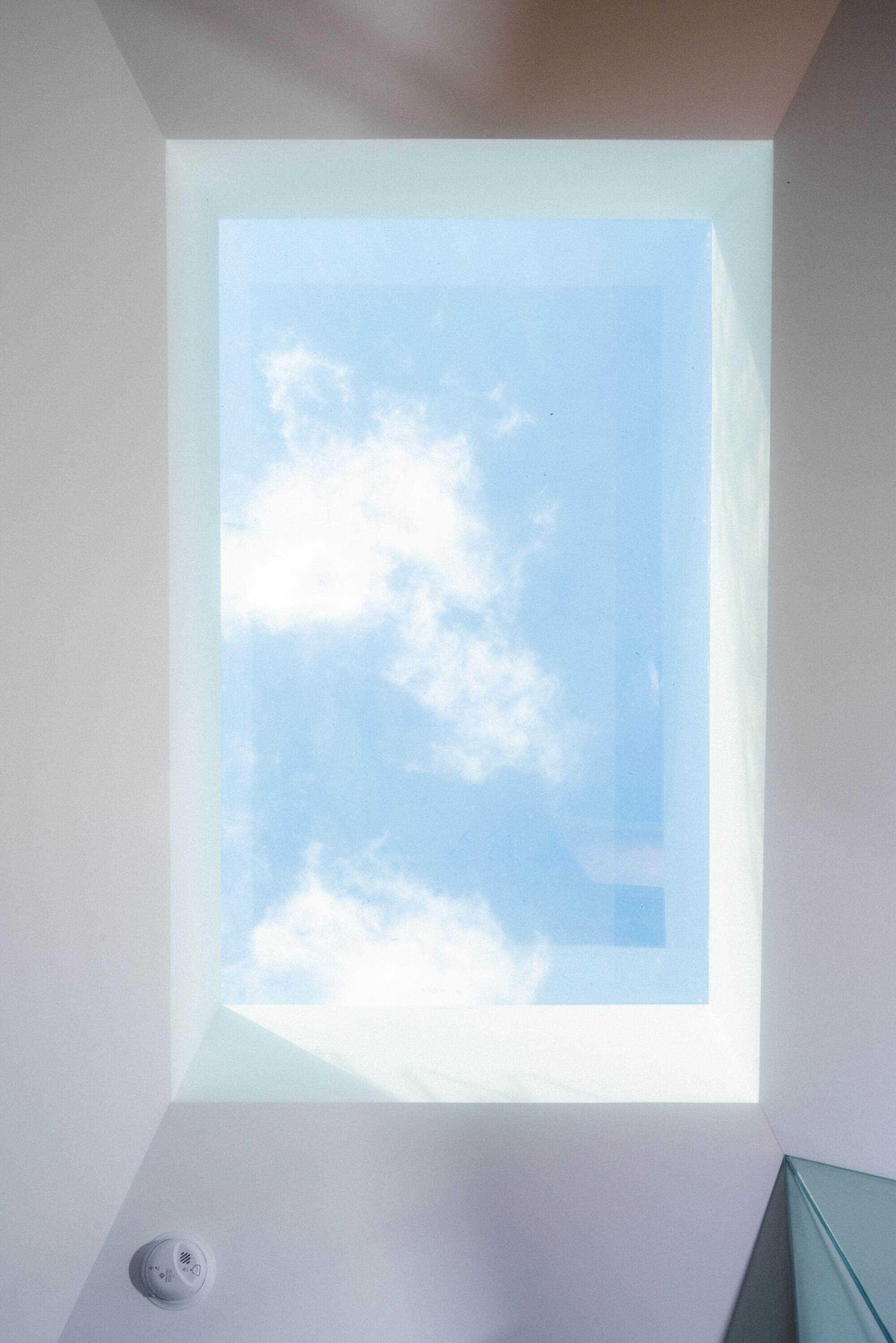
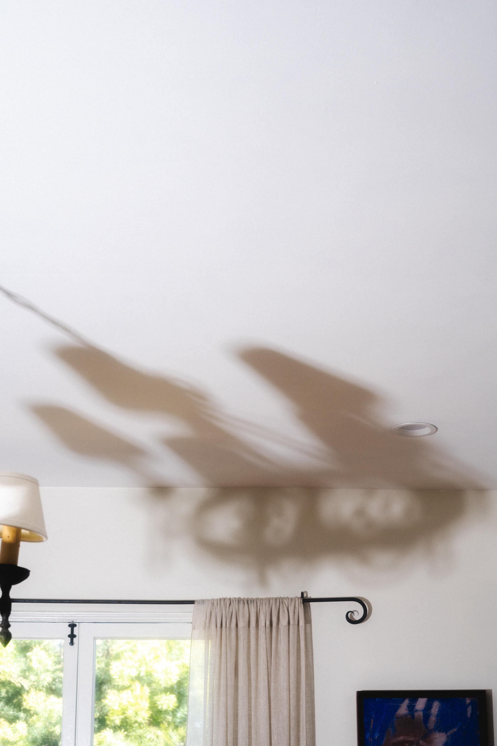
I’ve finally escaped from the scourge of popcorn. In my bedroom now, the ceiling is empty white like countless others. There’s a single half silver lightbulb that reflects light back onto the ceiling. In the morning, through the gap between the curtains, the sun sometimes casts a perfect fan of alternating stripes of light and shadow on the ceiling that I don’t understand, but is a wonder of natural phenomena. From the bed, the bottom of the lightbulb itself is a silver globe, a fish-eye mirror encapsulating the entire room, the walls, the long-curtained windows, the chairs with piles of clothes, books on the floor, the bed, and me in it.
Even when it seems like there’s nothing to see, you can either find or found a world. The void is not emptiness, it contains everything. Look up.
Krystal Chang is a writer, architect, and a designer of landscapes, installations and public art in Los Angeles.
